How to make 1,000 fonts
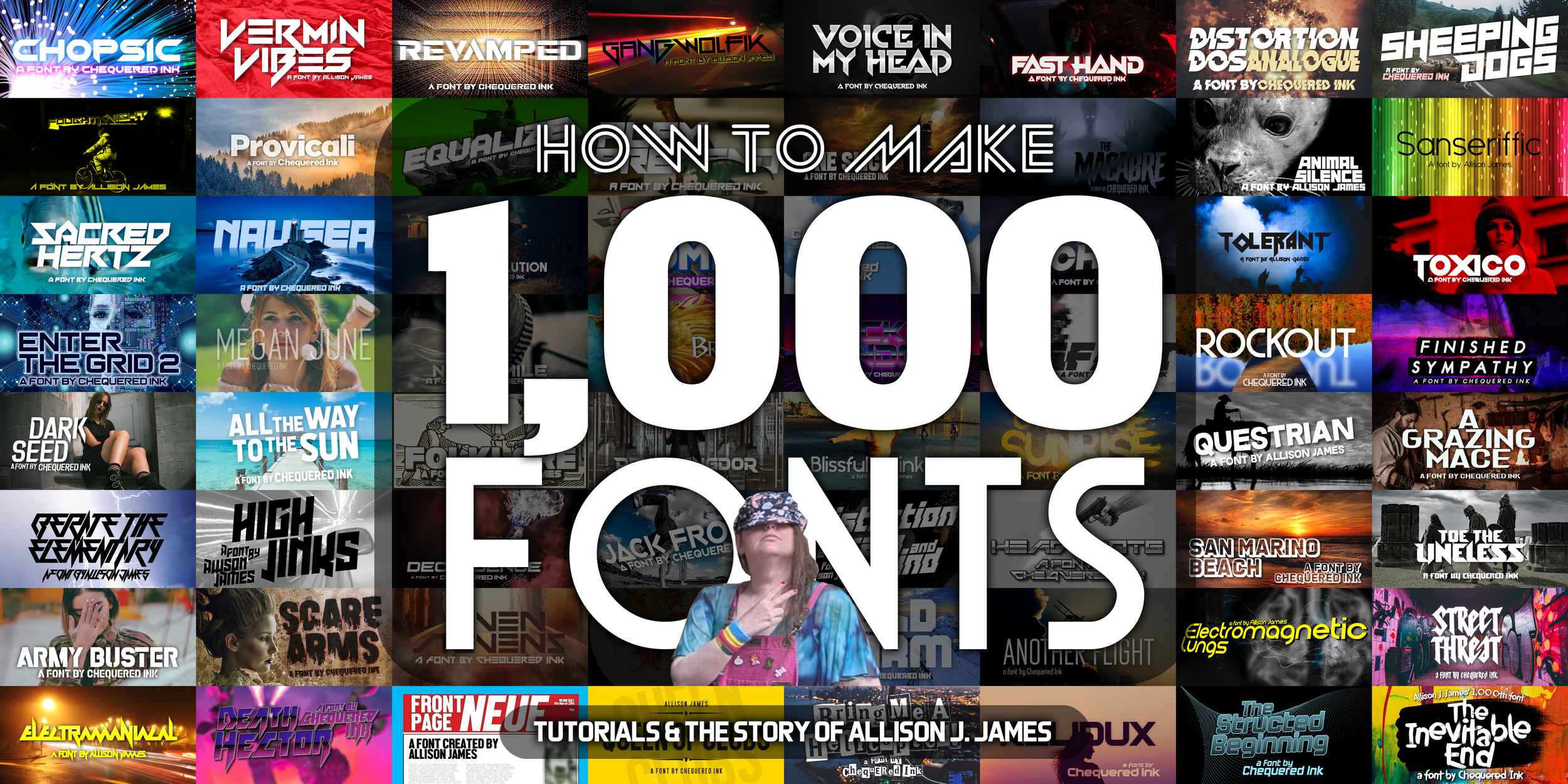
Over the last 21 years, and ending today, I have made 1,000 fonts. It’s been… a long story.
A short introduction: hello! I’m Allison. I’ve been part of Chequered Ink with Daniel Johnston Menezes since 2015, a company born in part from my fonts.
There is a lot more to my story. This will not only be a long, detailed history of my introduction to, and work in, the field of typography, but will also document the creation of my last two fonts. #0999 will be a throwback to my early days, and serve as a tutorial for making your first-ever font, if you’re that way inclined. And #1000 will be a culmination of every technique I have learnt over the last two decades, along with something very new to me.
Enjoy!
[I] Becoming interested in (font) design
Paint & the Aldi resource discs
I was a fan of fonts from the moment I found the dropdown in Windows 3.1 – my oldest surviving digital art is from when I was eight years old, recovered decades later from a floppy disk that could, miraculously, still be read from. Even back then, I was using every preinstalled font on the computer with reckless abandon.
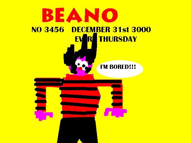
I was a big lover of the Beano in childhood, and one of my first pieces of digital art was a tribute to that.
I also used Paint for tributes to my dad’s love of old aircraft, birthday invitations to print out, and fantasy Robot Wars entries.
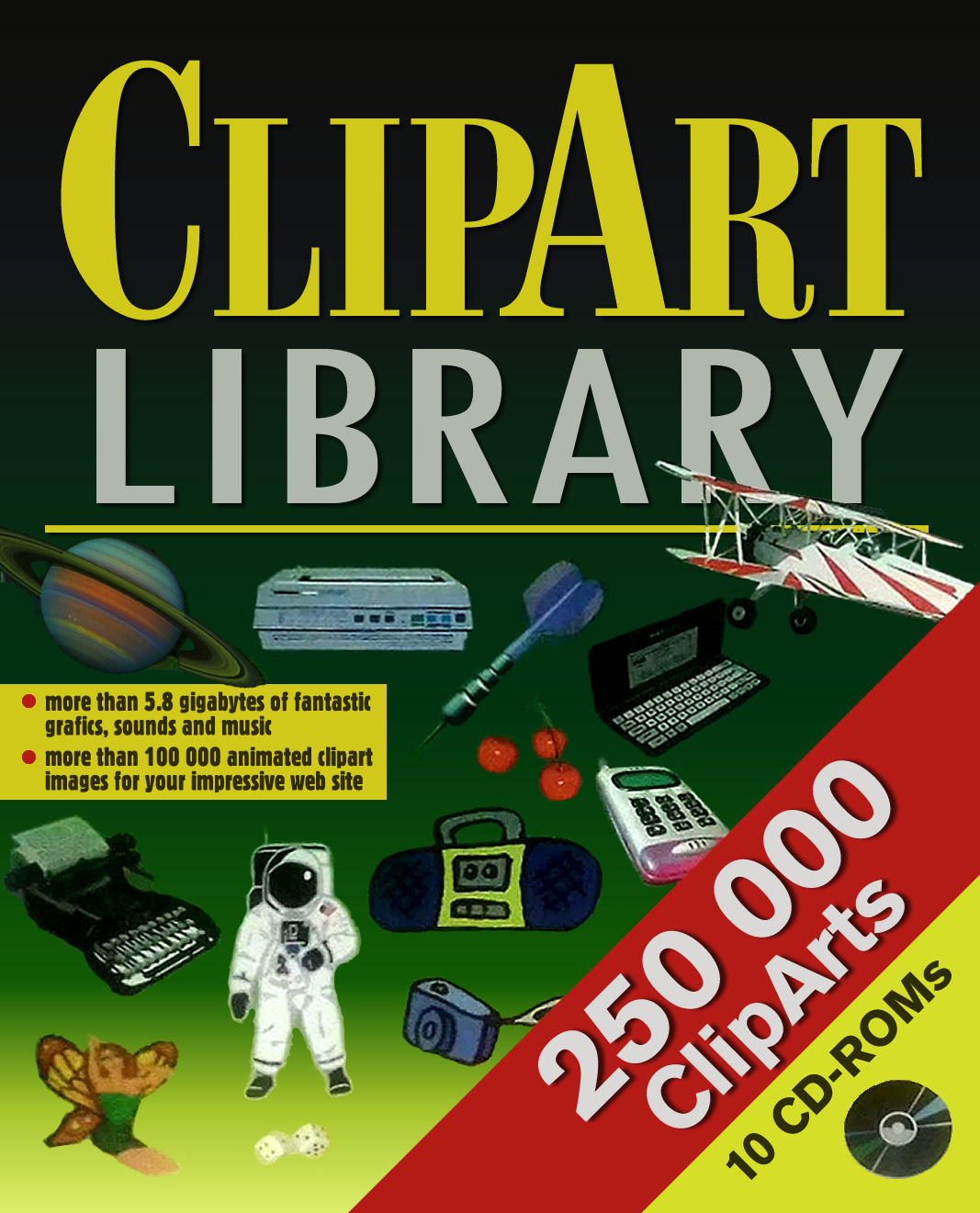
What really got me into the artform of typography was a purchase from an Aldi a few years later – “ClipArt Library”, a 10-CD-Rom set of stock assets. One of those CDs was the reason I bought it – a CD full of fonts. I used those fonts in every game I made in the early days – for better, and for worse.
The rest of this library was a whole lot of extremely old-hat clipart and low-resolution photography, largely unusable for the games I would have loved to use it for. (This was bought during the very early days when I still tended to use resource packs for most of my work.)
Computer Shopper & High-Logic FontCreator
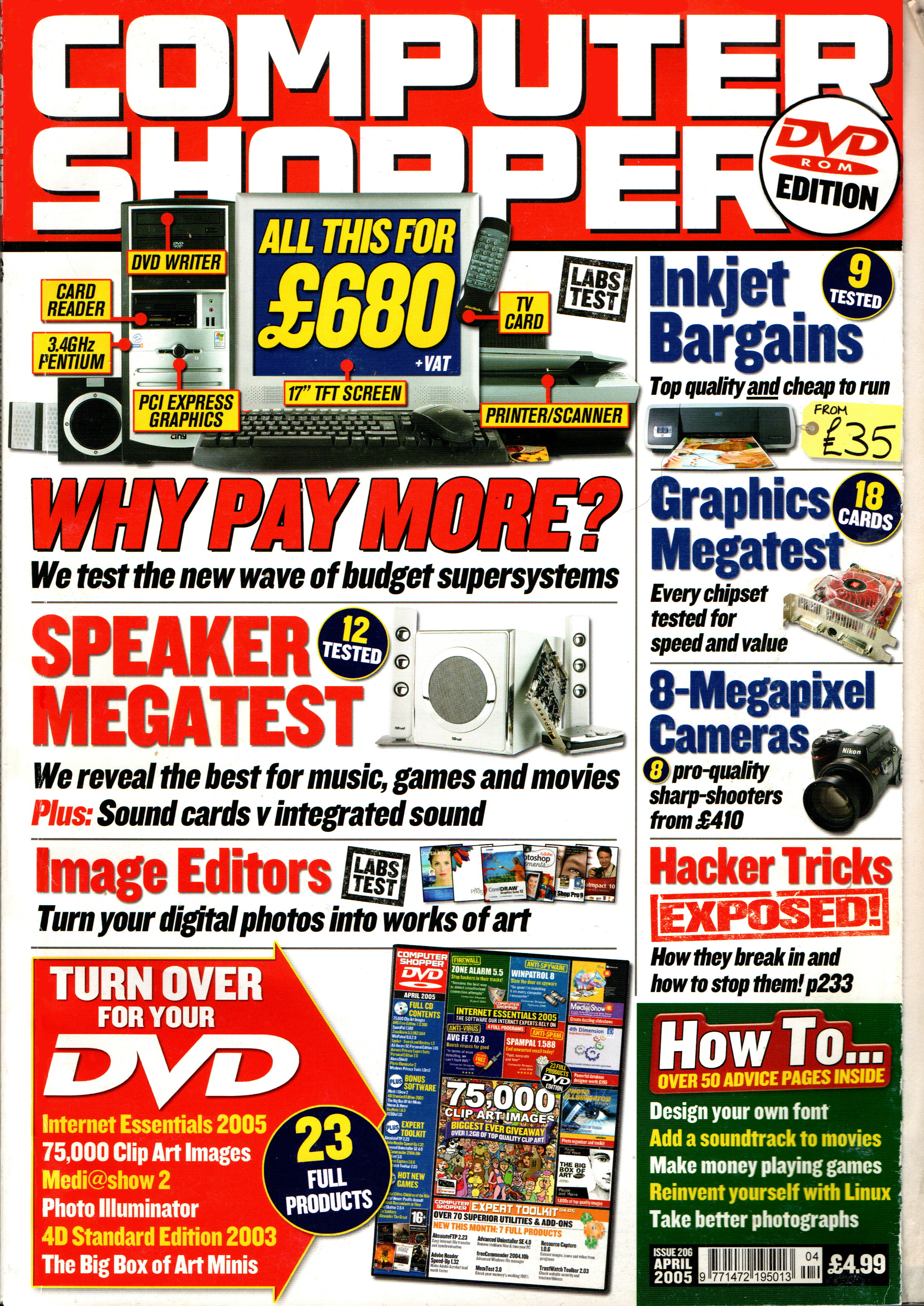
A couple of years later, while browsing through magazines in Tesco Thetford, my eyes were drawn to the April 2005 issue of Computer Shopper. I liked that magazine anyway, getting to window-shop for new PCs years before I could afford to buy them myself. But what really drew me was the bonus disc stuck to the front… another clip art library!
And in small text, on the bottom right corner of the cover, “How to… design your own font”.
The magazine included the URL for High-Logic FontCreator, along with a two-page tutorial on how to make a font. I never followed the tutorial, just the link, and downloaded it slowly that evening through a spotty dial-up connection.
Making my first few fonts
I played around with FontCreator a lot that day, but never truly learnt it until years later. However, for my own gratification, and in one case my own use, I did make a few fonts, which survived in my archive thanks to an obsession with burning everything I created to blank CD-Rs.
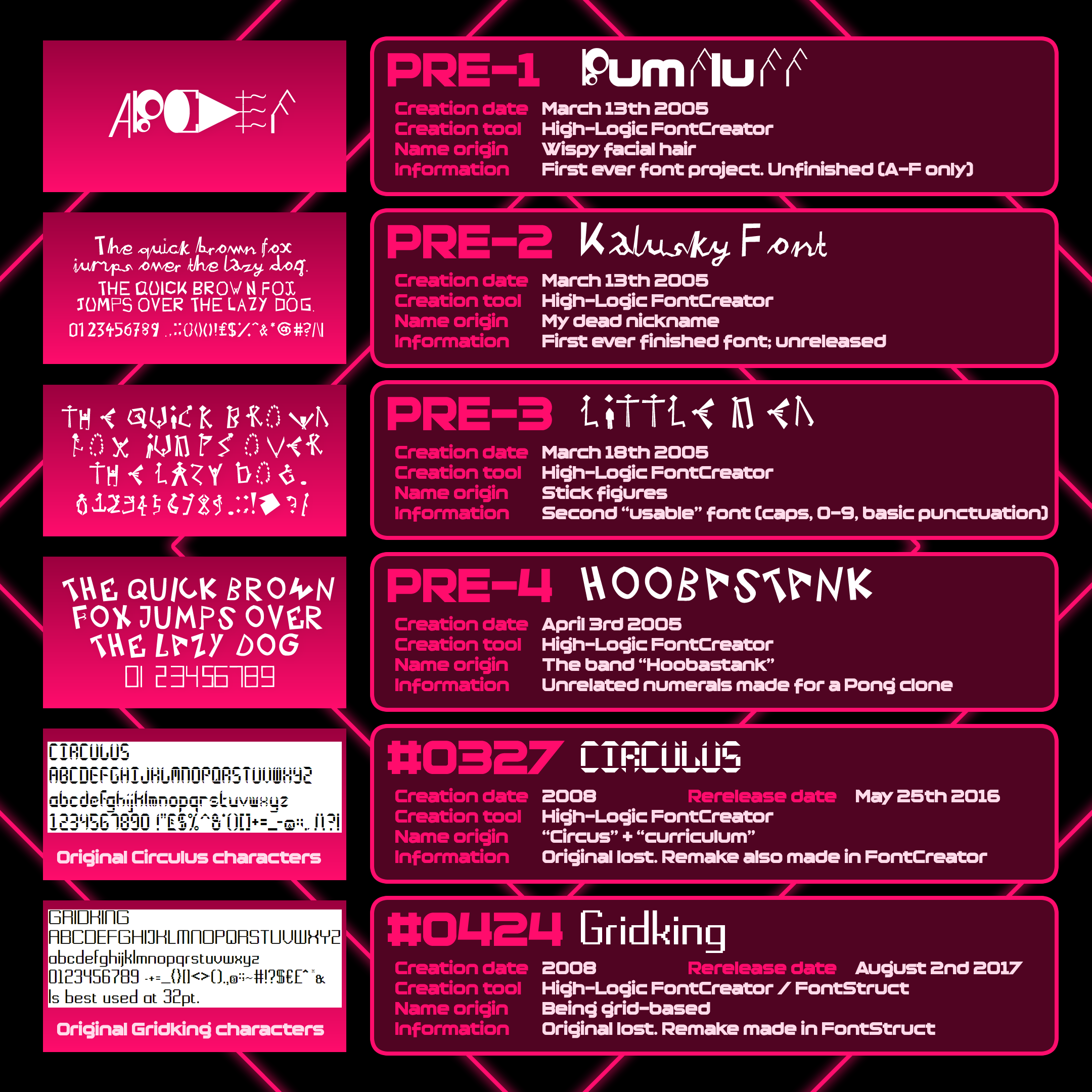
My earliest fonts
Bumfluff was my first ever try at Font Creator. I didn’t even know what a vector was, so I just used stock shapes. I very quickly gave up on this one…
…and learnt about vectors that same day with Kalusky. Amazingly, my first ever actual complete font was cursive handwriting. It’s awful, hence why I have never released it.
Little Men, five days later, was me going for a gimmick for the first time ever. Each character was a different little man, with some extremely bizarre choices such as the O being a ring of just heads.
Hoobastank was a mix of two styles. The lettering, an overly-angular set of capitals. The numerals, extremely simple, mostly made for a Pong clone I whipped up in 2005.
None of these fonts are part of the 1,000, since I have never uploaded them online. This is the first time I have ever spoken about them in detail, or shown them at all to other people.
Beyond a couple of rough modifications of Arial also in 2005, I made no other fonts for three years, until 2008, when I was deep into the game-making hobby hole. I did two fonts that year, Circulus and Gridking.
While I have lost both Circulus and Gridking to the long-dead online file sharing website Will Host For Food, I retained screenshots of their character sets, and ended up remaking them in the Chequered Ink era, hence their official numbering and being part of the 1,000.
A burgeoning interest in graphic design
Fonts were come and go between 2005 and 2011, although something did contribute to that range of interests – my love, and learning, of graphic design. I won’t call it my “passion”.
At GCSE level, I was taught how to use a CAD program called TechSoft 2D Design, which I ended up using casually quite a lot. I made the opening screen of Innoquous 1 in it in 2008.
At A-level, I took Design & Technology as one of my four subjects, for lack of a dedicated graphic design course. It was during that that I learnt how to use a new piece of software, Macromedia Fireworks. I still use Adobe Fireworks CS6 to this day. I very much need to learn Affinity Designer or something.
Design & Technology was the only A-level I didn’t fail, but I fluked my way into a job in Dundee in 2010 making games in GameMaker. Making games full-time caused my hobby game development to drop, and I was aching for a new creative hobby. That is when I looked back to my old love of fonts, and stumbled upon an online easy font-making website, “FontStruct”.
I toyed with FontStruct, made my first font in it, tried submitting it to DaFont… and they accepted it. The new era was born.
[II] Font #0999: “The Structed Beginning” / How to make your first font
Introduction and Setup
FontStruct is a free-to-use online tool for making fonts. You can publish them into a site-wide ecosystem for other users to comment on and provide feedback. It’s extremely easy to make a decent, usable font with it. Here’s how.
After making an account, go to “My FontStruct” and click “New FontStruction”.
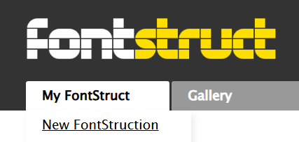
I’d recommend enabling Expert Mode and Extra Guides*, then choosing a grid size. Choose an odd number height for a thinner font or an even number for a thicker font. This will become the height of your capital letters.
* “guides”: horizontal and vertical guidelines that keep your font’s dimensions consistent.
You can also add extra extra guides with the little plus button. This is good for lowercase “x-height”*, ascender height, and any other guides you may want to add for consistency across your font.
* “x-height”: an officially-defined parameter in fonts, literally the height of the lowercase letter “x”.
Uppercase
Then start building! I like to do “S” first as it is quite a complicated letter. “E”, “O”, and “P” are also great first letters to do. “E” should generally be a brick or so less wide than the other letters for visual balance. You can copy the “S” to the “O” and “P” to speed things up, too. Mouse drag to select, pressing C copies and V pastes what you selected.
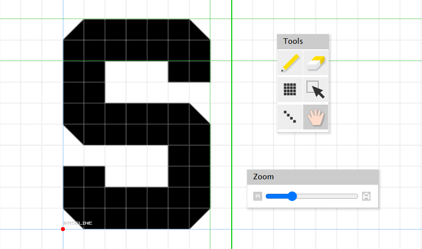
S shown along with four green lines - capital height and x-height are horizontal; letter width and spacing width are vertical.
Many of the letters come naturally after that. “E” can become “F”, “I” and “L” with a few removals. Add to “P” for “B” and “R”. Adjust “O” to become “C”, “D”, “J”, “Q” and “U”. FontStruct makes these modifications especially easy, since you can copy earlier characters and then add or remove a few bricks here and there.
You may need different bricks for some of the characters with heavy use of diagonals such as “V” through “Z”, but FontStruct has a lot of options. “V” is a good letter to start with; it can easily be doubled for “W” and flipped over for “A”. Jumping ahead to the forward slash can be copied to “X” and “Z”; flip it onto itself for the former and add horizontal lines for the latter. Then the “X” becomes an easy “Y” by cutting its bottom half off and adding a vertical line to complete it.
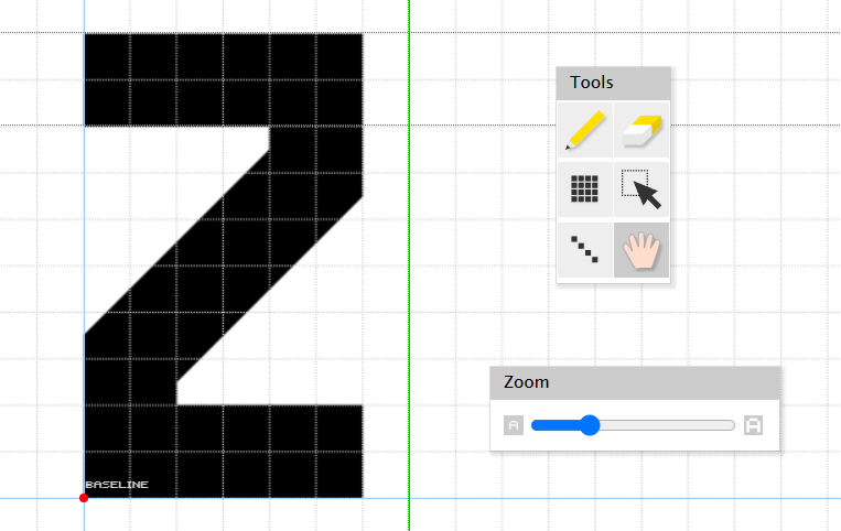
For “The Structed Beginning”, I used unique diagonal bricks to centralise the diagonal stroke.
FontStruct has a bunch of nice tools to help with parts of this. Along with the ability to flip entire characters, Nudge can be used to offset any brick from the grid – although you may have to work around gaps doing that. I find it’s best to use Nudge as a last resort where bricks don’t work, even if you have to use quite a lot of different bricks.
Lowercase
For lowercase, it’s best to start with lowercase letters that are the same shape as their capital counterparts. “C”, “O”, “S”, “U”, “V”, “X” and “Z” all translate easily depending on your chosen constraints – my choice of 10x6 for capitals and 8x6 for lowercase with a 2-brick stroke width is very simple to change.
Then start sensibly filling in the lowercase gaps! The increasing bank of already-completed glyphs makes more and more of the letters easy to fill in in just a few seconds. “b” “d” “p” “q” can all mirror into each other; “g” becomes “y”; “n” becomes “h” with an ascender*, uppercase “I” becomes lowercase “i” and then “j”, et cetera. The remaining letters can be made with very similar techniques too.
* “ascender”: the part of a lowercase character that goes above the x-height, as “b”, “d”, “f”, “h” etc do.
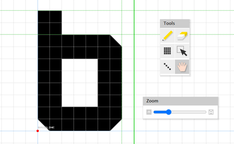
Lower-case b is shown, with the main body reaching x-height and the ascender touching capital height.
Numbers
Numbers are just letters with aspirations, and can mostly be made with existing tweaked geometry. “O” into zero, “Z” into 7, “S” into 2, 5, 6 and 9, “B” into 3 and 8, and then fill in the 1 and 4 with modified “T” and “H”, or make them from scratch matching your other numbers’ heights and widths (1 can be thinner).
It’s worth periodically checking how the font’s looking with the Preview window – type some pangrams*, the font’s name, or whatever else in there to get a good idea of how it’ll work!
* “pangram”: a sentence or word that uses every letter of the alphabet at least once, for example “The quick brown fox jumps over the lazy dog”

Testing the font using FontStruct’s preview tool. You can type anything here, and see the entire character set in real-time, before downloading the font.
Punctuation
Now do punctuation! You know the drill by this point. The only big thing to note is that a few of these characters can be a little tricky, so here’s a rapid rundown.
· Ampersand, the “&” symbol meaning “and”, is a corruption of the French “et” for “And”, and can be easily made accordingly - take “E” and “t”, smash them together.
· The “@” sign can be vaguely hinted at for a geometric font. Start with the “G”, flip it top to bottom, then thicken the right side to suggest the existence of the “a”.
· Parentheses (), brackets [] and braces {} should be a brick higher and lower than your capitals, and a lot less wide.
· If you didn’t do it the other way around, take your X and make it a slash and backslash, then take the slash to become a per cent symbol, filling in the counters* on the two zeroes.
· Asterisk can be done cleverly with more angular blocks. They are difficult to do well in FontStruct, but are less important than getting the rest right, so do your best.
* “counter”: The negative space fully encapsulated in letters, like the middle of the “O”, the two middles in “B” etc.
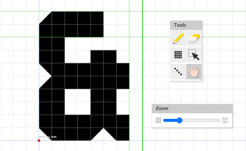
Ampersand, constructed from “Et”, is simpler than it seems to make if you know FontStruct’s limits.
Fill in the rest of the punctuation accordingly. Nothing else should be too problematic with what you already have at your disposal.
For extra character support such as those in Latin-1 Supplement, you can autofill the basic letters in Menu > Advanced > Commands > Copy to Latin Accents. Then choose More Latin in the dropdown (where you can also go as far as Greek, Cyrillic, Arabic and further European support) and fill those in too in much the same way!
And that is how to make a basic first font, as well as how I made:
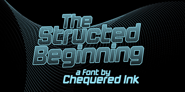
Font #0999: The Structed Beginning
The font I made following my own tutorial, which closely mirrors the methods I learnt in 2011 when starting to get back into fonts, and making my actual, official #0001.
[III] The YoYo Games era
The first few fonts in 2011
FontStruct was so easy and intuitive to use, and its community so friendly and helpful, that I quickly became addicted. Having a new creative outlet without succumbing to the burnout of game-making meant I very quickly started using it more and more often. 2011 only saw six fonts, the earliest released a few months apart, but that quickly accelerated.
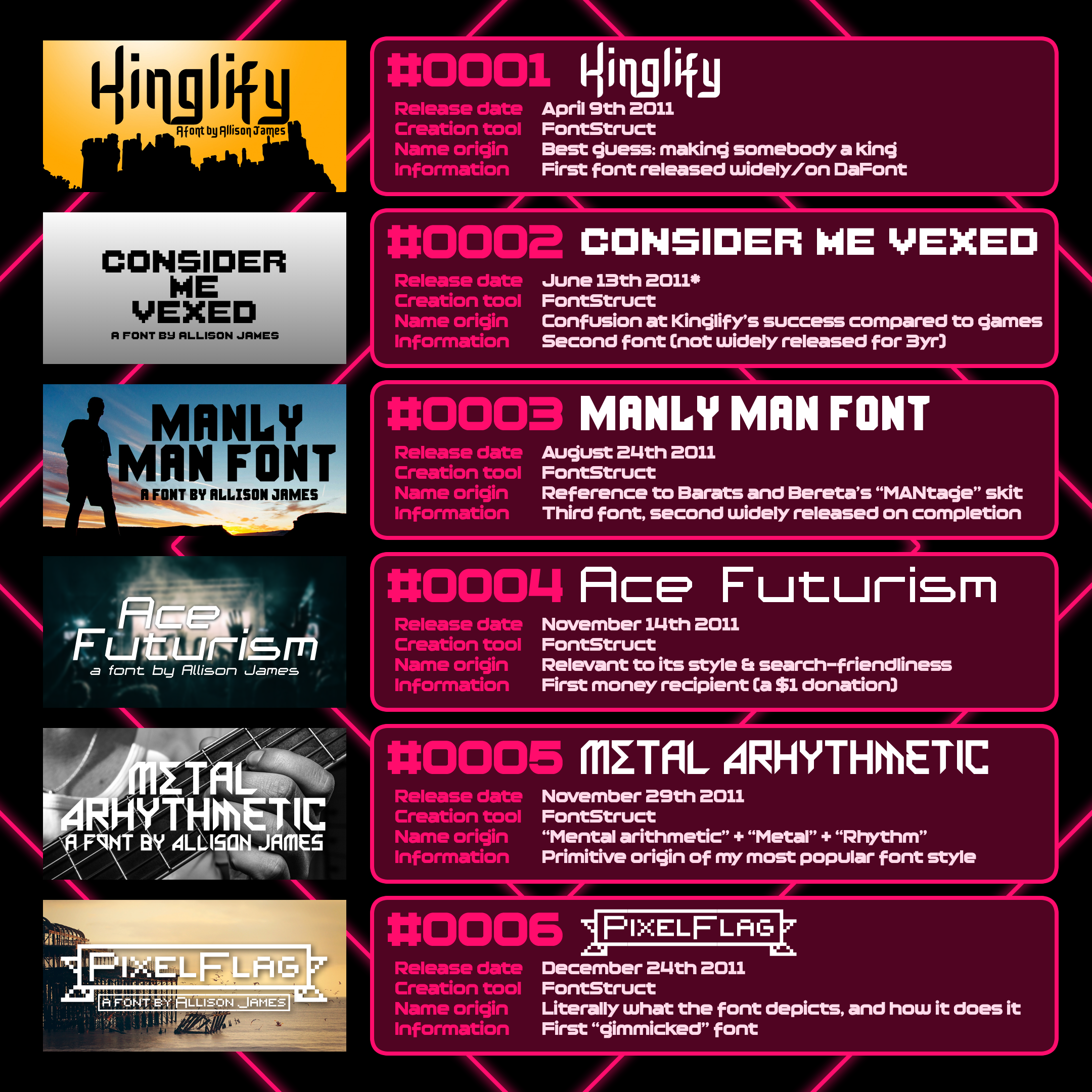
My first six official fonts
Kinglify, barring my largely-unreleased output of 2005 and 2008, was my first font. I was already using some of the different bricks in FontStruct to add curvature where I could (FontStruct is not great for proper curvature, although some people have worked magic in it.)
Consider Me Vexed was my first-ever bitmap font, although it went unreleased outside of FontStruct until 2014, when I released it only on FontSpace, unmodified from its 2011 origins.
Manly Man Font was my second DaFont release, and third overall. Fun fact – I think this may have been part of the basis for Max Payne 3’s logo, as the E matches up weirdly perfectly.
Ace Futurism was my first techno font, and importantly, the first recipient of a donation - $1.
Metal Arhythmetic is the earliest glimpse of the style I am most known for in typography – angular, thick strokes with a side order of quirk.
PixelFlag is my first released gimmick font. It features several “enders” for various flag and ribbon shapes.
While I released all these fonts for free originally, looking for no money (as with my hobby games), the first couple of donations, and the quantity of downloads, was hugely eye opening. As someone used to spending 25 or more hours on indie games for 200 downloads, getting 10,000 on a font that took me 2 was a rush.
Initial inspiration & references
I found inspiration from an assortment of places in the early days. My favourite TV shows, games, music, and sometimes even self-references.
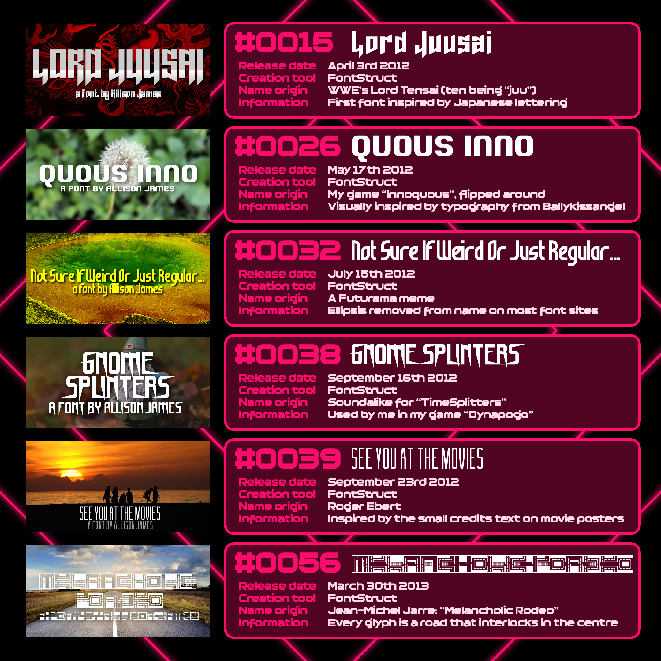
Fonts with name inspiration
Lord Juusai was a reference to a new WWE character, Lord Tensai, before Matt Bloom was relegated to comedy and backstage stuff.
Quous Inno reversed the halves of my game series Innoquous. I never used Quous Inno in an Innoquous game.
Not Sure if Weird or Just Regular… referenced Futurama and an internet meme generated from it.
Gnome Splinters was a cheeky soundalike of TimeSplitters, a game series I love, and my introduction to the FPS genre.
See You At The Movies paid tribute to Roger Ebert’s biting movie reviews.
Melancholic Roadeo referenced a Jean-Michel Jarre song. I’ve loved him ever since I stumbled upon a bootleg copy of Oxygene 7-13 in a job lot of CDs.
Throughout the years, I often paid tribute to things I like - even where the font itself was entirely different.
Making fonts for my own games
Other factors motivated me into making fonts. From the moment I began, I knew I could use them in my games – I’ve spent a LOT of money on fonts in the past, and still do license new ones now and then. It was a lot more common for me to use my own fonts for my indie games in the past. Here are several examples:
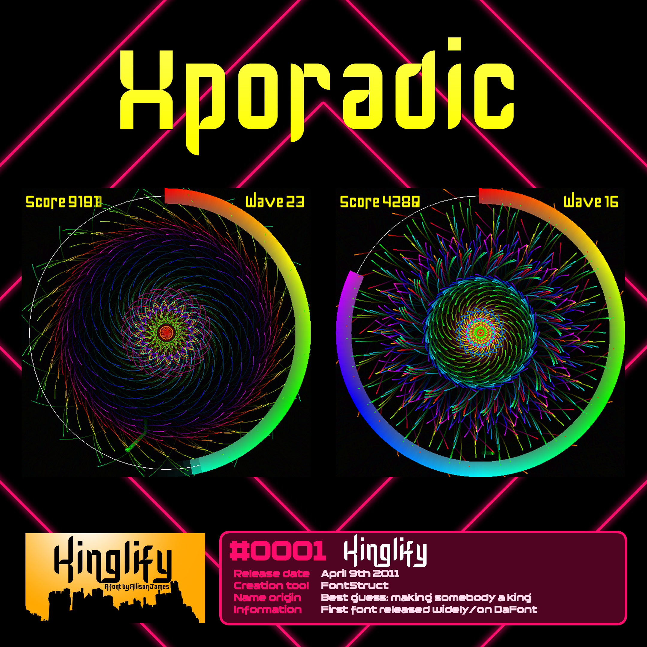
Xporadic
#0001 Kinglify
Kinglify, my first official font, was used for Xporadic, a bullet hell game I released for free on PC and Android – my only indie mobile game to date.
The game isn’t great. It’s borderline a screensaver. This is a genre I tapped into often, especially during the YoYo Games era, where I was burnt out on game creation from doing it full-time for them. Colourful pretty-em-ups were fast to make, easy, and the results, while not fun, were at least interesting.
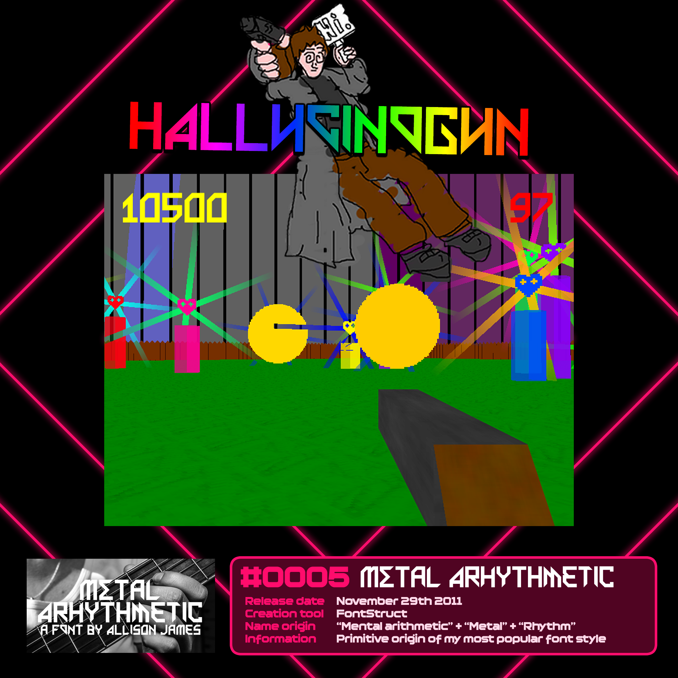
Hallucinogun
#0005 Metal Arhythmetic
Metal Arhythmetic was used for the logo and HUD of Hallucinogun, a rare foray into making an FPS, and my first entry into the GMC Jam.
It performed poorly. In more than one way. The game’s not very good.
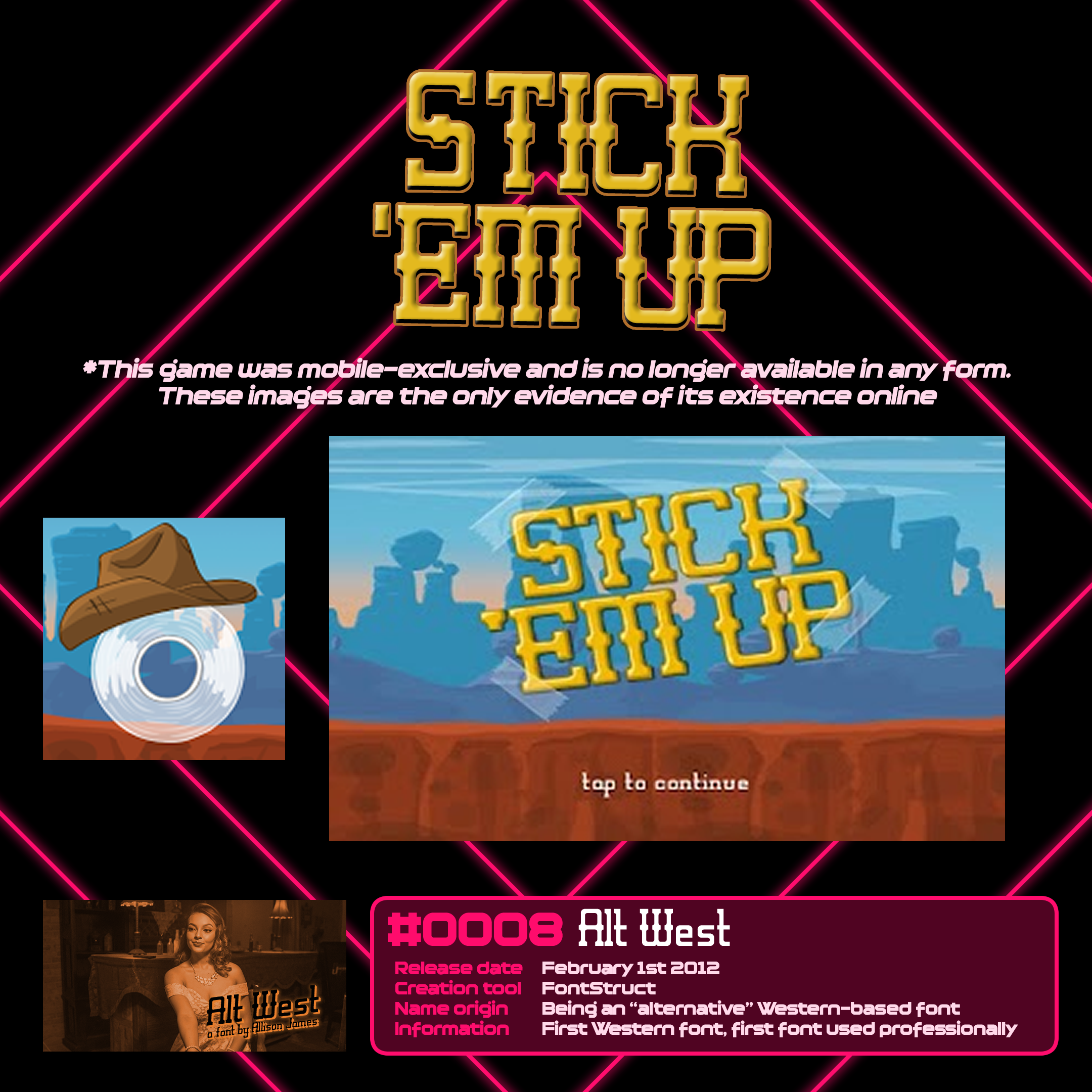
Stick ‘em Up
#0008 Alt West
Included as this was the first time I got to use one of my fonts in a professional product. Stick ‘em Up was a game we made at YoYo Games as a reward for a contest. I cannot remember a lot of the details, but it was a game design concept competition, with the winner being about a roll of sticky tape in a western world, using its tape for actions and attacks.
I had a lot of fun making it! It used gestures for the various options, like looping hazards to cover them in tape. Pertinently, it needed a Western font, which I made in my own time. Being the programmer of the game, I used it myself, and cajoled the artist into agreeing to it.
Stick ‘em Up is sadly long gone from every platform it was released on, as is 95% of the output I helped create in my five years at YoYo Games. My second “font used in professional thing” is in the same boat - QA Reports was used for a GDC Texas Hold ‘em Poker demo. There is ZERO proof this exists online, sadly.
Still clamouring to get Maddening Overload back so I can publish it myself… this is a story for a different blog post.
Sort of.
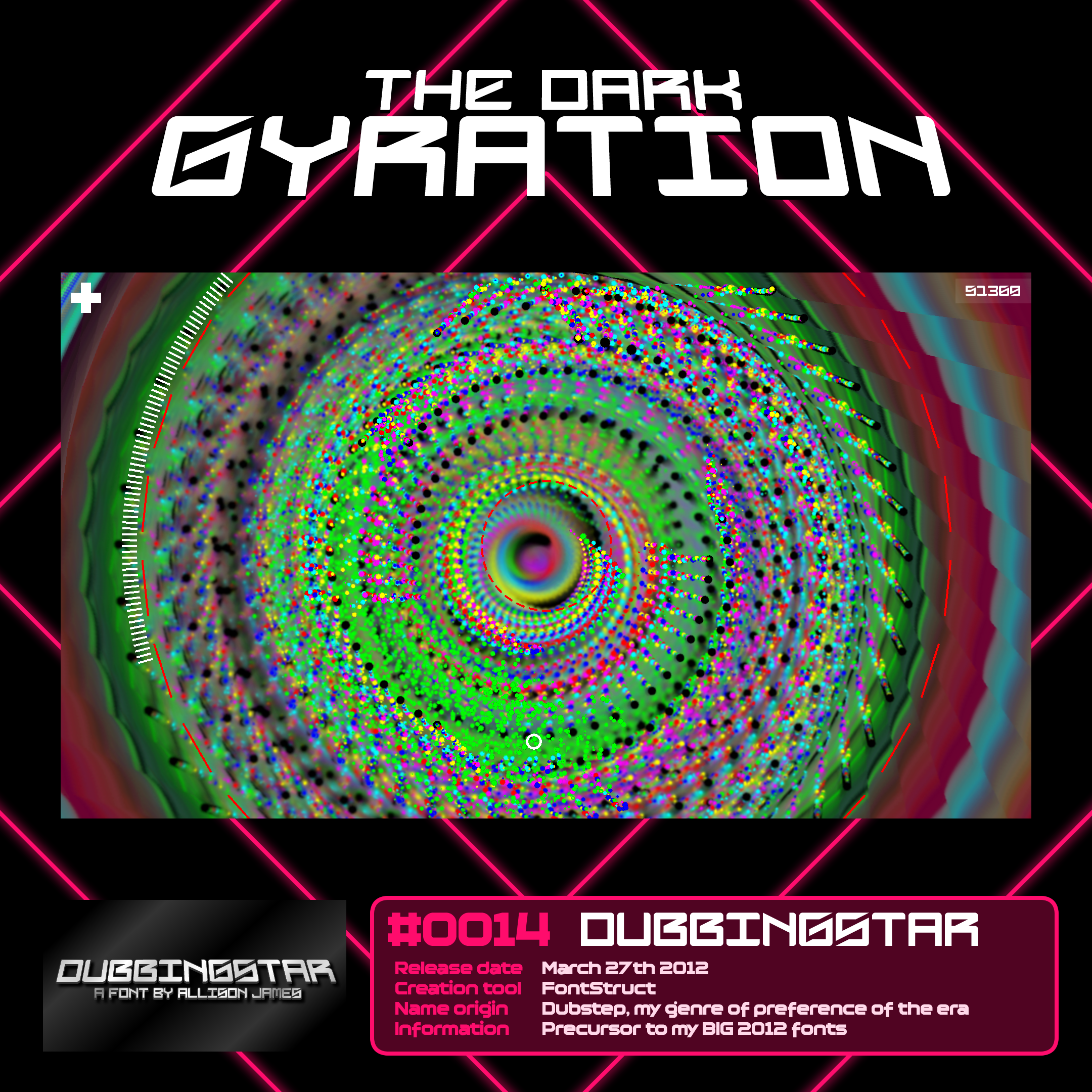
The Dark Gyration
#0014 Dubbingstar
Dubbingstar is the font I used for The Dark Gyration, a trippy shader experiment and another pseudo-screensaver akin to Xporadic. This was the first time I used dubstep as the music in a game, which became a running theme across the next few years.
Dubbingstar is also something of a progenitor to the style I truly made my own in 2012, with fonts like Vermin Vibes, Gang Wolfik and FoughtKnight. I’ll get to those later on, I have a LOT to say about them.
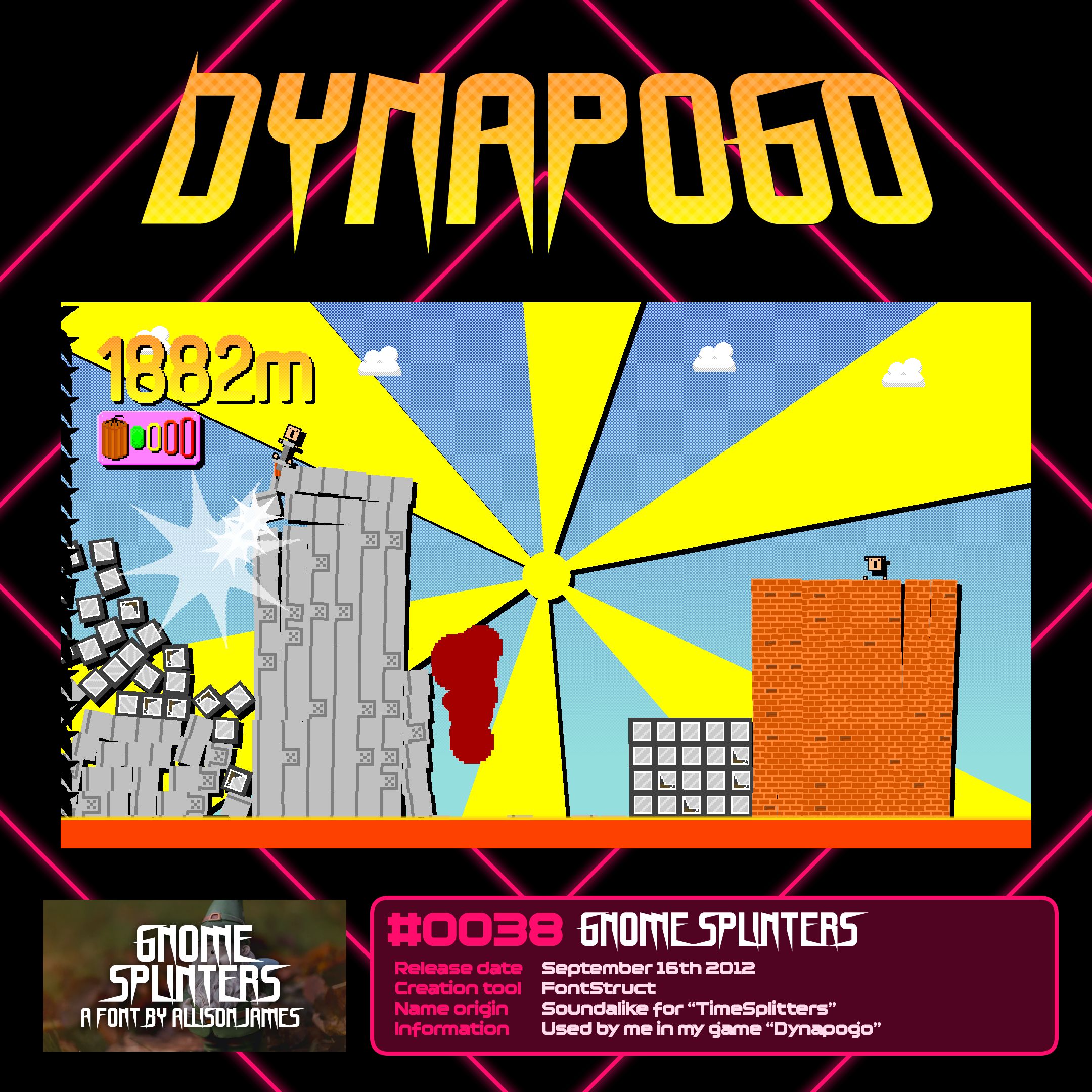
Dynapogo
#0038 Gnome Splinters
I rediscovered my love of independent game creation through the GMC Jam. My first two entries, Hallucinogun and Aardvark Cwm, were bad, but Dynapogo was when I took a huge shine to the jam and to making small, experimental, and overall “good” entries.
Gnome Splinters is arguably not the best fit for the style, but I loved how it looked in the logo. Still do. A little cheeky tilt backwards sold it for me.
Dynapogo got 5th place in the GMC Jam it was entered into. It took another year or two before I finally managed to win.
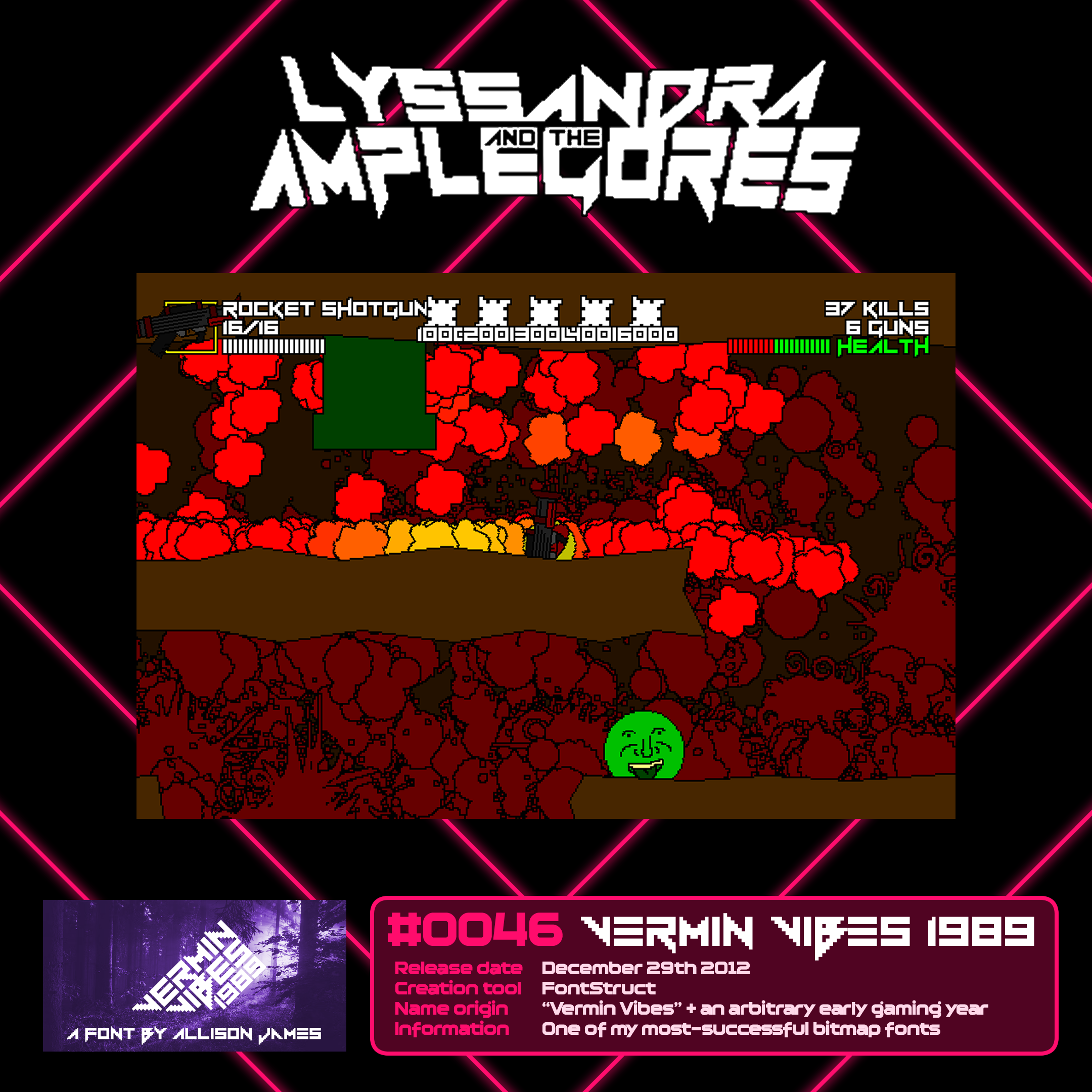
Lyssandra and the Amplegores
#0046 Vermin Vibes 1989
Vermin Vibes 1989 was used for ALL the typography in Lyssandra and the Amplegores. I should not have used it for the dialogue text.
Vermin Vibes 1989 is my most-successful bitmap font, presumably off the back of the original Vermin Vibes. But it’s not my favourite; I have a big penchant for Lady Radical.
Lyssandra and the Amplegores was another GMC Jam entry, and like Dynapogo before it, performed well. It’s one of my fullest-formed jam entries, with 30 different weapons and a challenge mode that focuses on each. It’s certainly not without its flaws, but for a 3-day jam entry… yeah. Proud of this one.
I threw back to the Amplegore character over a decade later, in a different genre, for a different game, for a different game jam. That game won.
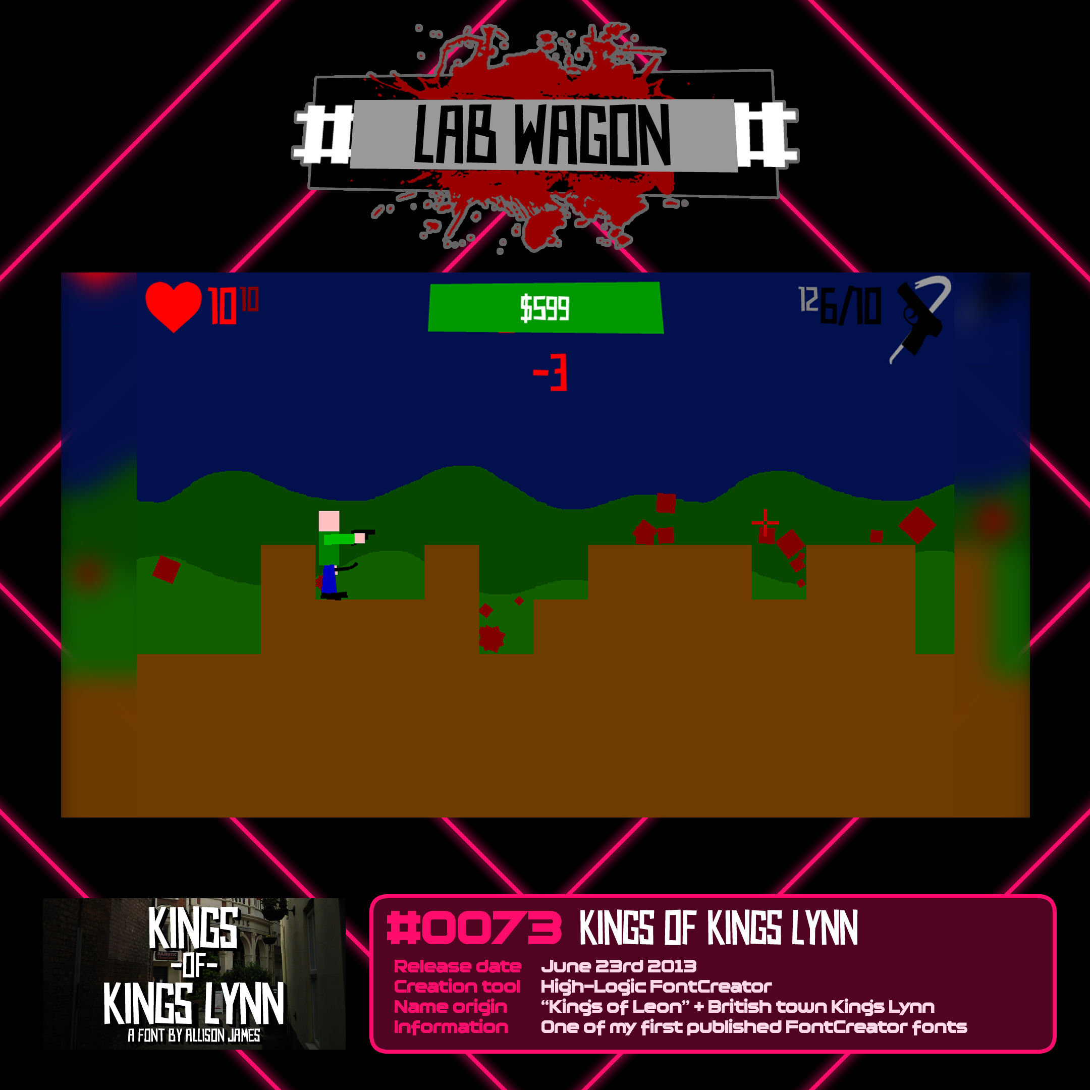
Lab Wagon
#0073 Kings of Kings Lynn
My best GMC Jam rank at the time came from Lab Wagon, which came second place. The font I used for it, Kings of Kings Lynn, was an extremely good fit - the entire style of the game across the board was an erratic papercut style.
Lab Wagon is a sleeper choice for the most important game I have ever made. In retrospect, it was the start of so many little things I have used in numerous games since. That papercut vector art style really became a hallmark of my art style in a ton of games. It was also my first-ever endless incremental game. Super-primitive in how I implemented it, but unmistakably there.
Proud of the game. Proud of the font (it was one of my first fonts back with FontCreator, more on that later).
Yeah. Surprised I’ve not made Lab Wagon 2 yet.
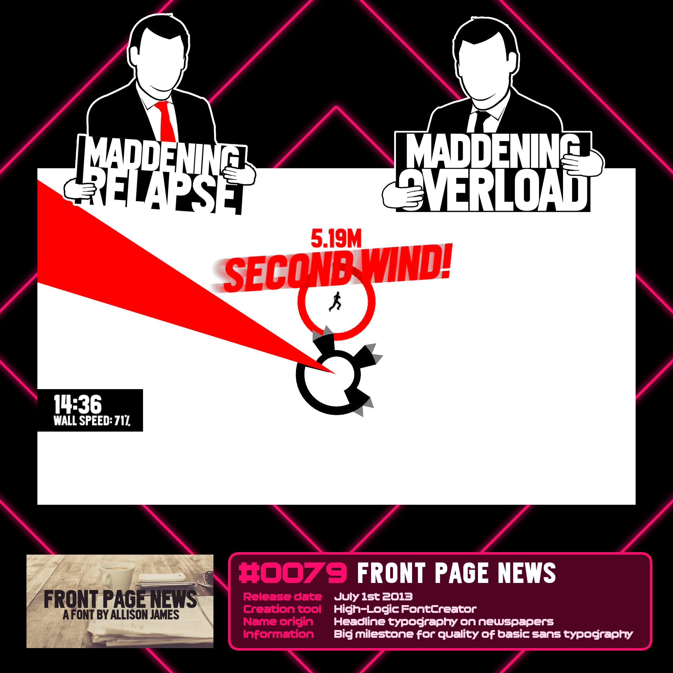
Maddening Relapse & Overload
#0079 Front Page News
The last one I’ll go over here is my use of Front Page News in two closely related games, Maddening Relapse and Maddening Overload. For a while, the Maddening series was “royalty” to me. The original madnessMADNESSmadness was my most-played game for nearly 15 years (until Pachog Day on GX.Games overtook it).
After a few years’ hiatus with the series, I returned to it with Maddening Relapse, which jumped it forward a bunch on feature set. Then, later that year, YoYo Games were looking for a guinea pig game for each of the PS4 and Xbox One, to test GameMaker Studio’s new console export options. I pitched a multiplayer addition to Relapse for PS4; that became Maddening Overload, which has the same basic gameplay as Relapse but with a full multiplayer and challenge mode. (The Challenge mode was already written as a potential Relapse update.)
Maddening Overload is now delisted on PS4. Every few years, I ask YoYo Games if I can have the game back in order to throw it on PC and preserve it permanently. I still have the files for it. I have yet to be successful.
One day.
The trend of me using my fonts in my games has continued far beyond this, but this blog post would be a lot longer if I went through everything.
It would also be even more chronologically unsound. I’ll save it for the time being.
Branching out from FontStruct
By mid-2013, I felt like I was exhausting FontStruct of its possibilities, and was hungry for a more versatile program. Early into the year, I tried an online tool designed to convert a scanned-in grid of glyphs, that you were meant to fill in physically and then scan in, using a digital art program with graphics tablet support. I used that graphics tablet for a grand total of two fonts.
19 fonts later and I remembered about High-Logic Font Creator. This time, I stuck with it, long-term. I learnt all the techniques I failed to learn in 2005 and 2008, and using my existing experience with fonts, created four fonts in a row in the tool with techniques I could never have done in FontStruct.
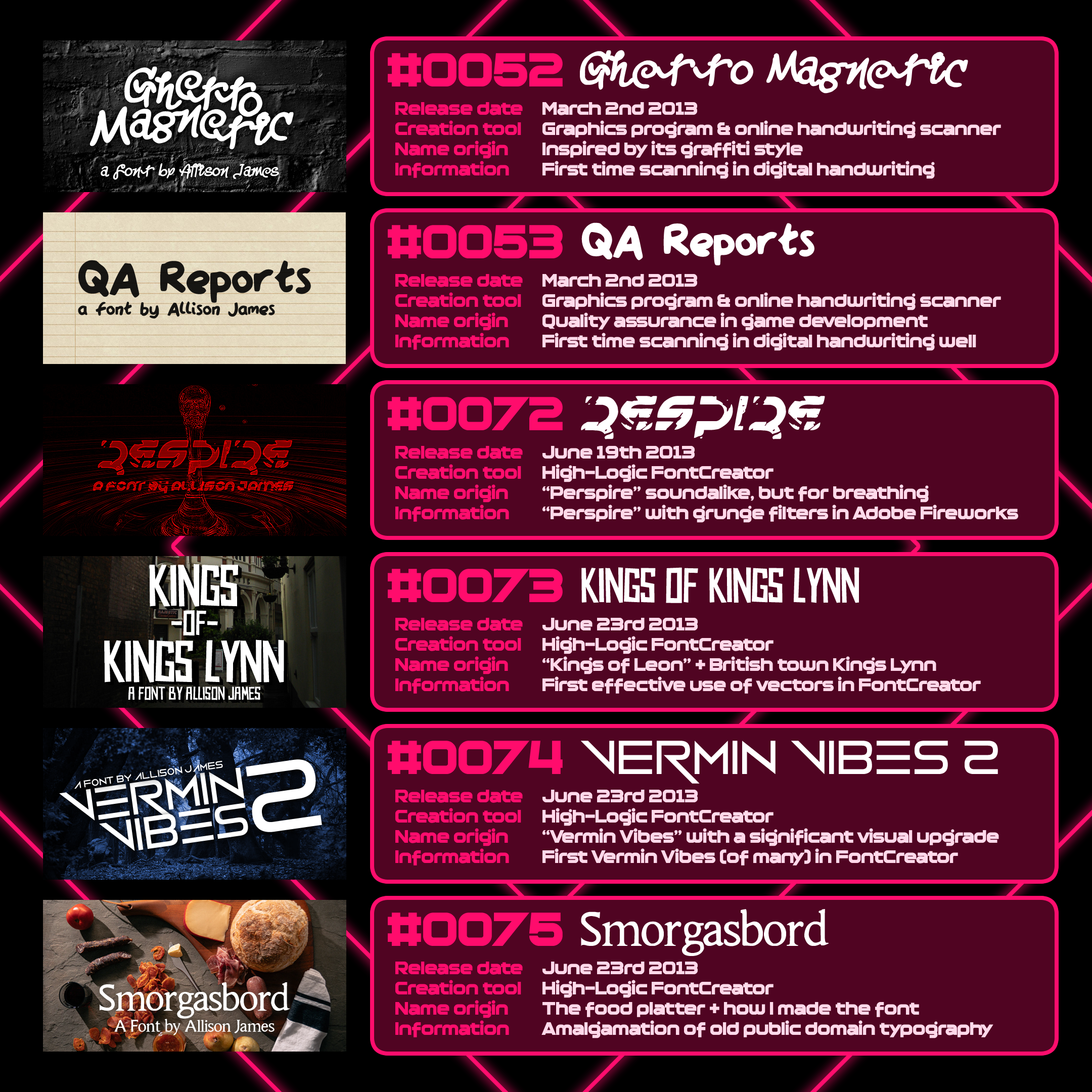
First non-FontStruct fonts of the modern era
Ghetto Magnetic was my first attempt. I did not start basic. The online tool was too primitive. This font turned out awful. The strokes broke apart and I did not have the knowhow to fix it. I patched it years down the line with manual adjustments, when I did know how to fix it. that slightly less embarrassing result is what you see here.
QA Reports was me going basic, thickening the strokes and using the same program. This time, the result was actually a usable font.
Respire saw me take a previous font, “Perspire”, apply a grunge filter to it in Adobe Fireworks, then convert it into vector-based glyphs with Font Creator’s automatic tool. I fell in love with this tool.
Kings of Kings Lynn saw me hand-place vectors with deliberately off alignment to create a true papercut-style cartoon font, again a technique I employed many times later.
Vermin Vibes 2 was me finally locking vectors to the grid for the first time, and creating a polished techno font with smooth curves throughout, something FontStruct just cannot do without serious compromise.
Smorgasbord is my least-repeated, most-unique technique of the bunch. In Fireworks, I sampled several different old, public-domain lettersets, overlaid them atop one another, and then converted the most-used areas into each letter. With minimal adjustment to account for inconsistencies and errors, this produced a generic, slightly erratic serif font, which I named in tribute to its own hodgepodgery.
In the following years, I still regularly used FontStruct for some fonts, especially those where the tool’s constraints were no issue for my style of choice.
In the last decade or so, however, that’s dried up, thanks to my experience with FontCreator overtaking FontStruct dramatically. I tend to only go back to FontStruct these days for bitmap fonts – those for retro games.
The first font spots
Within the first year of starting making fonts, I started seeing them used in various places. It made my heart race. It still excites me any time I see anything use my work.
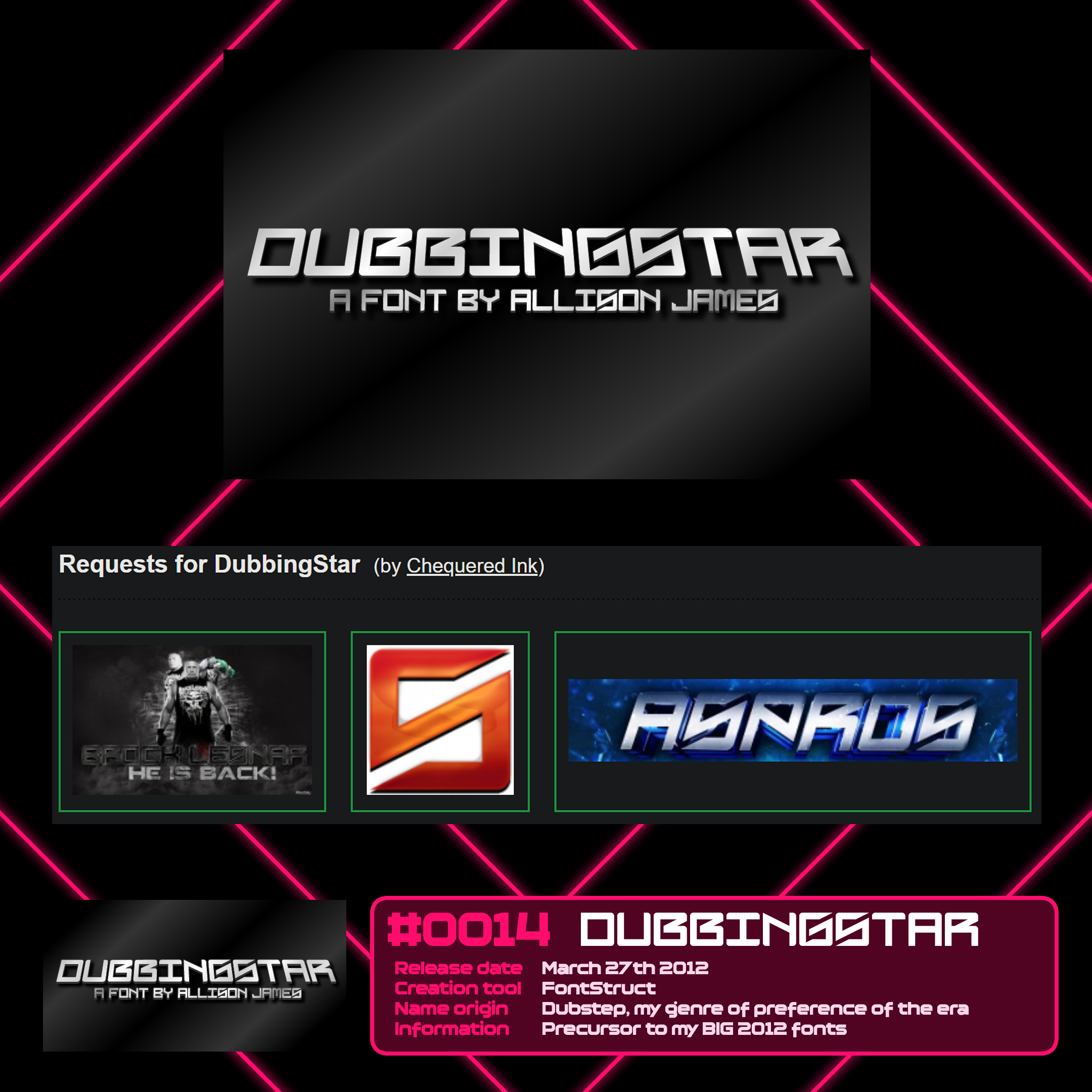
Multiple uses
#0014 Dubbingstar
Dubbingstar was the first font someone asked for the identity of through DaFont’s identification forum. Whenever this happens, the identification gets listed on that font’s page.
I regularly check Chequered Ink’s DaFont page for new identification requests, as they can unearth surprising uses I’d’ve never found myself.
We have had our fonts on DaFont identified over a thousand times.
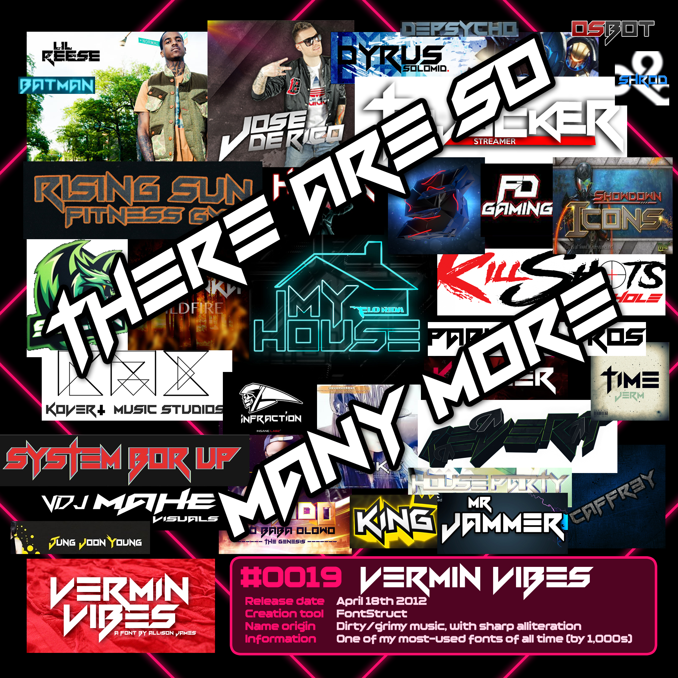
I guess it’s time to talk about
#0019 Vermin Vibes
My 19th official font is, by my best estimation, the single biggest thing I have contributed to planet Earth, and I doubt it’s particularly close.
I have seen Vermin Vibes literally hundreds of time by accident. Physical shop logos, WrestleMania, billboards, stickers, books, in movies, TV shows, numerous video games. And that’s even just counting the original. I’ve made 20 other fonts in the Vermin Vibes family, which some of them have themselves been used thousands of times.
I do not think it is an exaggeration to suggest that if you are reading this, you have almost certainly seen a use of Vermin Vibes at least once. You probably didn’t take it in, or remember it, and you almost certainly did not know I made it.
But it was me. I did this weird little thing in like two afternoons and now it’s absolutely everywhere. I have my grubby little anonymous fingerprints on thousands upon thousands of things, physical and digital. A few of those uses will continue to exist on our planet for centuries after I die. One or two might endure millennia.
It’s a bizarre feeling. Really, really weird.
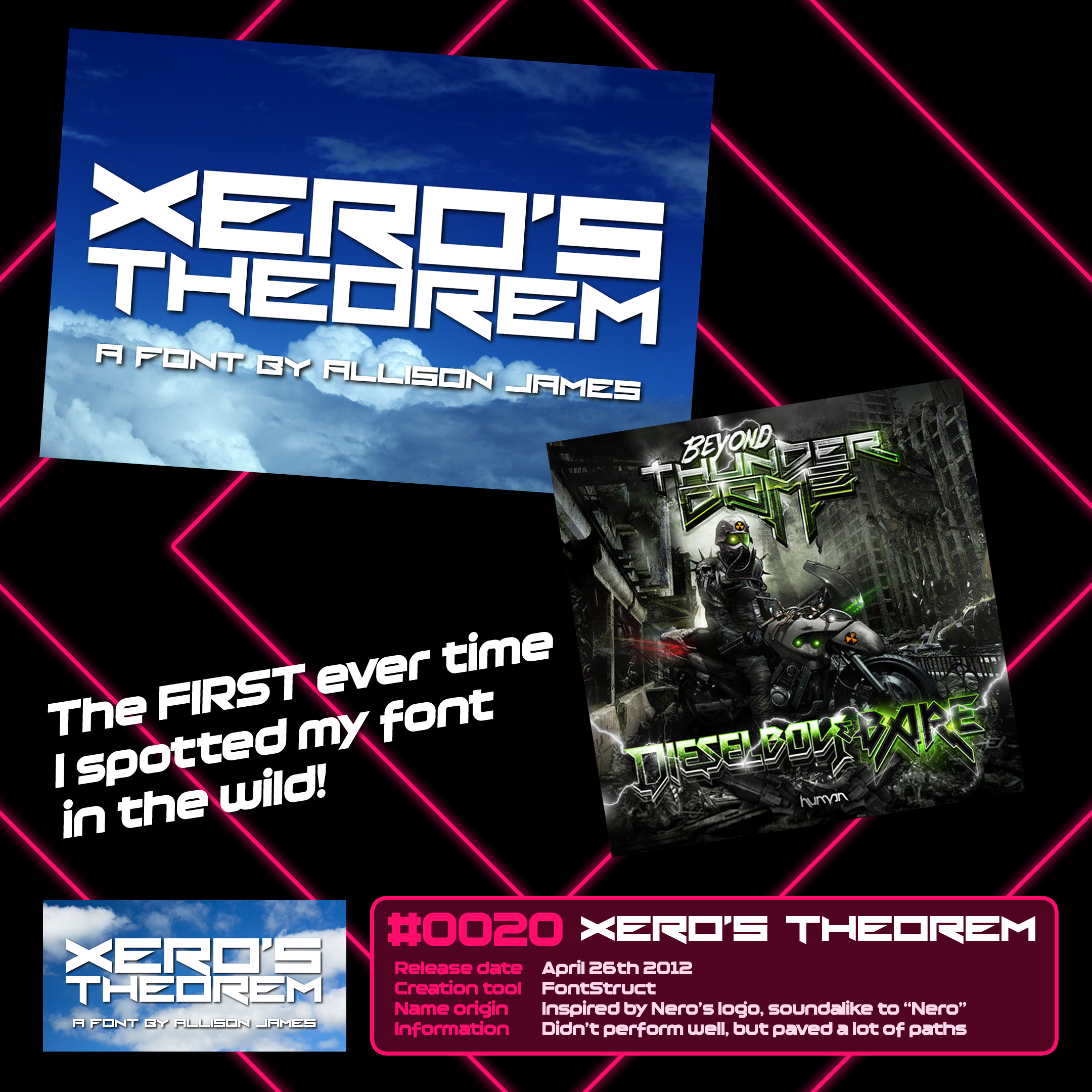
Beyond Thunderdome
#0020 Xero’s Theorem
Vermin Vibes was not the first font I stumbled upon randomly in use. That honour goes to the very next font I released, Xero’s Theorem.
Dieselboy & Bare’s single “Beyond Thunderdome” was exactly positioned for me to find it. I was deep in the dubstep/EDM rabbit hole, looking for increasingly niche music to sate my appetite. When I saw the front cover for this song, I double, triple and quadruple-took. And then… I told everyone. I was so proud.
Within a month of seeing Xero’s Theorem once, I’d seen Vermin Vibes in 10 places. But Xero’s Theorem will always be the first.
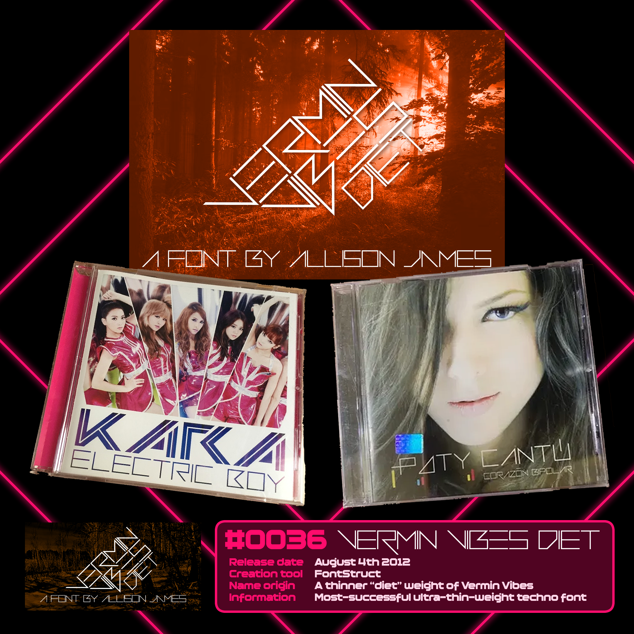
Two big music releases
#0036 Vermin Vibes Diet
I won’t go into every Vermin Vibes’ styles in detail, but this one is a fun one.
In the span of just three weeks, Vermin Vibes Diet flagged two different identifications, both for major music releases from other countries.
Electric Boy, by Korean pop group Kara, used it for the song title.
Paty Cantú used it for both her name and the title of her album Corazón Bipolar. The designer had to modify accents on the characters; I did not extend font support into Latin Supplemental 1 at the time.
I should really go and update my older work for that.
But yeah. I imported both of these on CD so I could have them in my collection permanently. I still own both. (I’ve also listened to both. Great song and great album respectively!)
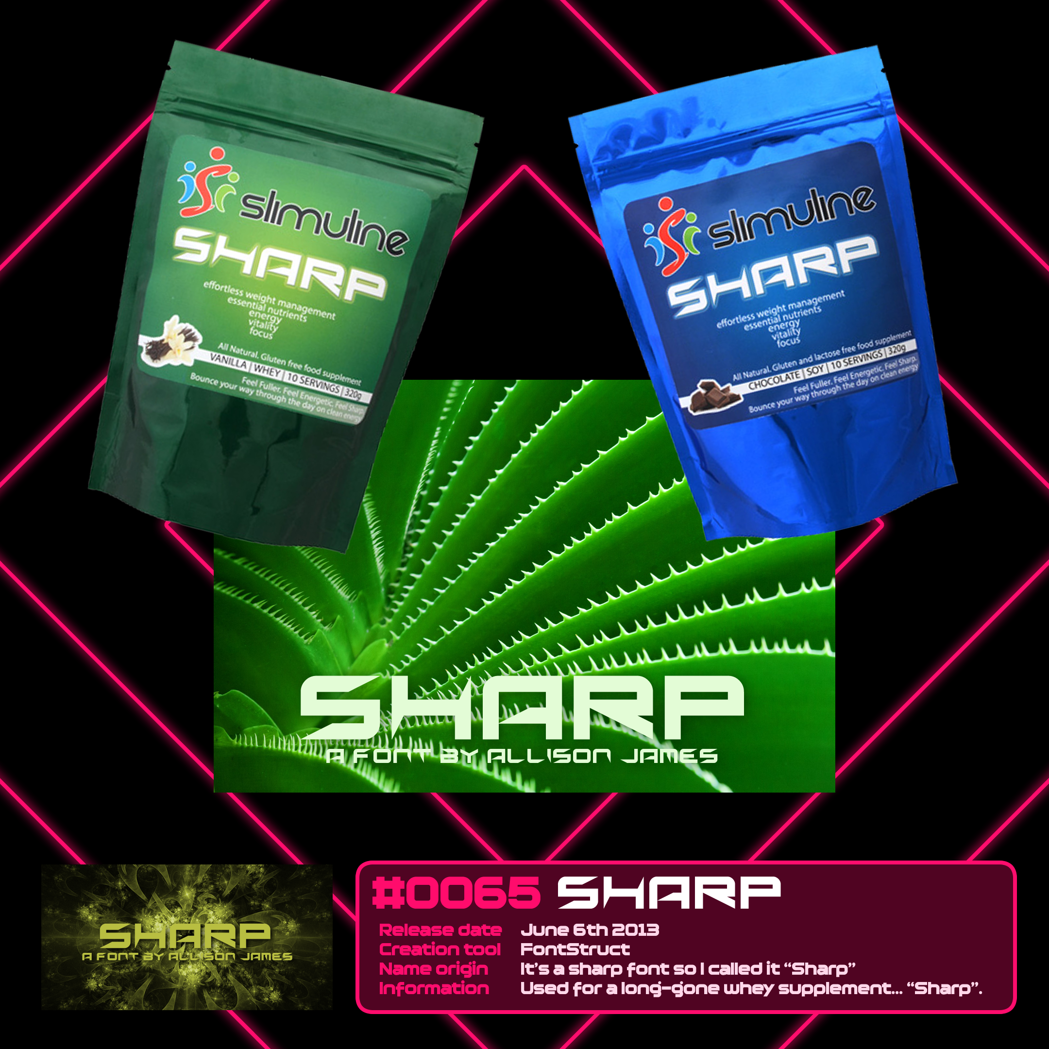
Slimuline Sharp
#0065 Sharp
The first, and one of the only, times I’ve known a use of one of my fonts to share its name (excluding where I made the font bespoke for the thing I used it myself for).
I was contacted by an Australian fitness company, Slimuline, in order to use my font Sharp for their weight management powder Sharp. I gave it a thumbs up, they paid me handsomely and also sent me a giant bag of the stuff.
I still have it somewhere back in my old bedroom at my parents’ house. It’s unopened and 13 years old, and presumably extremely dangerous. I should fix that one day.
This wasn’t my most noteworthy Australian physical item I received. I had an email chain with a really lovely lady that sent me a huge gift box of goodies, which included, among other things, a huge pack of Tim Tams, a pencil case with its own name, one of those adorable piggybanks with the cat that pulls the coins in, and a bottle opener modelled from a genuine kangaroo scrotum.
It was hairy.
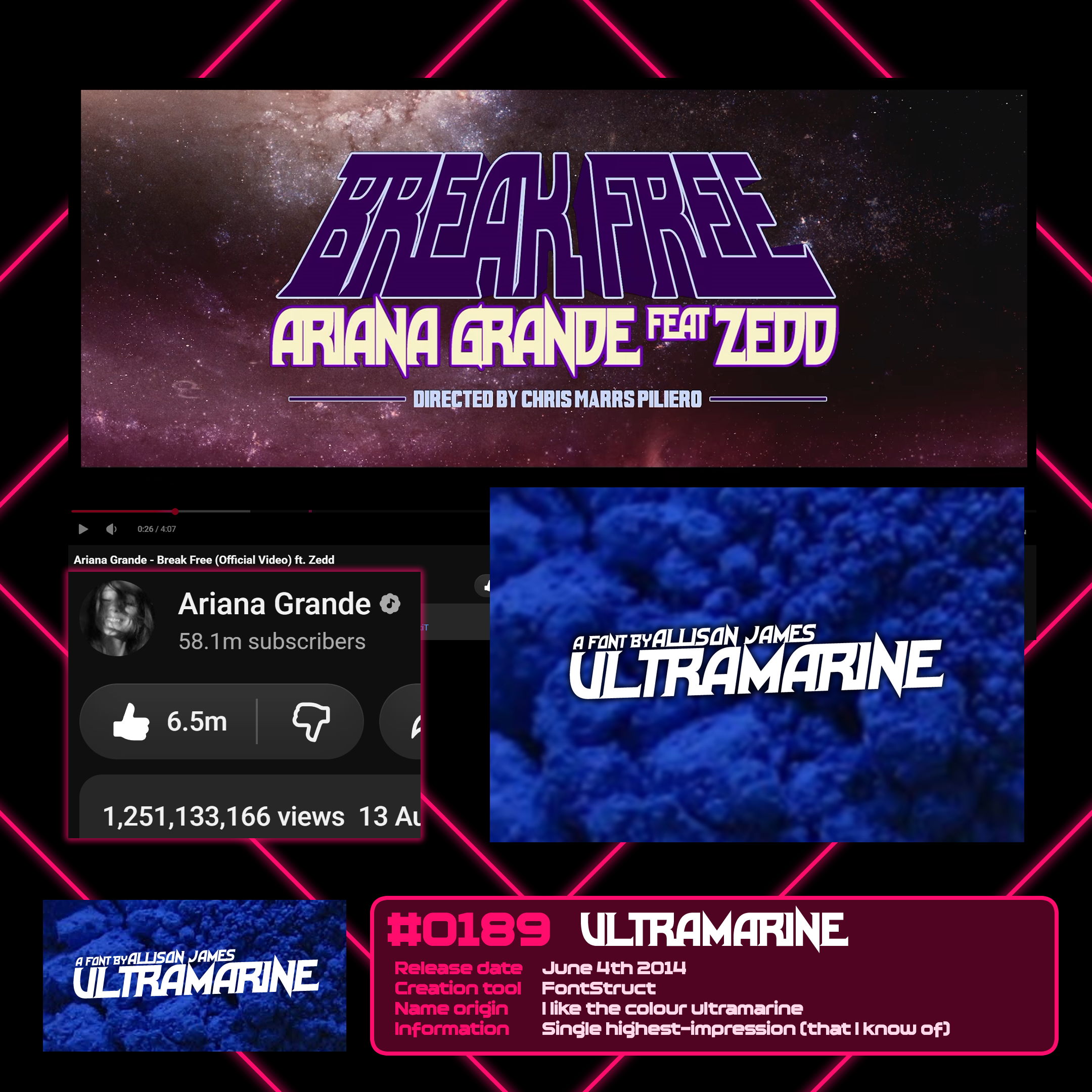
Break Free
#0189 Ultramarine
It’s an unassuming and underwhelming font to be so noteworthy, and yet, Ultramarine is, at least to my knowledge, my font with the biggest singular source of impressions.
Ultramarine is used in the title placard of the music video for “Break Free” by Ariana Grande and Zedd. It’s seen for about three seconds, right after the story crawl towards the beginning of the video.
The music video for Break Free has over 1.25 BILLION views. Now, for sure, a lot of those are repeat listeners, and a lot of those will not have even looked at that part of the video.
But the number is nuts. It’s one view for every 7 people alive today.
With my font in it.
Ultramarine, for what it’s worth, “only” has 75,000 downloads lifetime. I have made over 200 fonts with a higher download count. Exposure really doesn’t translate to anything.
Well, except pride.
I’ve seen my work used in thousands of other places since. I collate my favourites and the most impressive examples on my About page – but there are far too many to list individually here.
Direct points of inspiration
Pre-Chequered Ink, I was far more overt with my references to things. Learning FontCreator meant I could take very direct inspiration and make fonts close to the styles of media I liked. I generally made these fonts free for all, where by now with other fonts I was licensing them as donationware or a single paid fee. I was still a hobbyist at the time, but side income was definitely increasing through donations on my original fonts. (I spent most of that on Lego.)
This is a shoutout to everyone I’ve referenced and been inspired by in those early days.
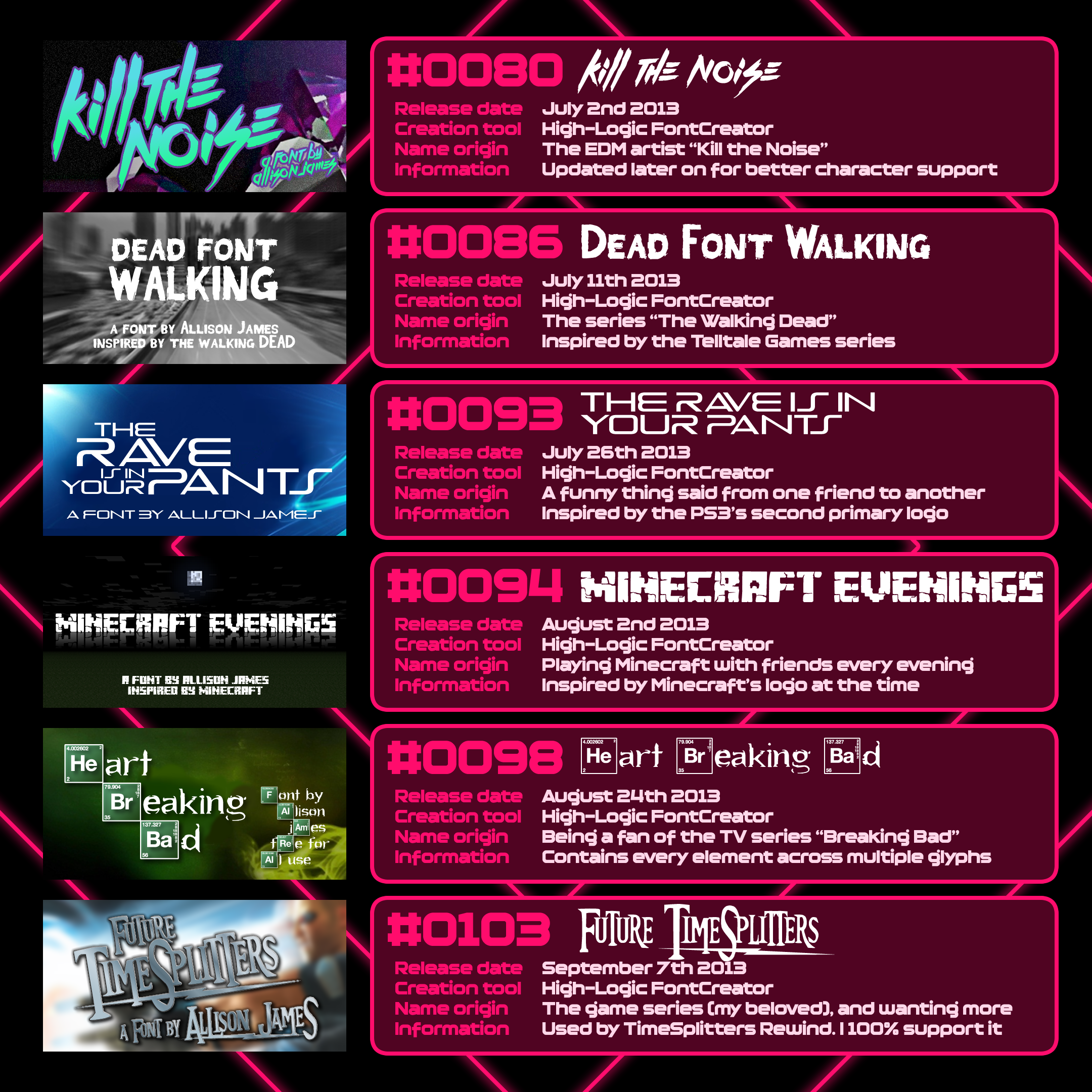
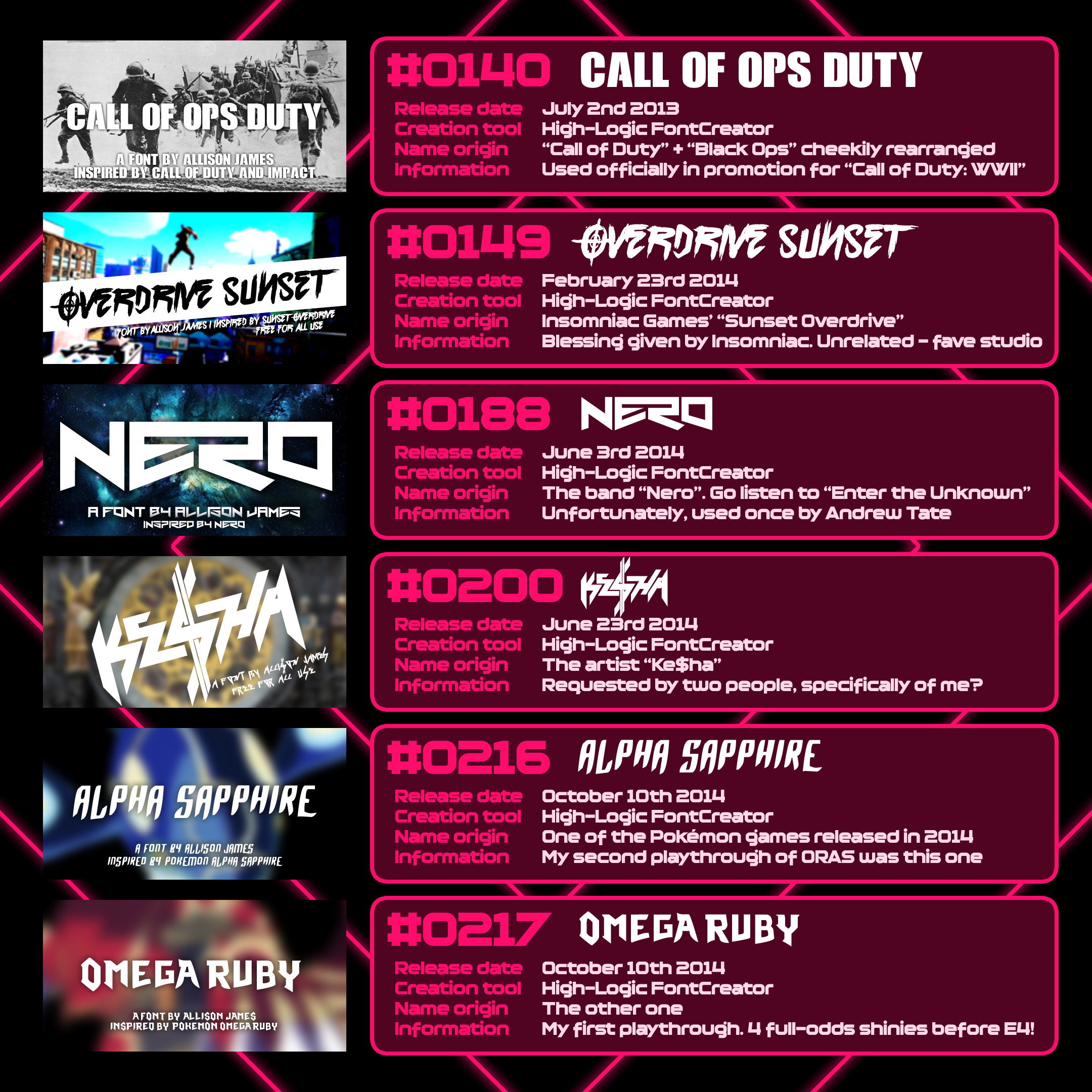
Notable among these is Overdrive Sunset. Inspired heavily by Sunset Overdrive, an Xbox One exclusive that I bought the console for, it ended up making the news in the oddest way.
Sony used it for a PlayStation 4 sale. They used the font inspired by an Xbox exclusive, which was funded by their direct competitor in Microsoft. Here’s IGN talking about it.
Insomniac were lovely about it. They made jokes, they gave the font their blessing to exist, they even went on to use Overdrive Sunset for the promotional materials of the game that inspired it. I have bought every Insomniac game on launch day ever since. (Admittedly, this wasn’t because of the font. I just bloody love Ratchet & Clank.)
As 2014 – a year in which I made 102 fonts – drew to a close, and 2015 rolled on, I gained a fairly significant reason to stop potentially dodging legal issues with my work.
[IV] The Chequered Ink era
Starting the company
Mid-2015, after YoYo Games was bought out and our boss Sandy Duncan (rest in peace Sandy.) left, my feelings that I could go independent with my games, and turn my fonts into a profession, strengthened. It quickly turned from a fever dream into an inevitability when my friend and work colleague, Daniel, handed in his notice – evenings joking about us starting a company together stopped being jokes quite quickly.
Daniel left YoYo Games in June, I left in August a couple of months later, after - and I shouldn’t be bitter 11 years on, but I’m gonna be - we had our long-standing YoYo House removed by the new owners of YoYo Games, and I was given a bit of a joke of a raise as a token offering alternative. (Most of the raise was them jovially taking “junior” out of my title and suggesting that was the biggest upgrade of the whole process.)
Side note: GameMaker is now owned by Opera, who have done so, so much more with the engine. Not sponsored. Just… thank you for saving GameMaker.
ANYWAY plans started brewing. We played around on an online name generator, which turned up the name “Chequered Ink”. We loved it. It’s so start-up-ish. Daniel used his business knowhow to found the company, and everything I had going on in my hobby life turned into plans for commercial releases for Chequered Ink. That included the next Innoquous, Innoquous 5, which I’d worked on for months, a game called “Fireline” which eventually turned into Won’t You Be My Laser, and a quiz game that became financially unviable after three years of working on it and it still being comically unfinished.
The stockpile
Leading up to my departure from YoYo Games, not only did I continue on Innoquous 5, I also stockpiled several fonts to release to start Chequered Ink off, since at the time I wasn’t planning on transferring my 225 personal fonts over. These were all made in FontStruct for the sake of speedy creation in the weeks and months leading to my final day – August the 15th, 2015.
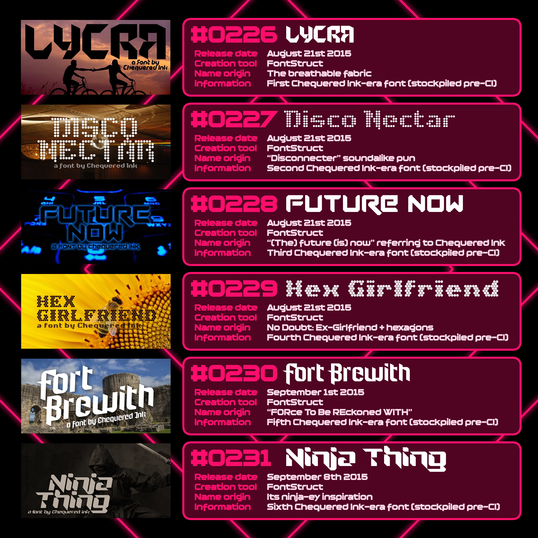
The stockpiled fonts
Lycra, an origami-esque font, and the first I released - mostly because I expected it to do the worst of the six. (In retrospect, it’s one of the best)
Disco Nectar, made from a series of dots in a retro style
Future Now, named in reference to Chequered Ink’s future starting “now”, and probably the best of the six
Hex Girlfriend, using FontStruct’s then-new hexagonal brick. This one took a while and involved a LOT of use of the Nudge tool and the brick resizer in order to stack the hexagons off FontStruct’s unrelenting square grid matrix
Fort Brewith, which shares a lot of cues with my first FontStruct font Kinglify, and mostly because I liked the ring of those choice letters from the phrase “FORce To Be REckoned WITH”
And Ninja Thing, which was again quite an old-school construction, with some sharp edges carved out of its edges to evoke katana slash marks
None of these fonts did particularly well, but were an important foundation to build off of. I made us a separate Chequered Ink account on DaFont and FontSpace, my two personal vendors of choice through my hobby fonts, and uploaded those six fonts across the first two weeks in the spare time between moving out of Dundee and adjusting to independent life*.
*what I mean by this is, three weeks after moving, I went to Sundown Festival in 2015 and saw Nero live with Daniel and mutual ex-coworker Darrell, who also makes fonts.
Chequered Ink’s first year
In the first year of Chequered Ink’s existence, our priorities were skewed from what would end up being successful. The initial objective was: fewer fonts, more games. Innoquous 5 came first, initially being developed as a potential game to release through YoYo Games with their publishing prowess, long before Chequered Ink had been formed in me and Daniel’s minds. I only made 31 fonts in 2015, a sharp decline from 2014’s 102, and a lot of those were post-August after we went independent.
Our games were never heavy earners, but our fonts always were – they provided the stability to make games our own way, with a high degree of experiment. Although nothing really stuck from our 2015 font output, 2016 saw me make 113 fonts – and some of those, along with some of Daniel’s fonts too, really helped us survive our first year and beyond in business.
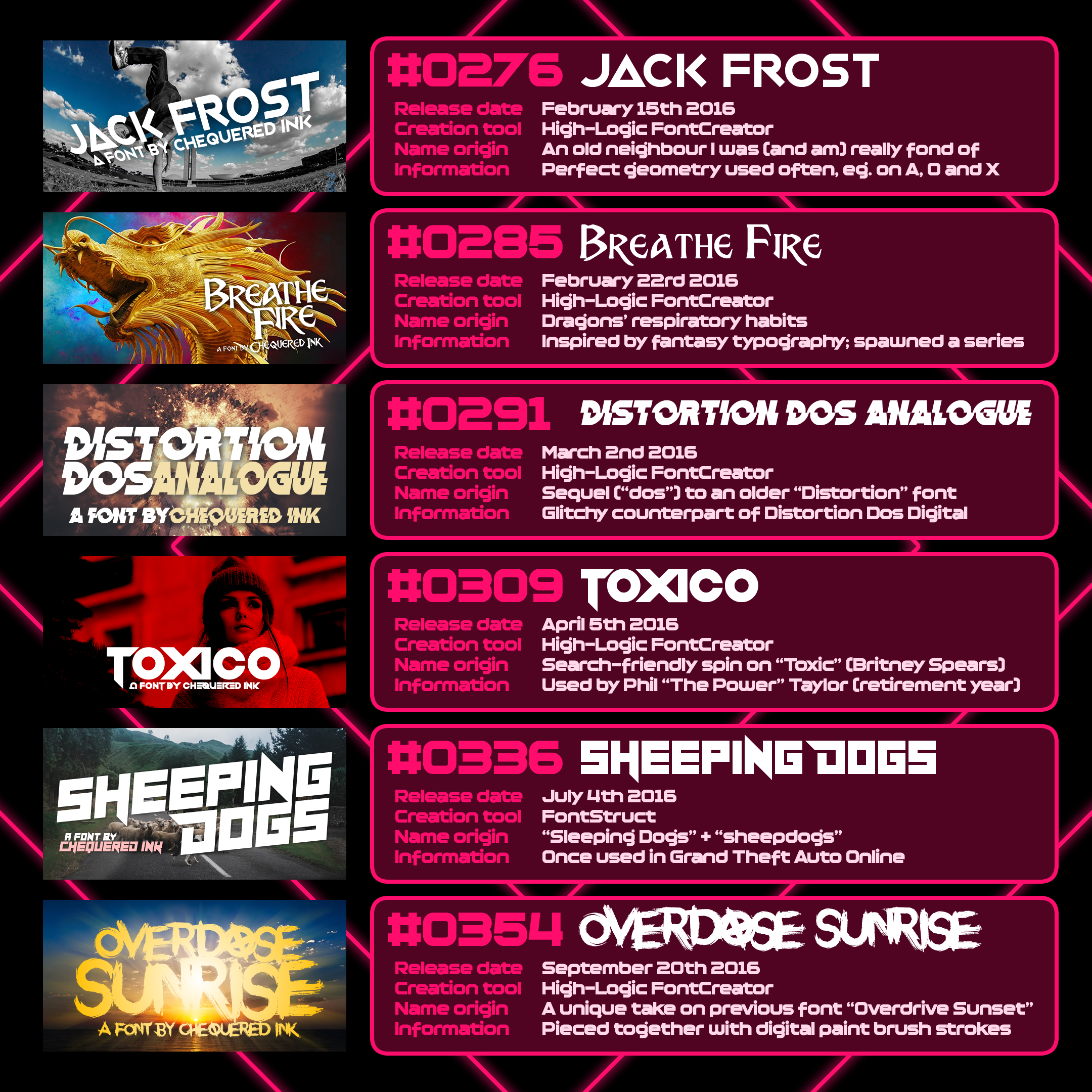
2016’s heaviest hitters
Jack Frost, my first hit under Chequered Ink, is a polished geometric font in a similar style to those I landed with as an independent hobbyist.
Breathe Fire is a fantasy-inspired font, and the first of a series of 5 and counting. Earlier font “DragonSlapper” is drawn from the same inspiration point, the logo for the game Dragon’s Lair.
Distortion Dos Analogue is a glitchy font with over 700,000 downloads on DaFont alone. It glitches the font released simultaneously with it, Digital Dos Digital, although the Analogue variant was always the primary plan.
Toxico, a font which was notably used by darts GOAT Phil “The Power” Taylor in his retirement year.
Sheeping Dogs, another font with over 700,000 DaFont downloads, which has been used in a number of high profile releases including Grand Theft Auto Online.
Overdose Sunrise, one of my strongest anarchic brush stroke fonts, which was self-inspired by Overdrive Sunset, hence the similar name. This one, however, is a far more original creation, with every letter being digitally crafted from a series of stock asset paint strokes. I will go into this technique later.
A personal realisation
As 2016 rolled on, and Chequered Ink’s growth was noticeable but hardly astounding, I was also hit by a new wildcard in my life – a bizarre, increasingly-severe depression. I knew what it was by mid-2016. Gender dysphoria.
But before I even knew for sure that exploring that side of me further was an inevitability, I was accidentally coding font names here and there with little hints to myself and to everyone.
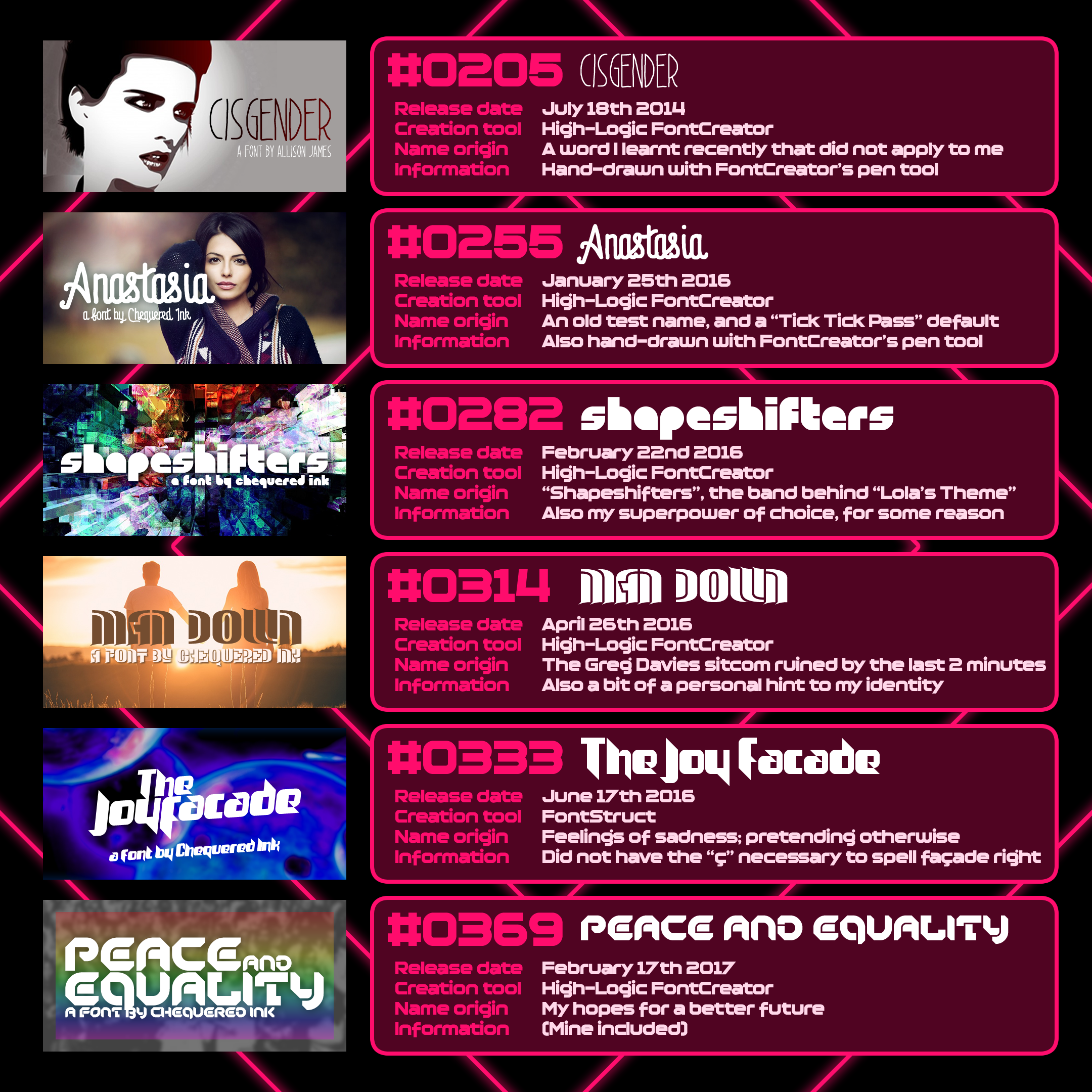
Transgender harbingers
Cisgender, a word I learnt at the time, that I thought maybe, perhaps, applied to me. I wasn’t kidding myself. An acquaintance in game development came out around this time, and really started my questions to myself. Terra, I hope you’re doing well, and thank you for the profound and positive effect you had on my life.
Anastasia was the default name for a character in a game I never managed to finish. It was also my first demo name… sort of. “Allie” was my first, and the one I went with in the end. Everything else felt wrong.
Shapeshifters was named after my answer to the question “What would be your dream superpower”. Turns out purely so I could be a cis woman. I’m basic.
Man Down… things were getting clearer by now to me.
The Joy Facade was released as my depression got stronger. My façade of joy.
Peace and Equality was my hope for those in the future. Ironically, those felt stronger in 2016-2018 than they do today… but little will shake my optimism.
2017 is a blur to me. I made 171 fonts that year, and spent most of my game-making time on my best game to date, Maddening Euphoria – the newest Maddening in my most-known game series, as well as my first Nintendo game a couple years later. That was my life – building Chequered Ink and distracting from my personal problems.
It worked, though. Chequered Ink saw a decent amount of growth that year, and I was able to channel my sadness, converting it into inspiration for creating.
By the start of 2018, Daniel and I felt we had a strong enough business to move together… as long as the rent was cheap.
Moving to Newport with Daniel
In April 2018, I moved to Newport with Daniel, in order to improve and increase our output for Chequered Ink. This was at a time when Chequered Ink was young, and long-term, it proved unsustainable. However, it did have extremely positive results.
Moving was not without its roadblocks. We were both self-employed, and very few landlords trusted us with committing to a year’s contract in a house, in spite of us screaming proof of our finances in their faces. Several of my fonts reflected that time period, and the frustration I gained from it.
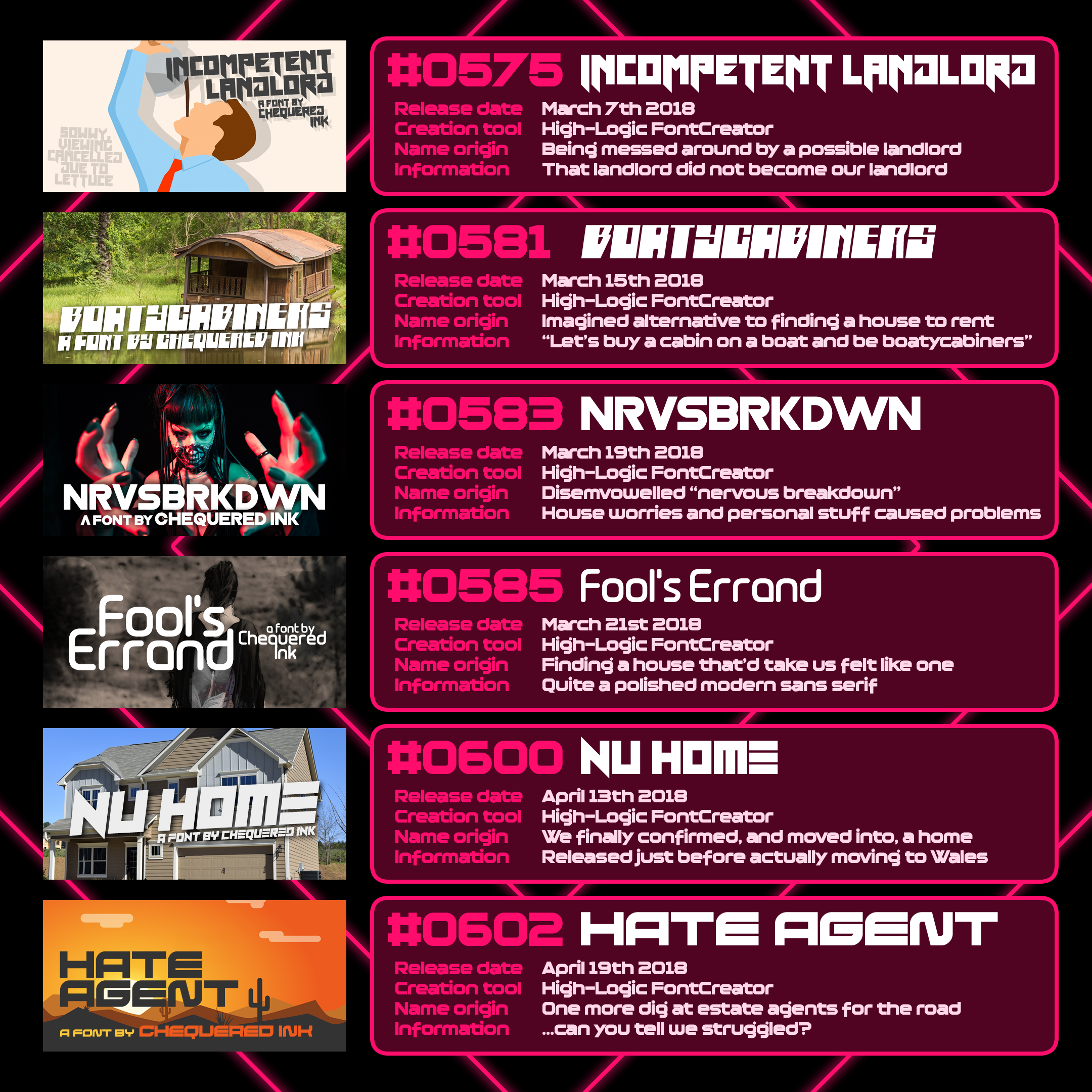
The story of the move
Incompetent Landlord was named after the second or third landlord cancelled house viewings on us for increasingly nebulous reasons.
Boatycabiners was born from a joke where it’d be easier for us to just build a cabin on a boat… it was the name I gave for us doing that.
NRVSBRKDWN… I’m less subtle sometimes. The mix of increasing gender dysphoria and woes with finding the right house, owned by someone willing to let us rent it, left me in a bad state for a long time.
Fool’s Errand was how it felt trying to move.
Nu Home was released when we finally confirmed a place to move. A little terraced house in Newport.
Hate Agent… and one more dig for the road.
Several fonts released in the weeks since moving were prepped in advance, and released via iPhone 6, as it took us weeks to get internet installed in our new home. To save on my then-limited phone data, I often dipped into my bank of licensed resources for their thumbnails.
Leading up to and following the move, I was effectively making fonts full time, usually 5 a week. This has not been the case ever since, and was definitely short-term unhealthy, although long-term it definitely helped fill out Chequered Ink’s repertoire. I have not had to keep up even close to that pace since, and I’ve yet to make more than 70 fonts in a single year.
Coming out & merging the font pools
As 2018 rolled on, depression got strong. I was closeted, sad, and scared of the future, with our income not making up for the costs of rent and survival. That was very apparent to anyone in the habit of psychoanalysing font titles.
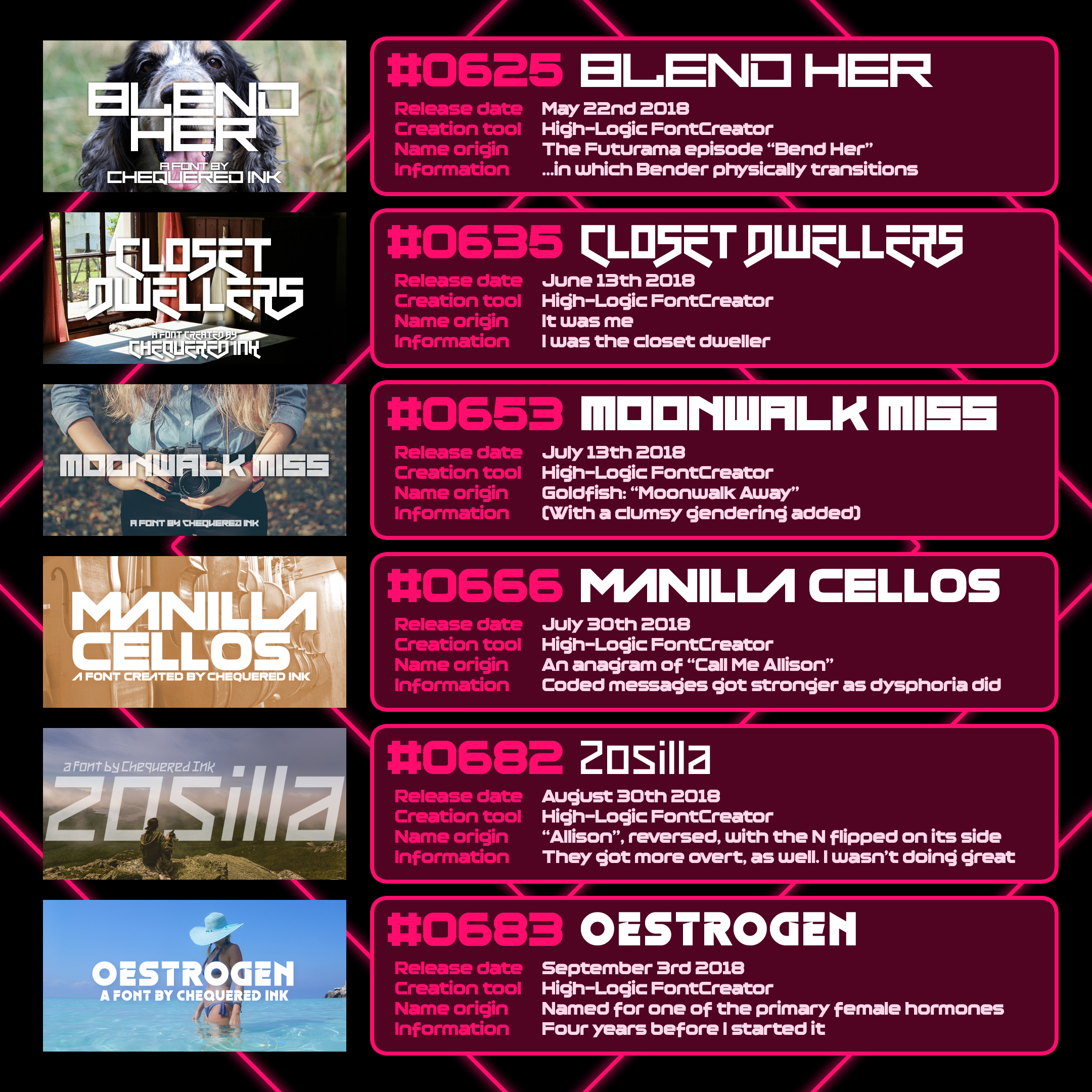
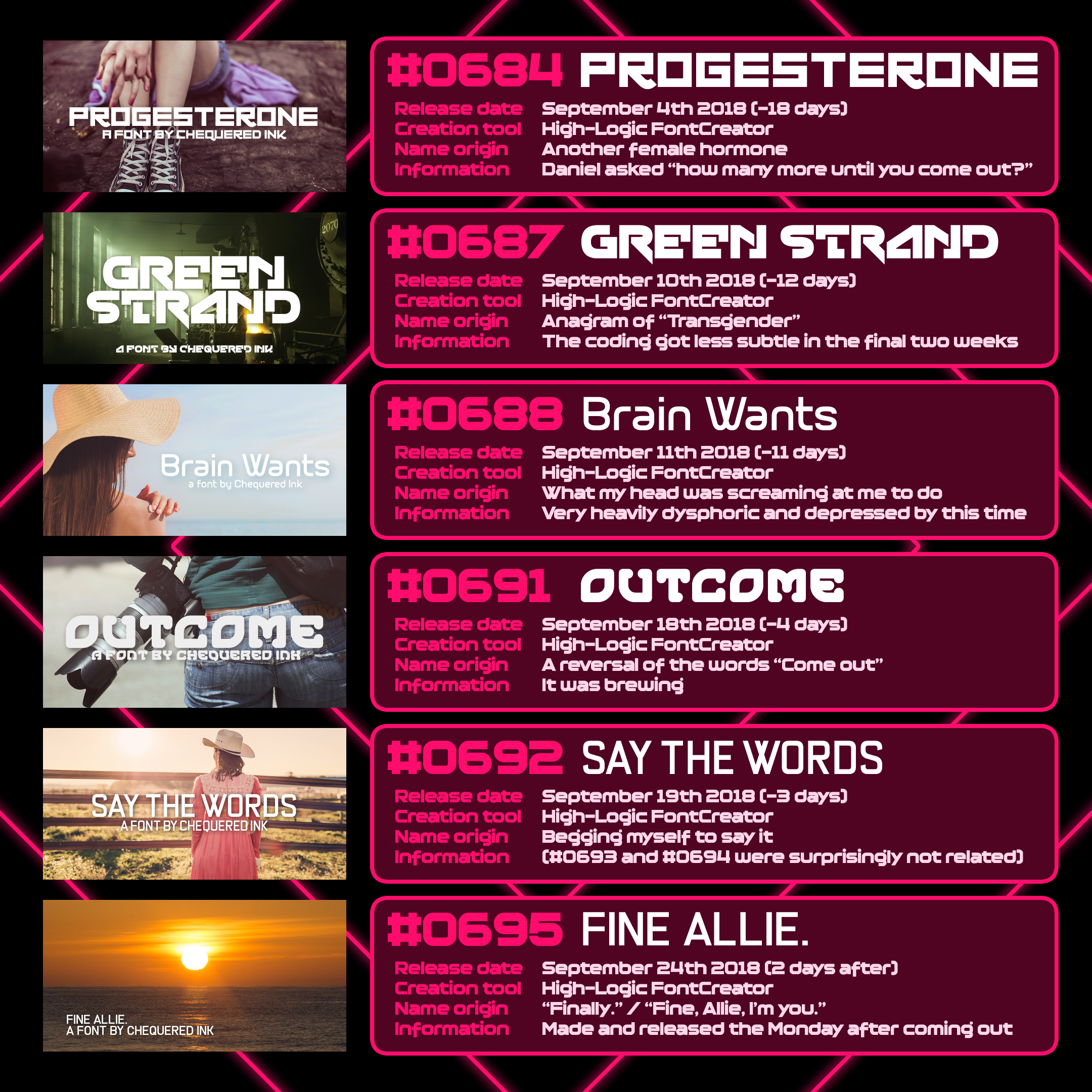
The theme of my font names took a sharp U-turn after that fateful weekend.
I came out, tearfully and drunk on Jack Daniels and cola, to my parents on 22nd September 2018. They gave me their full support.
The next day, un-hungover in spite of whisky and tears dehydrating the life from me, I came out to everyone.
From there, I had a new emotion to channel into creativity – euphoria.
Shortly afterwards, I merged my 225 pre-Chequered Ink fonts into Chequered Ink, largely to shed my deadname from them, but also since my personal income from them was dwindling with the three years of inactivity – it made more sense for them to boost our joint portfolio’s numbers.
Mental health struggles were the inspirational factor for a lot of my output in 2018. I find that inspiration should never be limited to positive forces. The bad times make for good inspiration, and I’ve always found it to be a healthy way of coping, especially when I’m not quite ready to feel good just yet.
[V] Leaving Wales
A month alone
After a year in Newport, and with long-term sustainability not on the cards, Daniel left. I opted to stay one final month in that house before resigning myself to life back in England. I released 10 fonts in this time, and one right after, marking the end of that chapter.
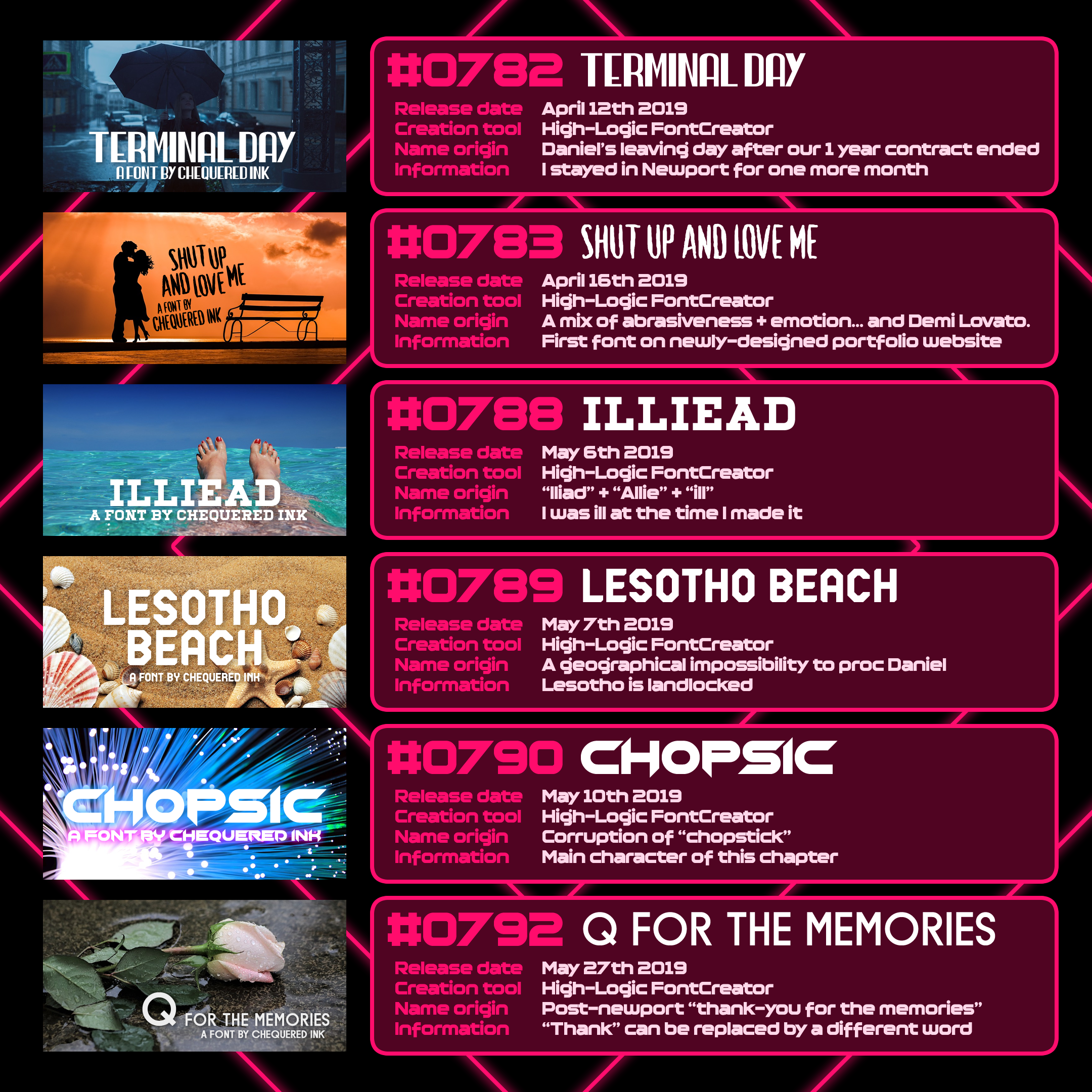
Loneliness and one standout success
Terminal Day marked the day Daniel left. For the first time in my adult life, I lived alone in a house… for one month (I have since never lived alone).
Shut Up and Love Me came as I decided to revamp my website, giving every font its own page with full details and a thumbnail showcase. This was my successful way of busying myself in the month alone. (My hidden template page for new fonts on my website still uses Shut Up and Love Me’s details.)
Illiead was made during a brief illness I experienced during the month.
Lesotho Beach… I wanted to annoy Daniel by proccing his geography knowledge. It worked. Lesotho is landlocked.
Chopsic is going to become one of the main characters of this chapter.
Q for the Memories was the font I released to “celebrate” leaving Newport. While it was a play on “Thank You for the Memories”, it could also be interpreted with a different first word.
Slowing on fonts to focus on games
Following the end of the Newport area, an emotional rollercoaster of a year, I lived back with my parents for almost five years. Two of those were spent holed up thanks to a particular worldwide illness, which also stalled transition progress and generally was a huge detriment to me being outgoing… and going out.
After the hyper-productivity of 2018, I slowed down my font output dramatically and permanently. Compared to 2017’s 171 fonts, and 2018’s 216 fonts, I “only” released 66 in 2019, 46 in 2020, and 17 in 2021.
I dedicated a lot of that time to games instead, which can inversely be seen in my games output. I made 3 games in each of 2017 and 2018, of which only 3 total were good. In 2019 however, I made 8. And FOUR of those were good. Huge improvement. I went on to make 16 games in 2021.
Although my font output decreased, their quality broadly increased. I broke through font burnout from making nearly 400 in two years and 2019-2020 resulted in some of my most successful fonts, including my all-time most successful:
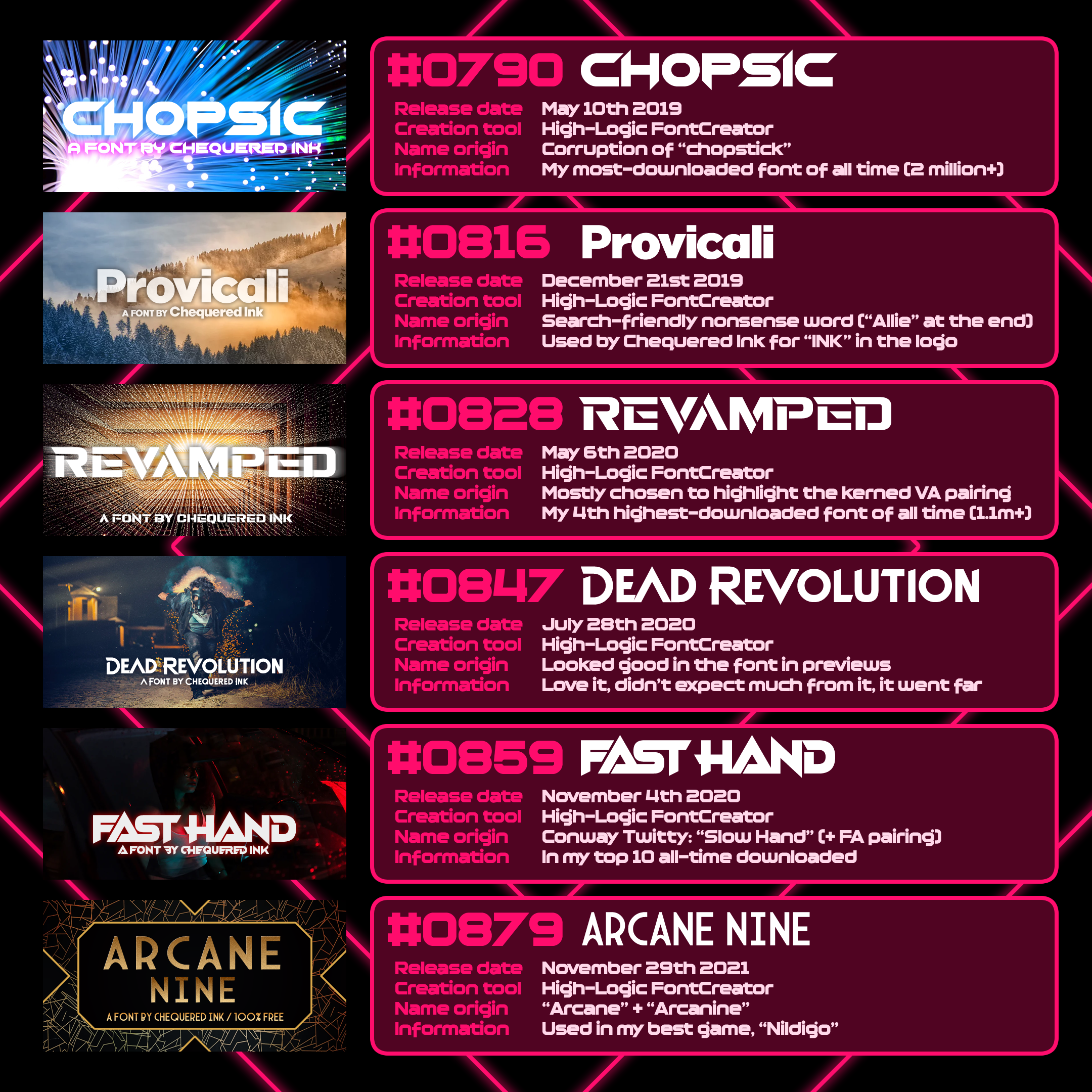
Big hits around the big ‘lerg
Chopsic is my most-downloaded font of all time, with approaching two million downloads across DaFont and FontSpace, topping even Vermin Vibes (which I have SEEN a lot more). It will get its own section in a bit. Hang tight.
Provicali is possibly my best-ever basic sans serif. We use it for the thumbnails of Chequered Ink’s asset packs, and even the “INK” in Chequered Ink’s logo. The “CHEQUERED” is in one of Daniel’s fonts; I really like that we both have representation in our logo.
Revamped is my fourth-most-downloaded font on DaFont, which recently crossed a million downloads on that site. Best-performing stencil font by a long, long way.
Dead Revolution is the kind of font I make, fall in love with, and expect to die fast. This one did not.
Fast Hand is my eighth-most-downloaded font on DaFont, and has kept pace with my biggest EDM-inspired fonts.
Arcane Nine was inspired by Arcane, and is one of my best art deco fonts. I make art deco fonts quite a lot. Something about them gets me every time.
Slowing on the speed of fonts, but prioritising quality and styles that worked, was a huge boon. Those six fonts are the standouts, but there were plenty of other download successes and money makers besides them. That time frame also included some of my best game work, including one of my best games, Revolver and Co.
The font series (3+ separate fonts)
Time to go on a tangent. Over the years, I’ve released several font “series”. Sometimes those are reactionary based on a font’s success, providing extra weights and style variants. Sometimes it’s purely because I’m fond of the name and style, and want to do that for my own satisfaction.
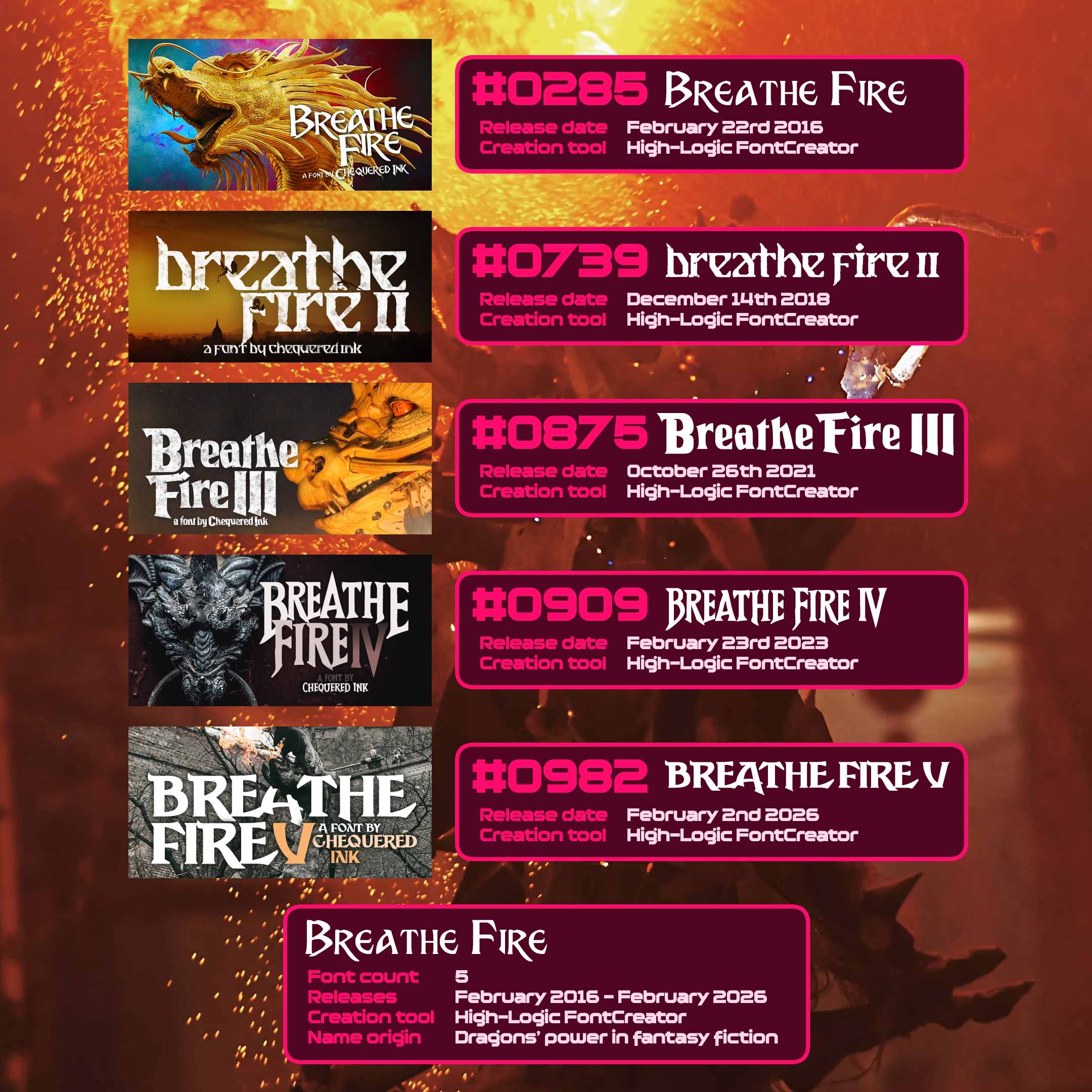
Breathe Fire
Breathe Fire has five variants, each inspired by a different logo from fantasy or sword and sorcery logos, which tend to have utterly beautiful, unique wordmarks.
The exact points of inspiration are:
Breathe Fire (I): Dragon’s Lair / Dragonslayer
Breathe Fire II: Thief (the outlier)
Breathe Fire III: Deathstalker
Breathe Fire IV: The Beastmaster
Breathe Fire V: Red Sonja
Their creation all involved roughly mimicking the available letters from the respective logos, and then filling in all the blanks with unique characters to match. Some filled in more blanks than others; Breathe Fires II and V particularly had very minimal starting letters, and thus are a lot more original overall.
My plan for Breathe Fire is to nominally stop at 8… because if I do Breathe Fire IX, it will no longer be alphabetical with the rest of them. Damn your eyes, Roman numeral 9.
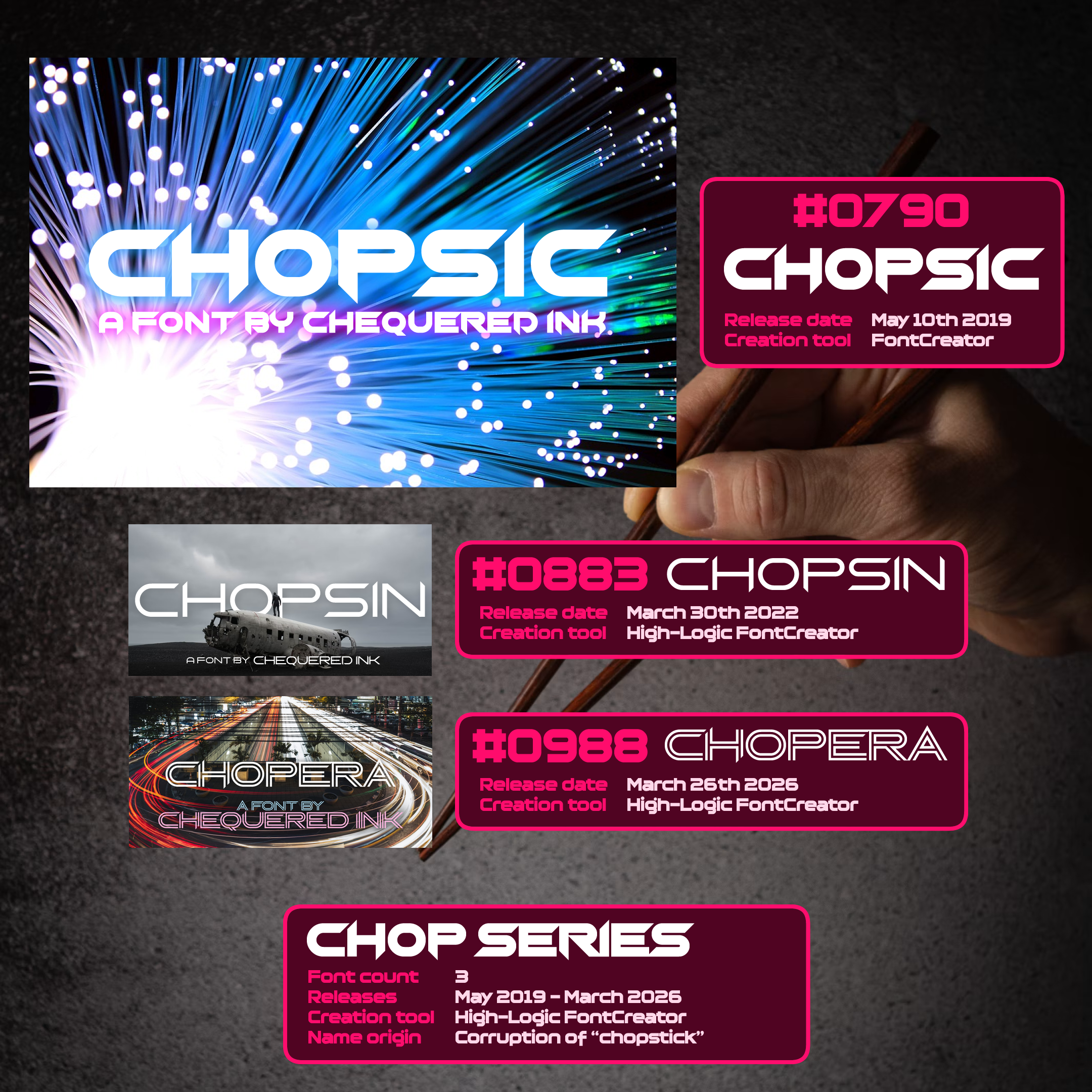
Chop Series / Chopsic and Co
Most of my wider font families are a lot older; I tend to stick to “one-shots” for most of my fonts these days, excepting Breathe Fire.
The “Chop” series is a rare exception, mostly born from the success of the original. Chopsic is my most-downloaded font of all time, with over 2,000,000 downloads across multiple distribution platforms, including several I didn’t purposely upload it to.
Chopsin came a few years later when Chopsic had truly established itself as my newest powerhouse font, with most of the letterforms the same but way thinner. Its name played off of it, Chopsin’s “thin” to Chopsic’s “thick”. (“Thick” was never originally a factor in Chopsic’s name, it was simply a corruption of “chopstick”.)
Lastly, earlier in 2026, I revisited the font one more time with Chopera, which gave the whole font a double-stroke. “Opera” was chosen as the base word for the slight theatre-iness the newest variant gave off, as well as flowing well as a portmanteau and retaining the seven-letter naming that was apparently a thing now.
Chopsin and Chopera combined have been downloaded around 4% as much as Chopsic. I think this font family is a trilogy forever.
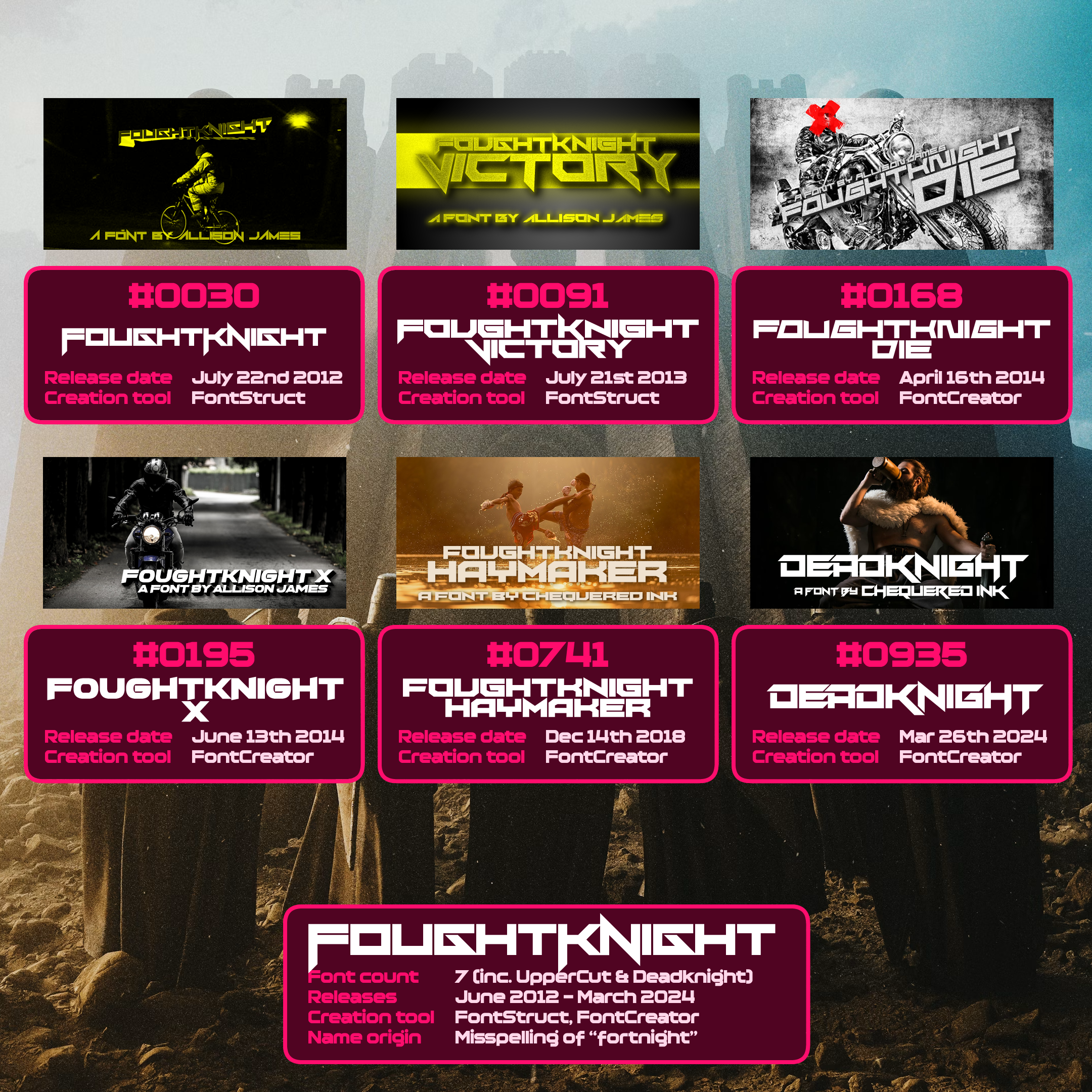
FoughtKnight
I’m proud to be the second most-famous example of a property misspelling the word “fortnight”. I got there first!
FoughtKnight has anywhere between 5 and 7 entries depending on my generosity and denial regarding the forgotten one. The main five are FoughtKnight, FoughtKnight Die, FoughtKnight Haymaker, FoughtKnight Victory and FoughtKnight X.
There is also DeadKnight, a modern throwback to the series, which keeps a lot of its hallmark styles while dropping half of its name and cheekily referring to how I basically left it for dead for six years.
Lastly, there is FoughtKnight Uppercut. All my fonts up to 2019 received their numeric ID when I revamped my website to its current iteration, and gave every font its own page. It made cataloguing them a lot easier. Then, when preparing for this blog post, I found two fonts I missed.
“X-Termination” I found early. I retroactively added it roughly where it should be, and changed every ID for it. That font is important to me. Cody Rhodes uses it.
FoughtKnight Uppercut though? I found it VERY late. It is now an unofficial variant, and to my knowledge, is the only font I have published independently since Kinglify which is not part of the official 1,000. …So yeah. 7. Or 6. Or 5.
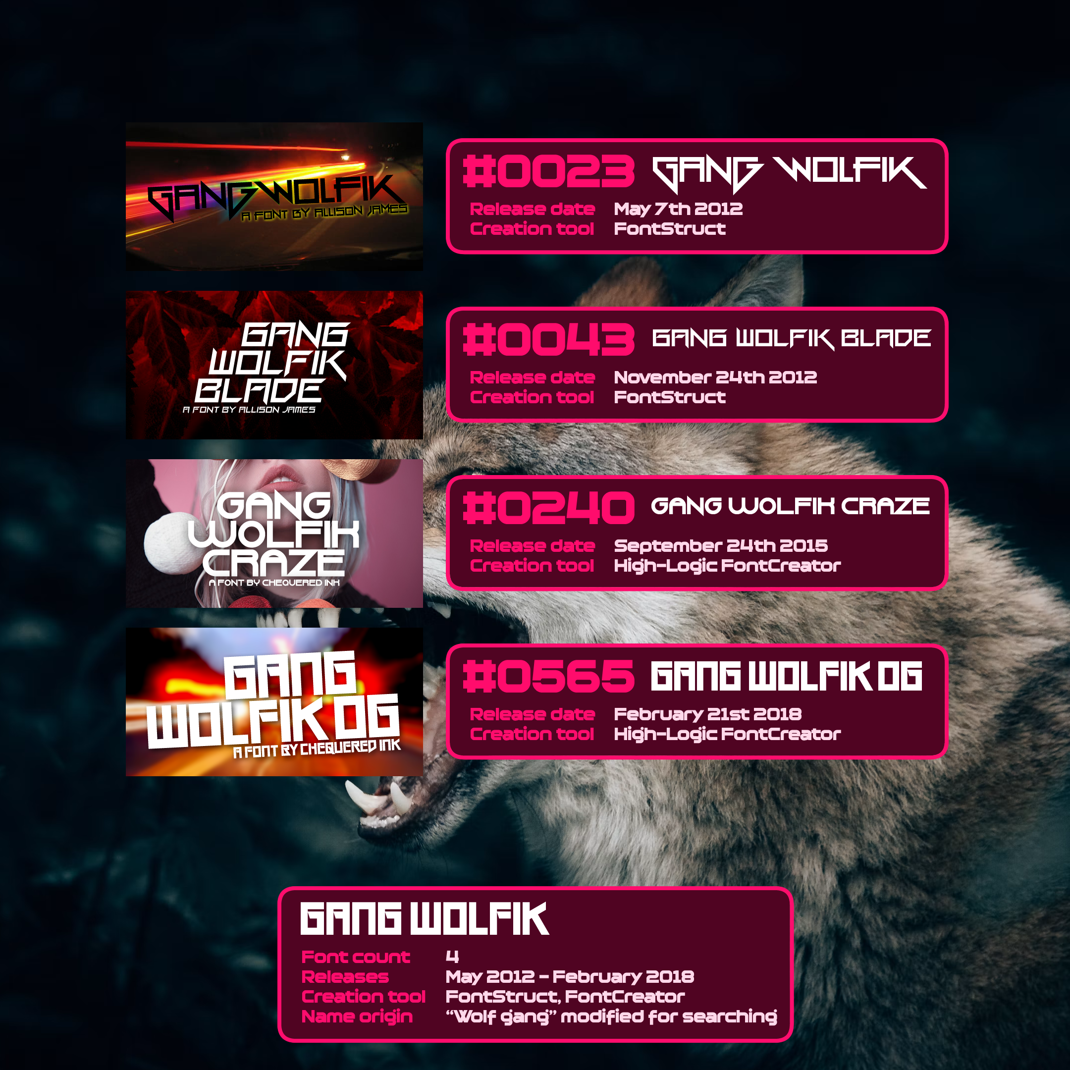
Gang Wolfik
Gang Wolfik was a font named after the idea of a “gang wolf”, or a member of a wolfpack, with a couple of nonsense letters added to improve its searchability, something that was more important to me back in the day.
The original font had less-wide characters, but I squared them off when I preferred how it looked (and as a reaction to the success of Vermin Vibes).
One of my first big hits, I quickly followed it up with a sequel, Gang Wolfik Blade, a more polished variant and one of my first goes at charging a flat fee for licensing a font. (Gang Wolfik Blade is now licensed the same way as my other non-100%-free work.)
After a few years, I created a rounded variant with Gang Wolfik Craze. This font did a good job of feeling really Gang Wolfik-y, but that’s the only nice thing I really have to say about it.
I revisited the family for the fourth and final time with Gang Wolfik OG, which recreated the less-wide look the original font had early into its creation.
Gang Wolfik was one of my big powerhouses in the mid-2010s along with FoughtKnight and Vermin Vibes, and was the first to die out in popularity. (FoughtKnight took years longer to quieten down; Vermin Vibes remains one of my most popular fonts 14 years later.)
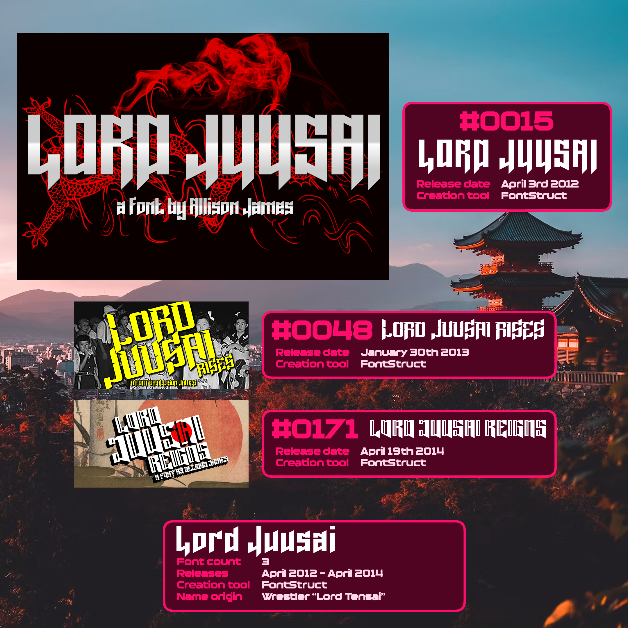
Lord Juusai
This family of fonts, my first ever attempt at a foreign-typography-inspired look, is also one of my shortest-lived series, with a total of 3 fonts, all created pre-Chequered Ink. Spanning two years and change, they lasted about as long as their namesake, the Lord Tensai character in WWE.
In my head-canon, Lord Juusai is a fictional warrior from centuries-old Japan, who arrived in battle, made a name for himself, and rose to the top. The story is told across the three names of the fonts.
All three took their similar inspiration in different directions. The original was inspired by Lord Tensai’s entrance logo, with the excessive pointy bits.
Lord Juusai Rises from a year after went even pointier, with some little cut-outs to simulate slash marks, a technique I used in a few different fonts.
Lord Juusai Reigns then dialed back the pointiness just a little, replacing it with a double-stroke effect.
The Lord Juusai series didn’t really perform, but it was an important trilogy for me, paving the way for far better-executed fonts inspired by the typography of Japan and other countries.
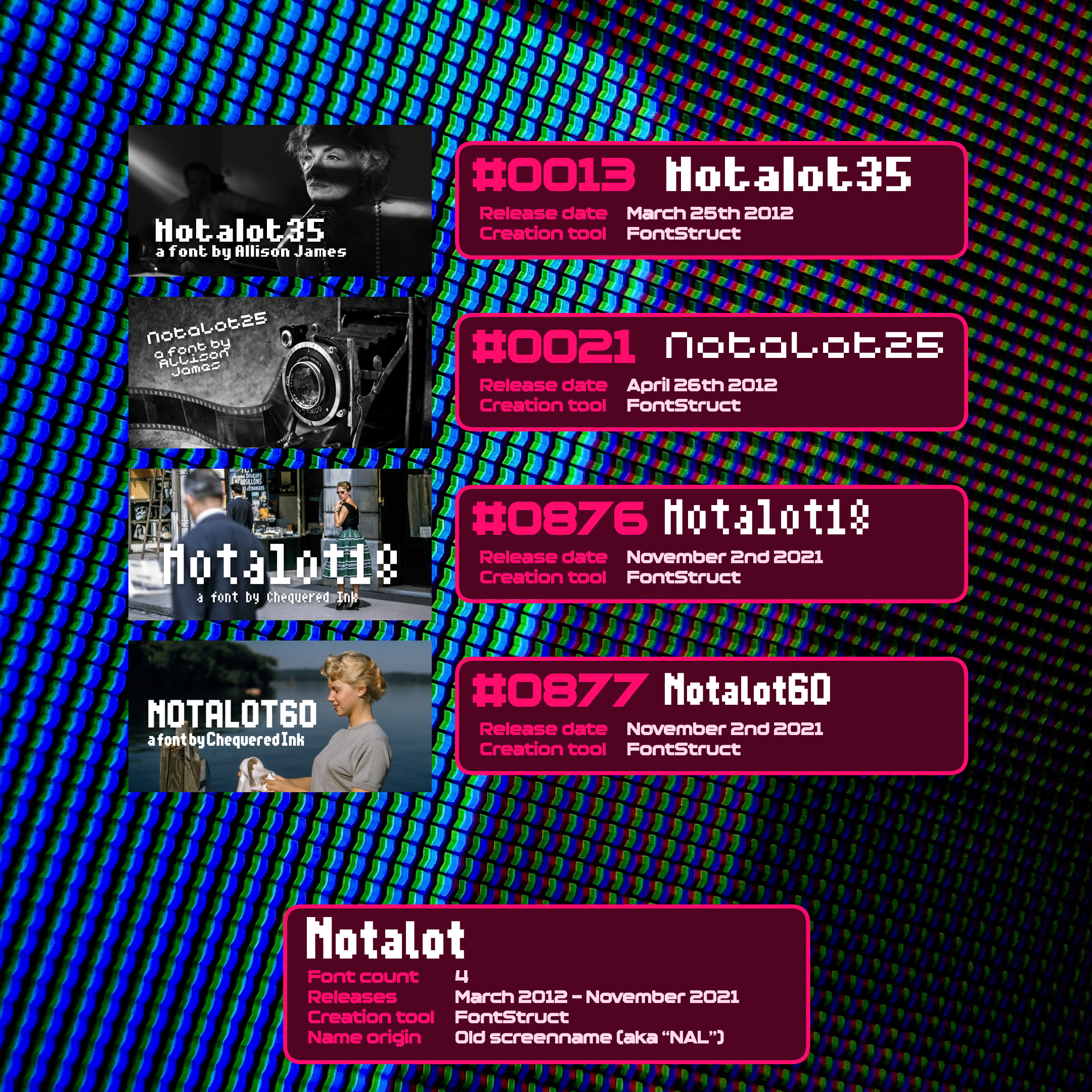
Notalot
The Notalot fonts are named in two parts - one, for my original screenname (that is what “NAL” stands for in “NALGames”), and two, for their capital letter pixel resolution.
Notalot35 and Notalot25 were two of my earliest bitmap fonts, sized 5x7 and 5x5 respectively.
Nine years later, I had two pixel fonts in my FontStruct account that I made for games but never released as fonts. I remembered the Notalot name, and gave them similarly themed names. Notalot18 is 3x6; Notalot60 is 6x10.
Notalot18 was originally made for Rev%lver, but I ended up using one of Daniel’s fonts for the game instead.
Notalot60 was originally made for Rev%lver’s sequel, Revolver and Co… but I ended up overhauling its graphics to a higher-resolution vector style. 0-2 on Revolver getting bespoke typography.
This is a series I’ll probably dig up if and when I next make a new bitmap font for a thing. I like the name, and I like the throwback to my 20+-year-old screenname.
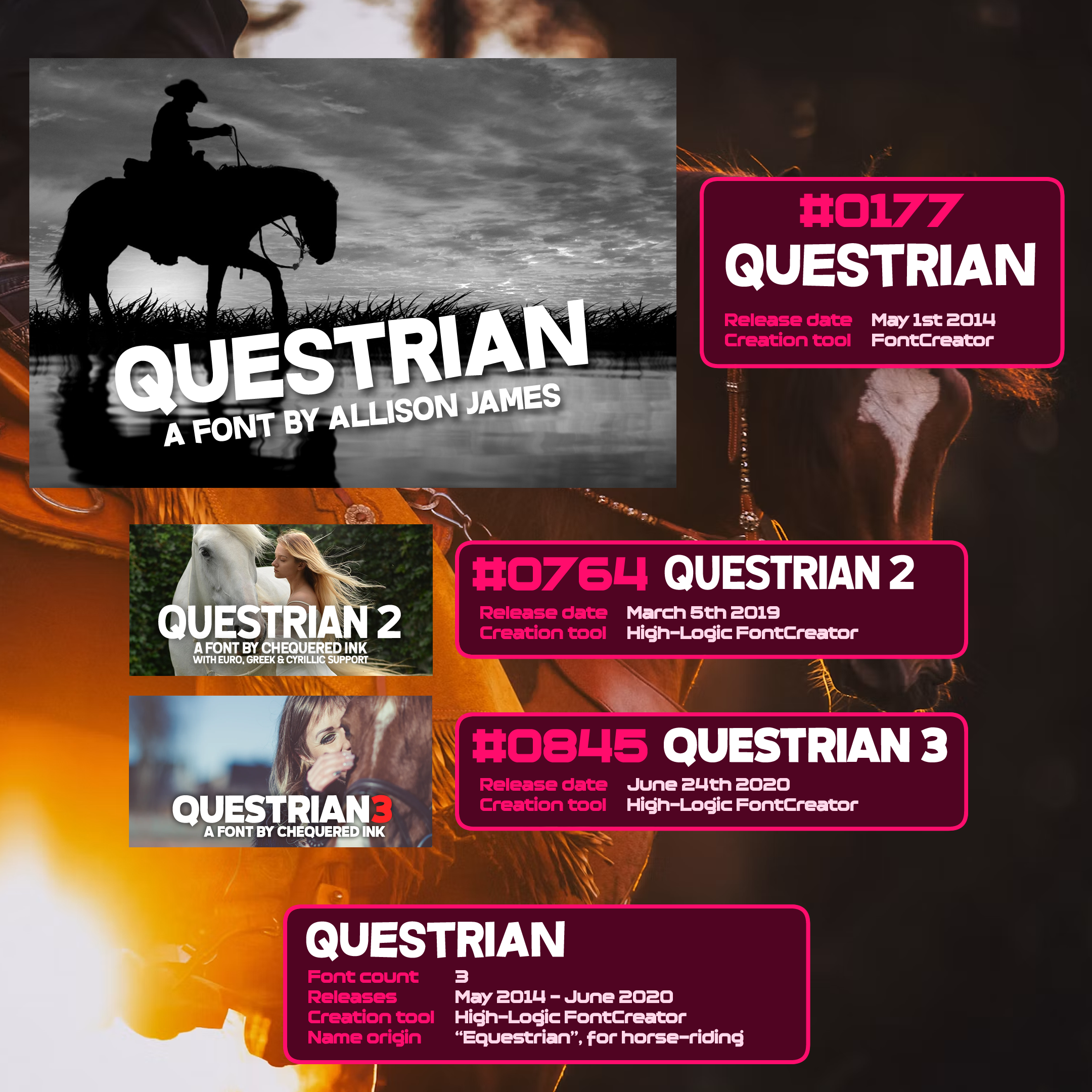
Questrian
“Equestrian” minus the first letter served as the name of the Questrian trilogy of fonts.
Part of the “never really meant to be a family” series of fonts, I ended up giving Questrian 2 its name purely due to its similarity to the original. Then the same for Questrian 3 a year or so later.
Questrian 2 is my firm favourite of the three. It’s just irregular enough while being a very cleanly-drawn font.
Add this to the collection of fonts that will get a sequel if, and only if, I accidentally make a font that looks like it should be called Questrian 4. I rarely do this style any more, though.
These kind of comic fonts are easy to make if you can make a sans serif font in a vector typography tool. Turn off gridlock. That’s literally it. Make the font the exact same way as you would were it regular, but intentionally slightly miss all of the grid points by just a little bit. Comic font made.
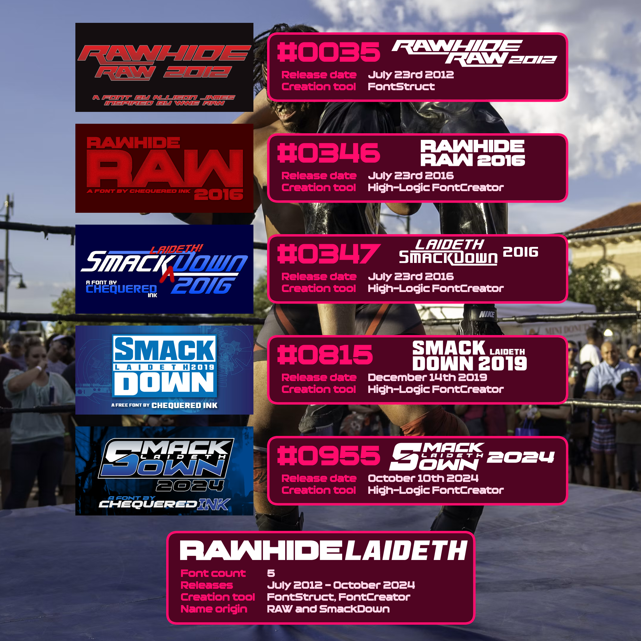
Rawhide Laideth
A cautionary tale in how to receive a pile of fan requests every time a company updates a logo for a thing.
Rawhide Raw 2012 was my attempt at turning the Raw logo, new to 2012, into a full font. Made in FontStruct, so it was limited by the bricks I had to work with, but it’s pretty close.
In 2016, Raw got a new bespoke wordmark, and so did WWE’s counterpart show, SmackDown. I was asked. Quite a lot. I released both Rawhide Raw 2016 and Smack Laideth Down 2016 as a pair on the same day.
Raw has, with minimal modifications, retained the same logo ever since. SmackDown, however, has gone through two revisions, in 2019 and 2024. In spite of a waning interest in wrestling, I received enough requests both years to nip it in the bud with a day or two’s work. Thus, Smack Laideth Down 2019 and Smack Laideth Down 2024 were born.
I’m crossing fingers that whenever WWE update their logos next, they use an established font for them. That way, I can bookmark the link to it and direct the messages that way.
Weird final aside: I bought a LEGO set in like 2015 and got jumpscared by one of its decals using Rawhide Raw 2012. That was mad.
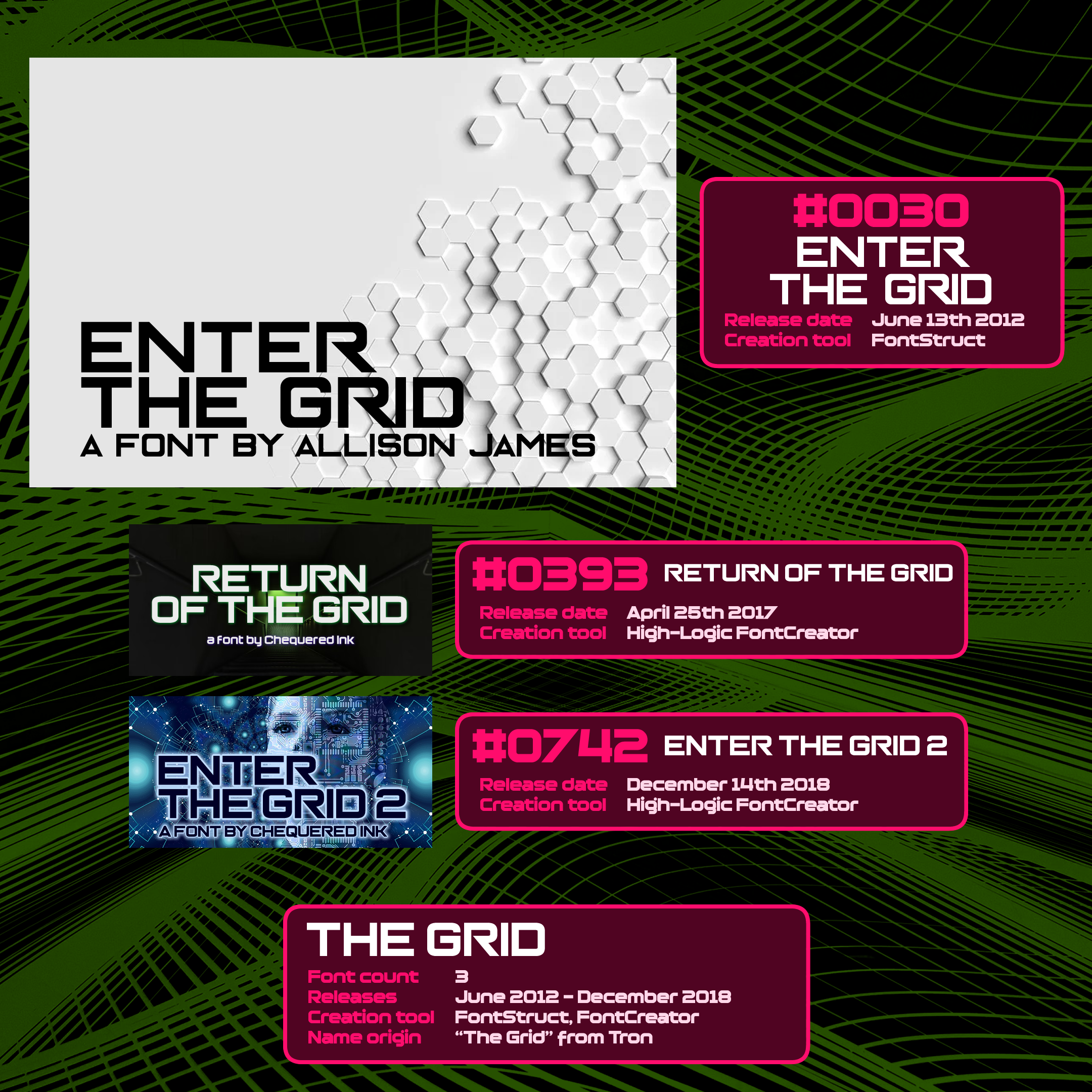
The Grid
Tron is one of my favourite franchises of all time. I was obsessed with the original ever since buying it on VHS at a young age. It was advanced further when I got to see Tron Legacy with work colleagues while I lived in Dundee. Love both films. The score for Legacy… mmf.
Enter the Grid was named for “the grid” from Tron, and inspired by all manner of futuristic sci-fi technology. It was, however, marred by its execution. (It’s a font with curvature made in FontStruct, I did my best.)
Five years later, I returned to the Grid with Return of the Grid. A lot of this font was different to Enter the Grid (least of all because I gave it a lower-case), but its execution was far better, now made in FontCreator.
One year later, I completed the trilogy with Enter the Grid 2, which was MUCH closer in shape to the original - just with a far cleaner execution. No more lower-case, no more off-angle curvature. Basically a remaster where Return was a remake.
I have been dreading watching Tron Ares.
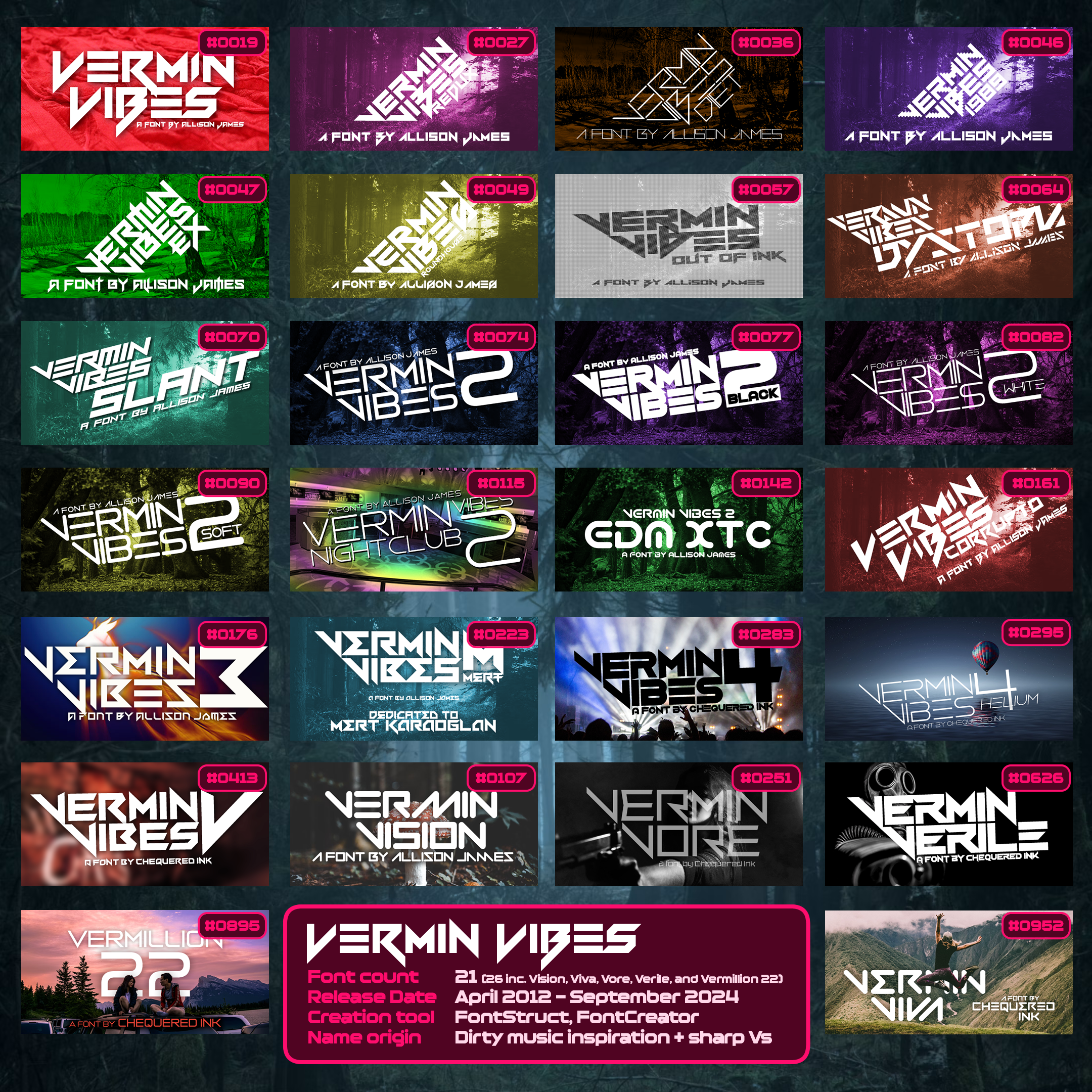
Vermin Vibes
Okay, that’s a lot. I’ve covered the original Vermin Vibes, so here’s a rundown of the rest.
Redux was a version of the original, with improved/modified characters across the board. Diet made it skinnier. 1989 made it pixellated.
The original was heavily influenced - in a unilaterally positive way - by the feedback from my friend Mark. I undid his positive fixes with Vermin Vibes eX as a showcase of what the original might have been.
Roundhouse was me attempting full curvature in FontStruct. Out of Ink was me reducing the vertical brick height. No to both.
Dystopia and Slant were better. Both heavy iterations. (Slant especially is something of an achievement. There was no native italic filter in FontStruct, I remade the entire thing, still on FontStruct’s very un-italic grid.)
Vermin Vibes 2 was me visiting the series as a practice of High-Logic FontCreator when I got back into it in 2013. I then made several variants, first adjusting its weight and then making weird stylistic decisions. I also used FontCreator to filter the original with point randomisation for Corrupto. It’s terrible.
I went back to eschewing curvature, while still using FontCreator, for Vermin Vibes 3. Then I uneschewed curvature for Vermin Vibes 4. Between these two, I learnt from a friend of one of my previous clients that said client had passed away, so I made Vermin Vibes Mert as a tribute to him. (This is the only Vermin Vibes I released 100% free.)
Vermin Vibes V is my newest pure Vermin Vibes font, once again eschewing curvature and giving Vermin Vibes something of an official finale. It’s not quite the end of the story, though.
Vermin Vision was my first “Vermin-like”, a term I use for fonts with clear bases in the family while only partially using its name. Vermin Vore continued this, and is the only Vermin font with a lower-case. Vermin Verile and Vermin Viva, the newest font in the series by quite a way, did this too.
Vermillion 22 is as loose as it gets. “Vermin” with extra letters, and a 22 as a little nod to the fact that if I’d called it Vermin Vibes, it would have been the 22nd font in the family.
I may very well have this font family to thank for my entire career. The original was my first runaway success, and remains top ten by day. It’s the font I’ve seen the most, and it’s the family that’s been downloaded the most across the board. I went a little overboard with the number of entries, and some of them are plain crap, but… yeah. Viva la Vermin Vibes.
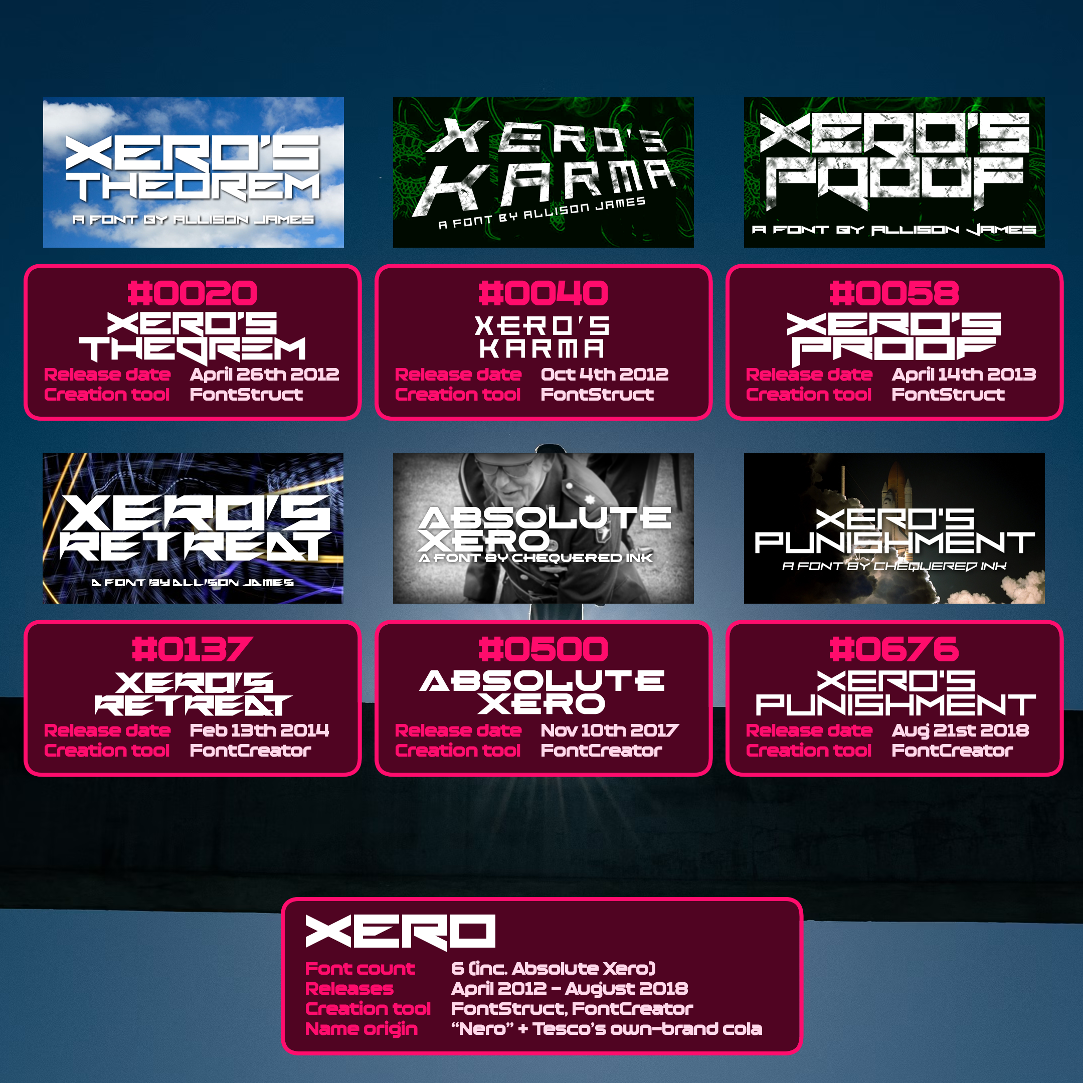
Xero
Not every day you get to simultaneously name a font family after a band you like and a supermarket own-brand diet cola.
Xero, like Lord Juusai, is in my head-canon a character, whose fonts are named for their various wacky scrapes. They are a lot less “formed” in my head than Lord Juusai, though.
But yes. The original font was inspired by Nero’s logo, which I guess in a way makes the later-on font “Nero” part of the series. I’ve not counted it here, though. Its name is also a nod to Tesco’s excellent Pepsi Max knockoff “Xero”. At the time of the original font, it was like 50p for a 2 litre bottle, and it didn’t taste half bad.
Xero ended up with six escapades, four pre-Chequered Ink and two post. None of them did particularly high numbers, especially considering Xero’s Theorem was from the same era, and sharing the same style, as Vermin Vibes, Gang Wolfik, and FoughtKnight.
Can’t win them all.
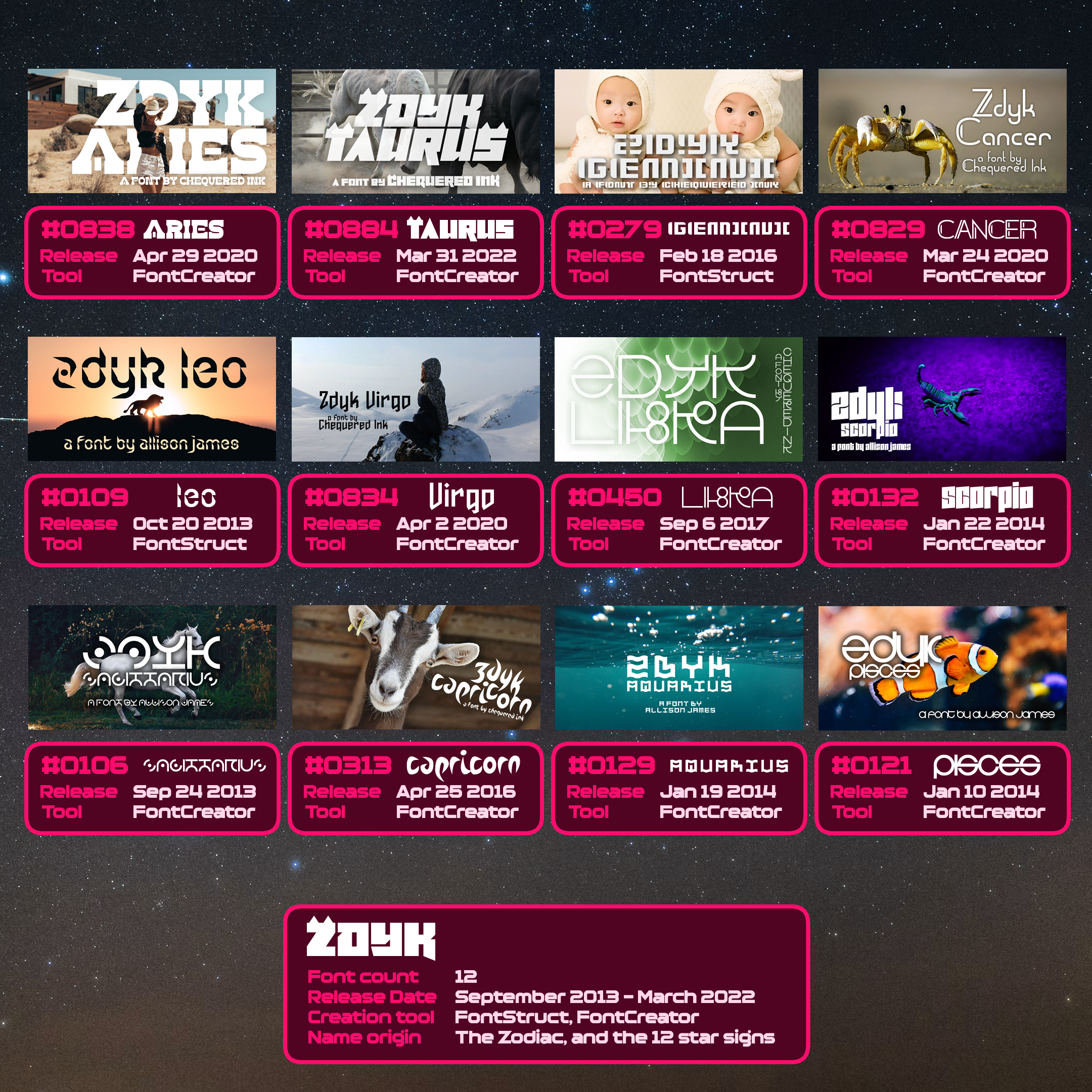
Zdyk
Finally, Zdyk (stylised as ZDYK and officially pronounced “Zodiac”) is a 12-part set of fonts inspired by the star signs of the Zodiac, released between 2013 and 2022, often with years-long gaps between entries.
In 2013, I kicked off the series with Zdyk Sagittarius and Leo. I think I originally planned to use dots as a motif for all 12; I quickly grew tired of this.
After I learnt FontCreator properly, 2014 saw Zdyk Pisces, Aquarius and Scorpio covered, which are far more usable fonts.
Two years later, in 2016, and into the Chequered Ink era, I made Zdyk Gemini and Capricorn. The former took direct inspiration from Gemini’s logo. Capricorn took precisely zero inspiration from anything to do with its star sign.
I added Zdyk Libra in 2017, which again took inspiration from the logo of the star sign itself. Alien-ish typography was an inconsistent theme across a few of the Zdyk fonts.
Another three years later, I covered Zdyk Cancer, Virgo and Aries. All wildly different fonts. And finally, in 2022, I completed the series with my own star sign, Zdyk Taurus.
One day, I will cap the series off properly with Zdyk Ophiuchus. Until then, Zdyk is a family of 12 fonts, and the only family in my entire portfolio where none of the fonts feel even slightly related to each other stylistically.
2022-2023, and the pursuit of confidence
Following 2020-2021’s world events of great introversion, I looked to resume life in the real world going into 2022. So while I did make a good handful of fonts across these years, I also became laser-focused on improving myself.
I went out and saw friends more often. I attended my first Pride event in Norwich. I also resumed my transition, eventually resulting in a hormone prescription in October 2022. My happiness is reflected in a lot of my fonts of that time period, in title, theming and thumbnail imagery.
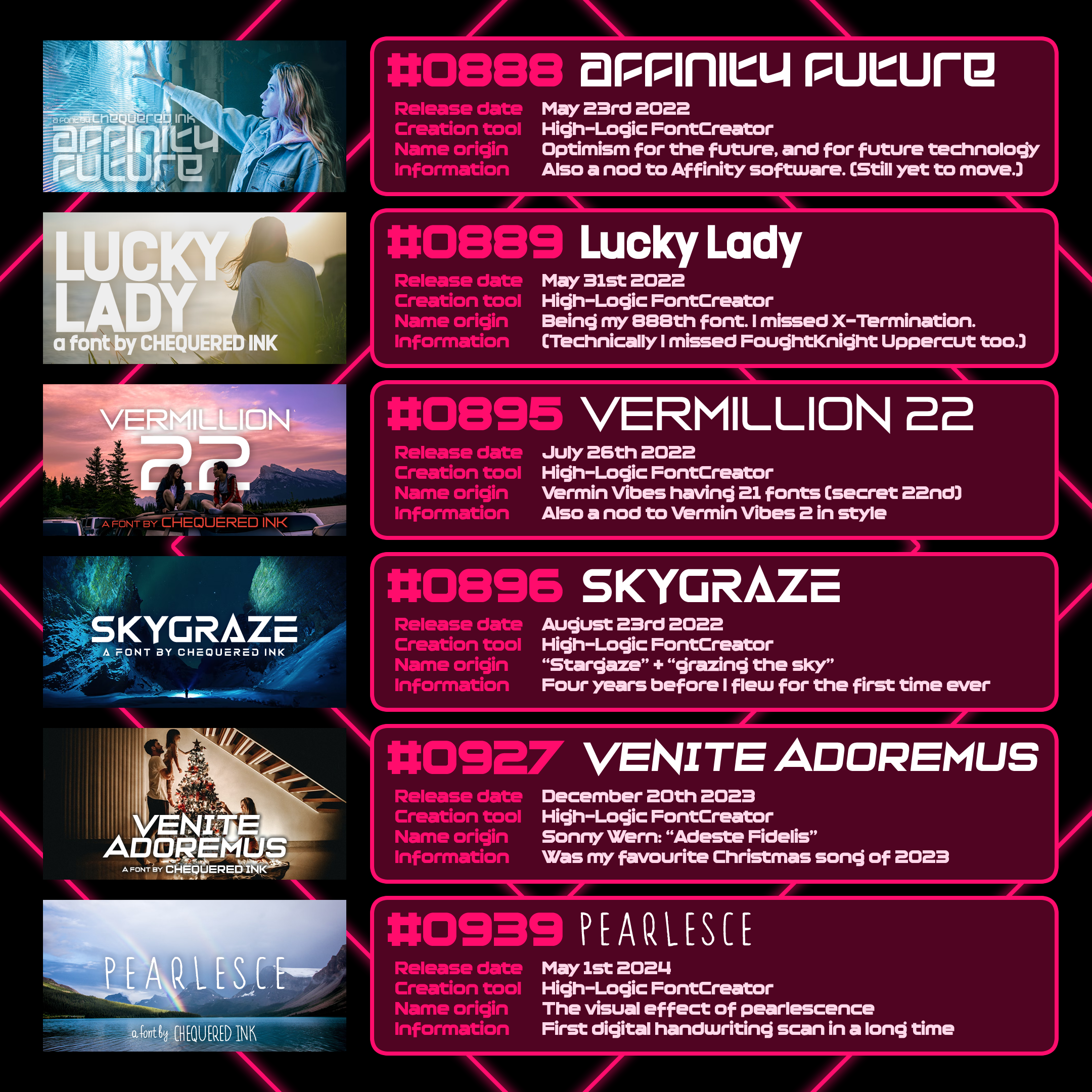
The optimistic era
Affinity Future, while named largely for its sci-fi inspiration, was also my take on the path ahead of me. Also, my plans to migrate from the then-10-years-deprecated Adobe Fireworks to Affinity Designer. I still use the now-14-years-deprecated Adobe Fireworks.
Lucky Lady was how I felt about myself. It was also a reference to being font #888, which got desynchronised by X-Termination being added to my collection officially.
Vermillion 22 was a nod to the past that got me to the present, referencing the number of official Vermin Vibes fonts +1.
Skygraze referenced natural beauty. Grazing the sky and all that.
Venite Adoremus celebrated an exciting Christmas in 2023 - one looking towards 2024.
Pearlesce brought together name, style and imagery all in one place, and was my first digital handwriting font in quite some time.
Among the fonts, I also made some of my best free games in this time period, with Chainwhacks, Courier 66, Monoquous, Sniper Waifu, and Write the Entirety of the US Constitution Before the End of Night of the Living Dead. Believe it or not, the last one was once shown at an American art exhibit.
One other thing happened during this time – I made new friends online. I know how that sounds. Bear with me. I got into a YouTube channel in 2022 called No Rolls Barred, which in turn got me enamoured with a social deduction game, Blood on the Clocktower. I got a few of my old friend group to agree to a game with me in a private Discord server. Then mid-2023, I started playing online games of Clocktower with a group from the No Rolls Barred Patreon. This eventually led to those friends joining that old private Discord server, soon to be retitled “Harts Bluff”.
Approaching the end of 2023, and more than sated on living with my parents (as much as I love them), I was asked by a friend if I’d like to move with him to Wales. After much deliberation and fear of once again being thrust into independence, but this time with a slightly steadier and higher income from Chequered Ink…
[VI] Moving to Wales… again
2024 and the Welsh reunion
I moved to Wales again. Different friend, not a work colleague. Different location. Other than that, very similar set up – both of us working from home by day in the living room. While this living situation didn’t work out great for either of us, he’s still one of my closest friends to this day. Perhaps most significantly, these were very important months for me as a person.
Beyond frequent visits to our local Lidl, three big things happened in my time there between January and September. Following prompting from some of my closest friends, I ended up finding a guy who I remain in a relationship with to this day. I love that man.
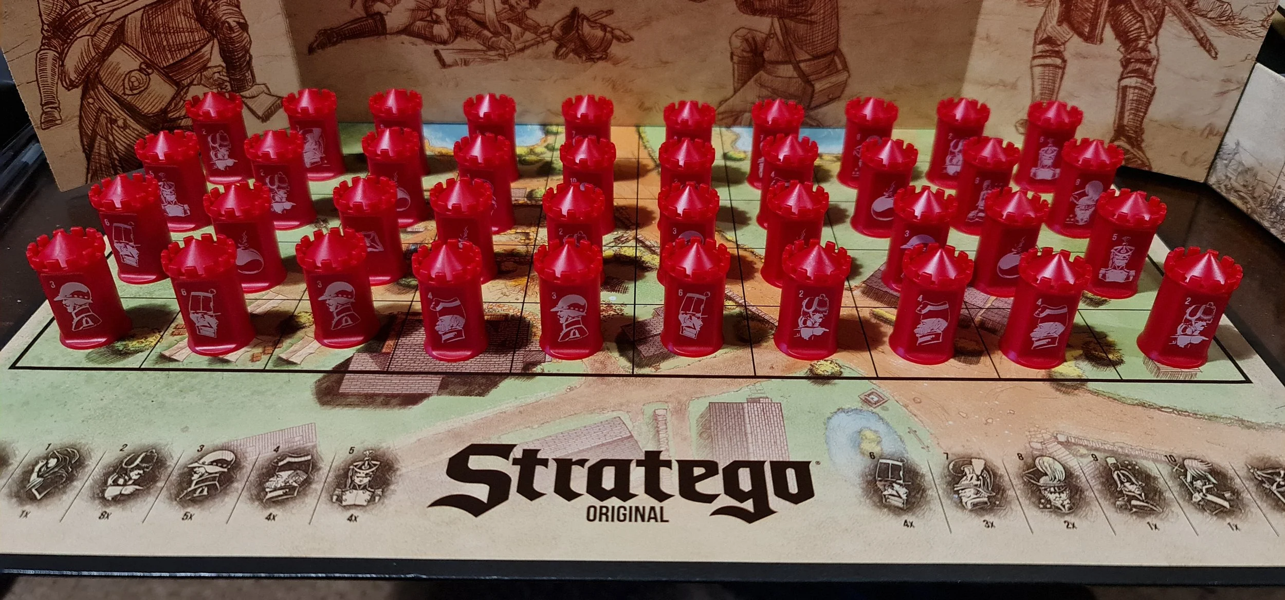
First order of business with my newly-official boyfriend was playing Stratego. I have never won a game of Stratego.
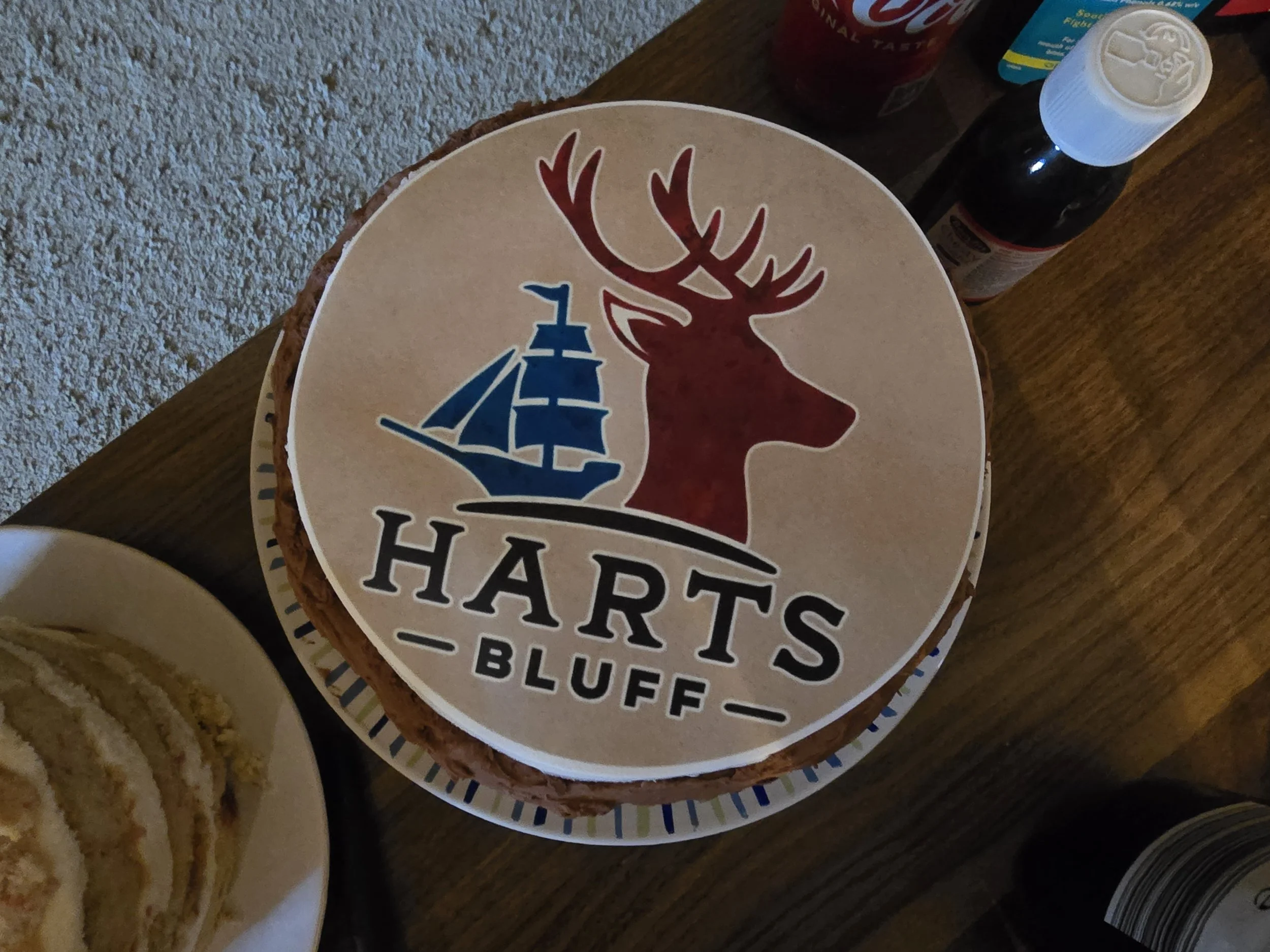
A couple of months later, Harts Bluff, my Blood on the Clocktower server (and my boyfriend’s initiation test as a long term partner), had enough people interested in a meetup for me to meet several of them in person for the first time ever. Hosted by my business partner, that was a huge experience for me.
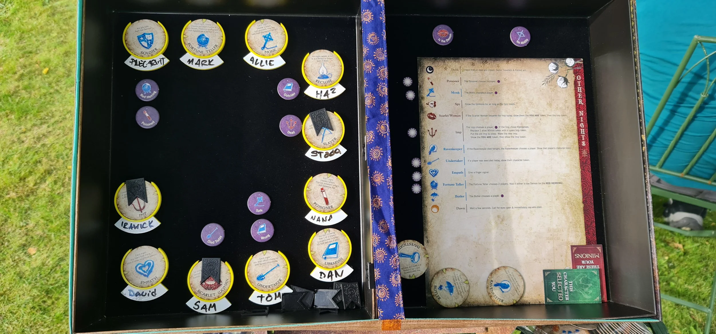
One of the Blood on the Clocktower games from Harts Bluff IRL1. That Empath.
I was also the maid of honour for my lifelong best friend Emily’s wedding to Sam, also a close friend of mine, in August. Those names will come up again in a bit. Needless to say: love them both.
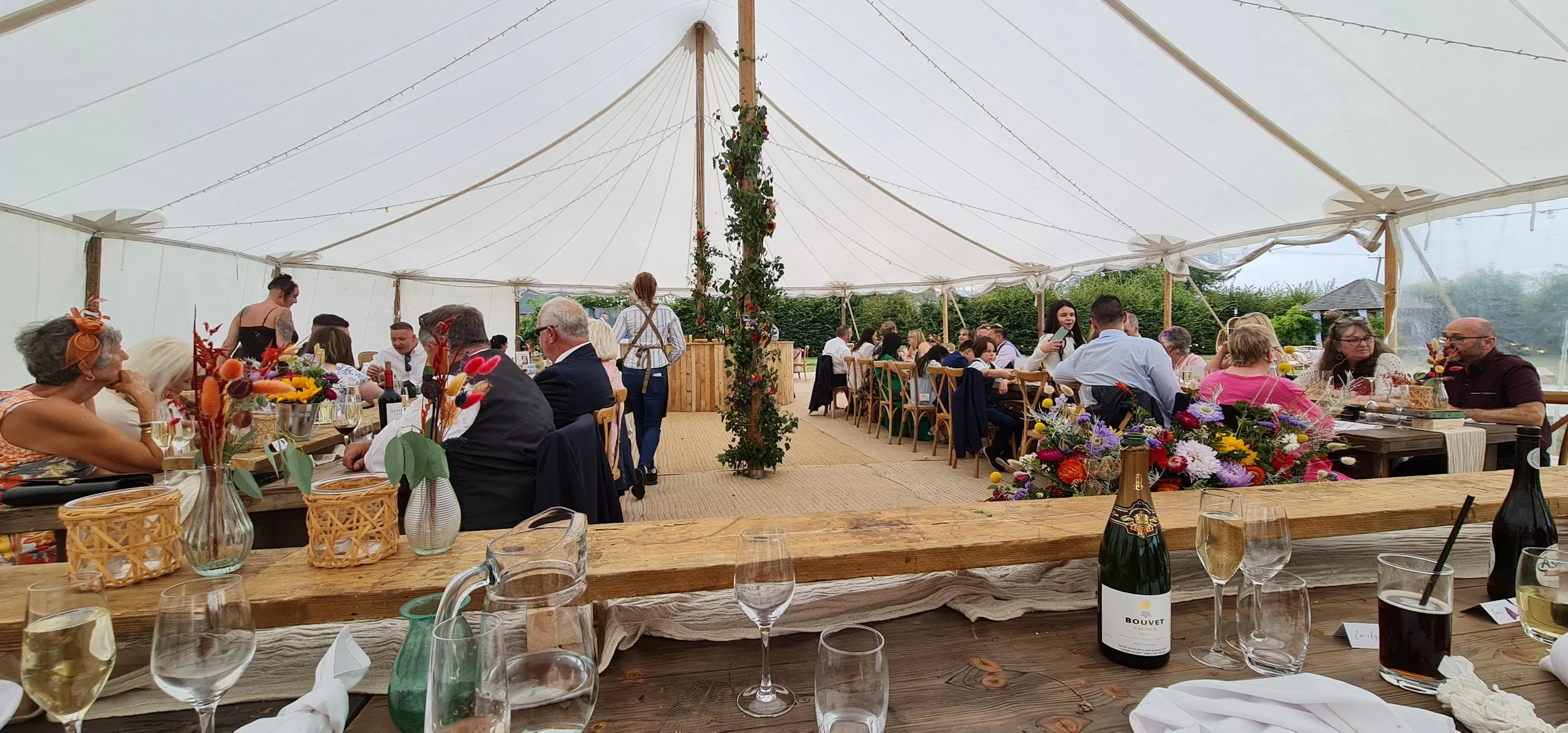
Taken shortly before the speech I was terrified of.
While my newfound accidental extroversion took up a lot of my time, I still made a lot of fonts. All the while, my ever-aging, ever-expanding library was seeing more and more popularity and use.
Modern points of inspiration
Being more unique with my points of inspiration when not a hobbyist any more, but with an ever-increasing bank of existing fonts made, I took inspiration from wherever I could get it at this point. It’s important to seek from places you never thought about before, especially when you have already made so much.
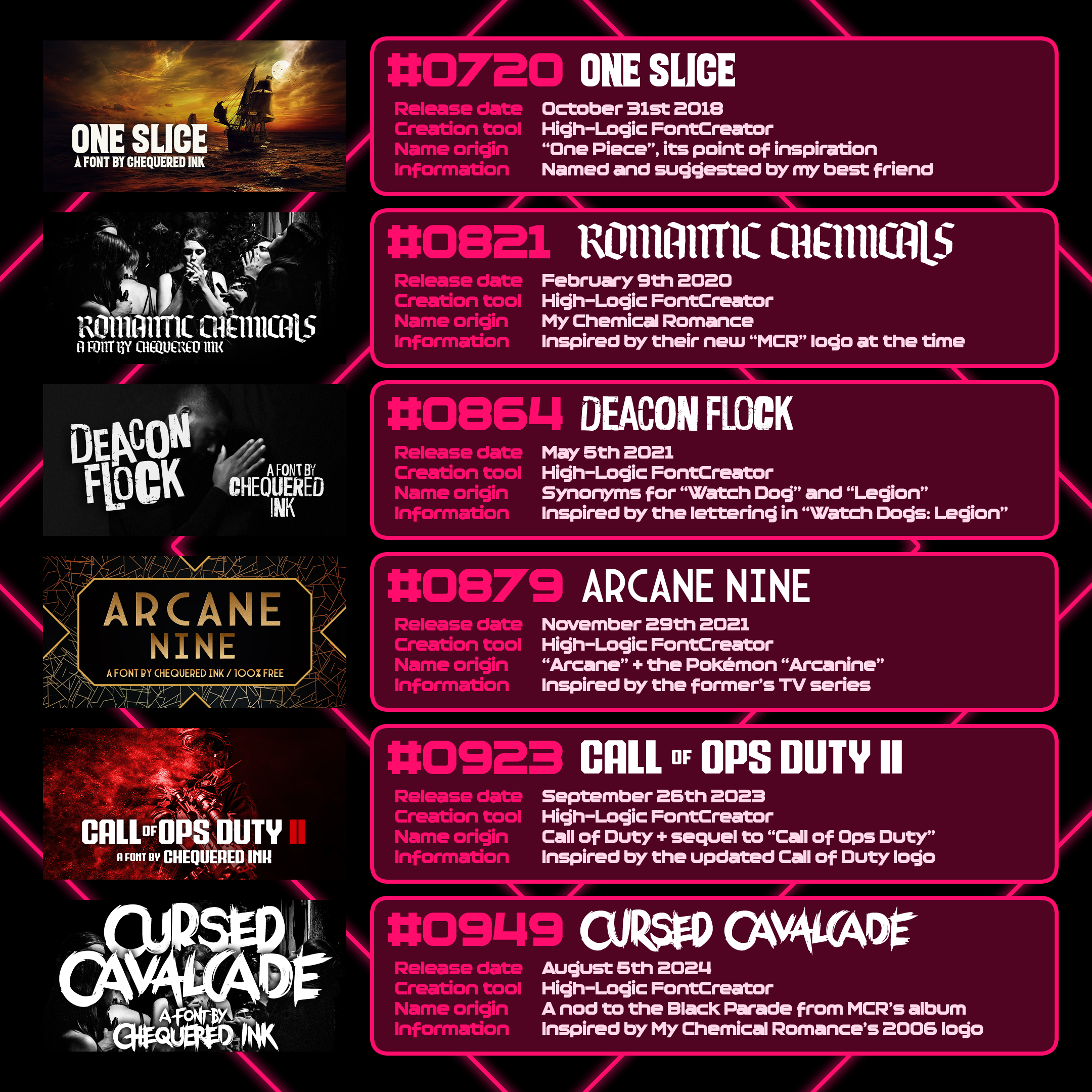
Inspo into the ‘20s
One Slice is loosely inspired by One Piece’s logo. This font was suggested to me by Emily, shortly after reconnected when she found out I had come out as trans and reached out to offer me a ton of support and girl advice.
Romantic Chemicals pays tribute to My Chemical Romance, with their 2020 “MCR” logo serving as the inspiration point for the full font. I love this kind of design challenge, taking an extremely limited selection of characters and making an entire font inspired by it.
Deacon Flock was created when I fell in love with the dystopian lettering employed by Watch Dogs: Legion, my favourite thing about that game.
Arcane Nine is a double-nod to the TV series “Arcane” and the Pokémon “Arcanine”, with the lettering inspired by the former.
Call of Ops Duty 2 was made when Call of Duty updated their logo, also self-referencing my font inspired by the original.
Cursed Cavalcade is another homage to My Chemical Romance, this time to their past – their logo for The Black Parade. Most of the letter forms in Cursed Cavalcade are completely unique, the inspiration is mostly stylistic.
I moved with two different friends to Swansea at the end of September 2024. Both are friends I met for the first time at our Blood on the Clocktower meetup in May. I do not know where I would be in life without this happening – probably back at my parents’. I’m so, so grateful for every friend that got me to where I was at this point, and where I am now.
One thing that was a little worse for wear, though, was my bank balance. With Harts Bluff’s second IRL in October, and several other trips around and out of Swansea, I was burning through money fairly quickly with all the extra outings and events of 2024. Me and Daniel both needed something to land within the next year or so, or potentially face getting icky normal jobs again.
The Chequered Ink All Fonts Pack
Something landed. At the end of 2024, Daniel had the idea to package all of our fonts and sell them all at a nauseating discount. It went viral. Some of my online heroes pushed it online. It spread across BlueSky like nothing I’ve seen before. I had a post on Bsky with 1,900 reposts, and that wasn’t close to Chequered Ink’s strongest post.
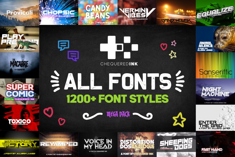
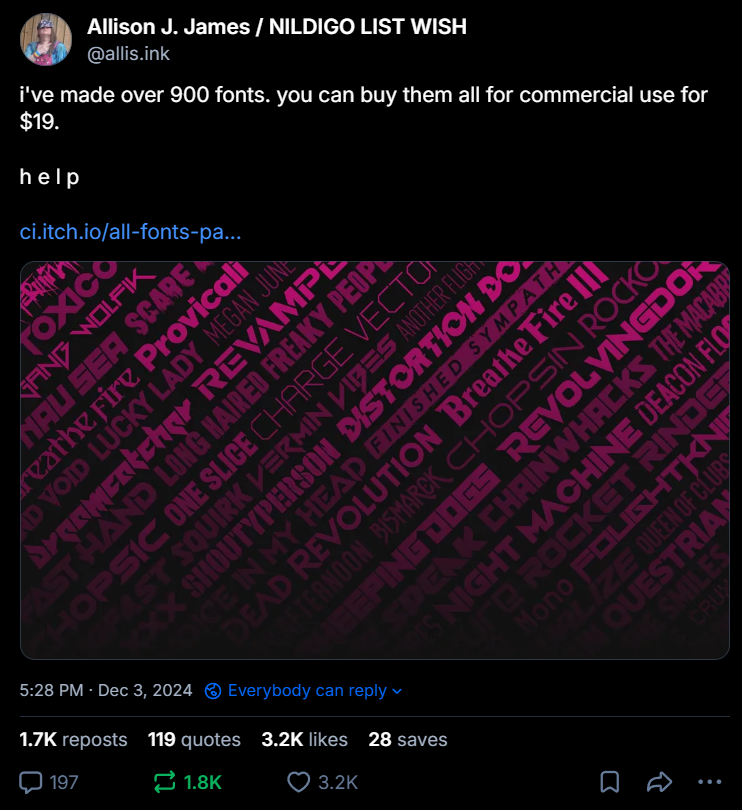
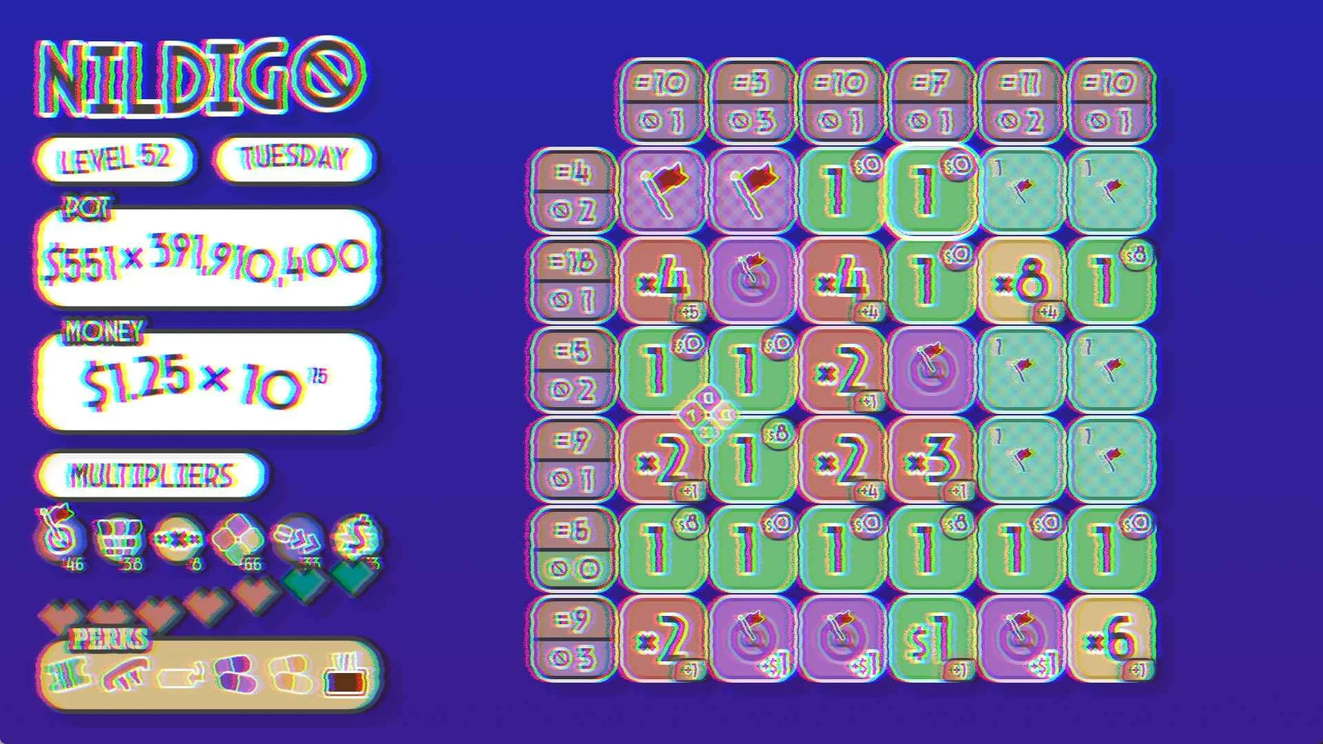
It opened so many opportunities that I was able to slow font output even further and start developing a big game in 2025. That game’s coming out soon. It’s called Nildigo. It’s the best game I’ve ever made.

New fonts for new games
With a reduced font output and heightened game output, I often made the former with the latter. Even when the games ended up not materialising, the fonts always did.
Revolver and Co
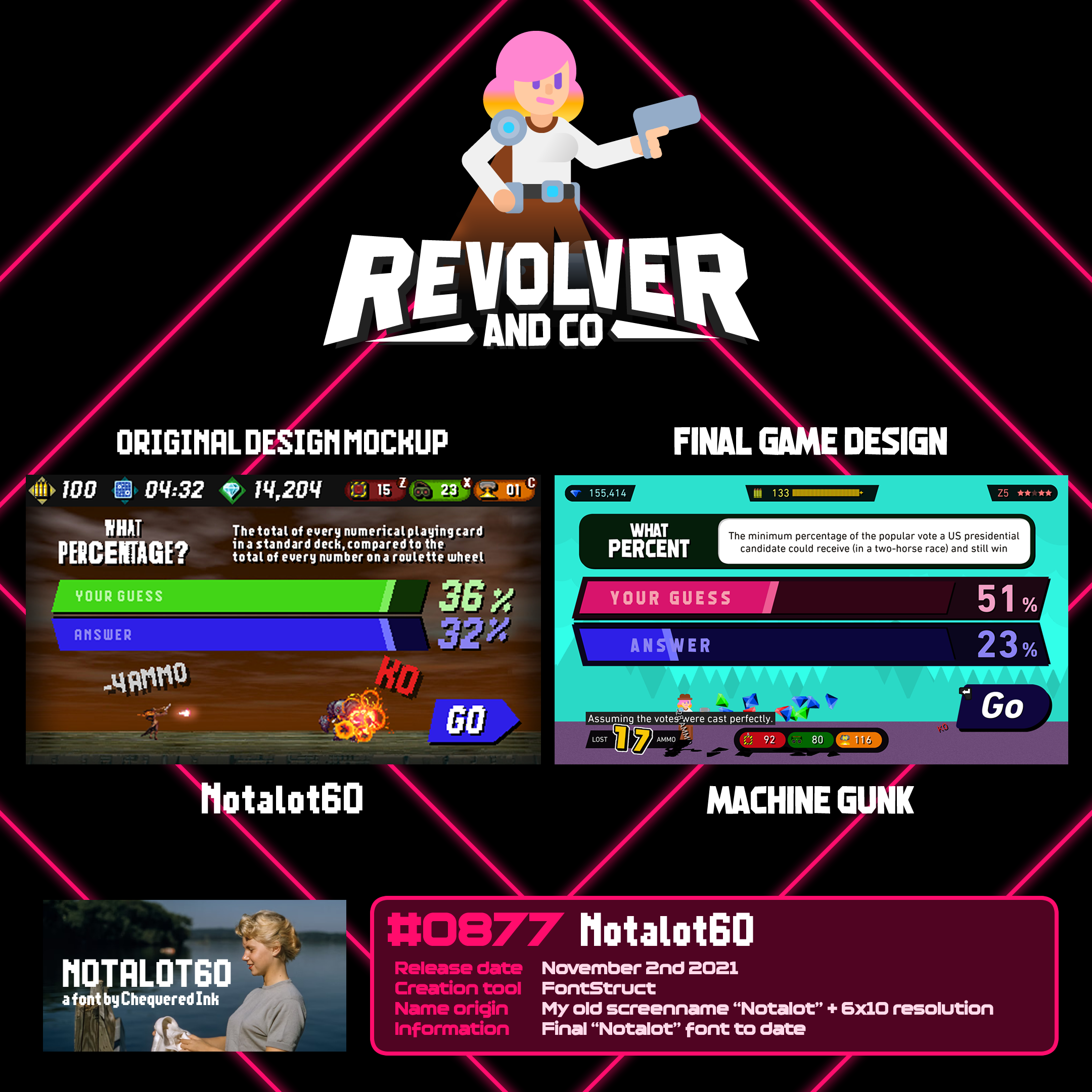
#0877 Notalot60
My bigger games sometimes go through several graphical iterations before I land on what I’m happy with.
Revolver and Co was originally designed as a more subtle upgrade to the original Rev%lver, sharing its low resolution. I attempted to make a font that was readable enough while staying true to its pixel density; I had one too many reports from early playtesting that it could be difficult/taxing to read.
Revolver and Co moved on to a completely different art style, at a true 1080p resolution. However, I still had the font I made for its older UI in a near-complete state.
Months after the game released, I renamed that font Notalot60 and released it for the public to use in all the ways I hadn’t.
Nildigo
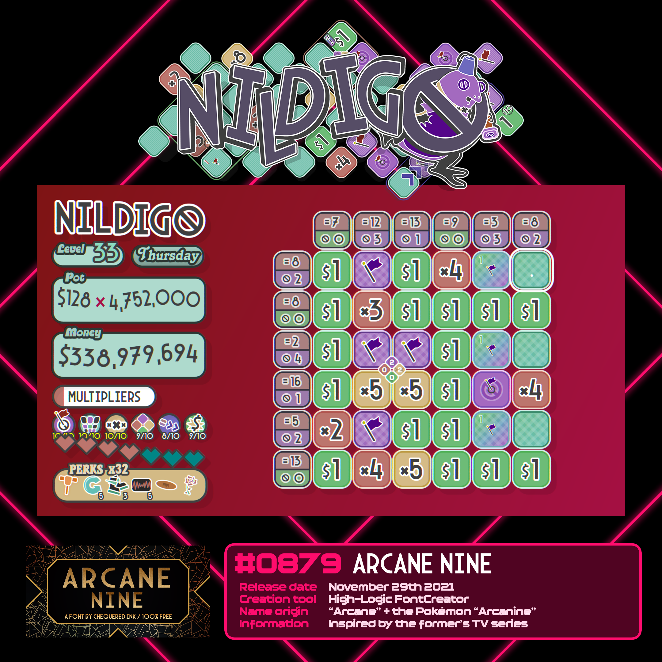
#0879 Arcane Nine
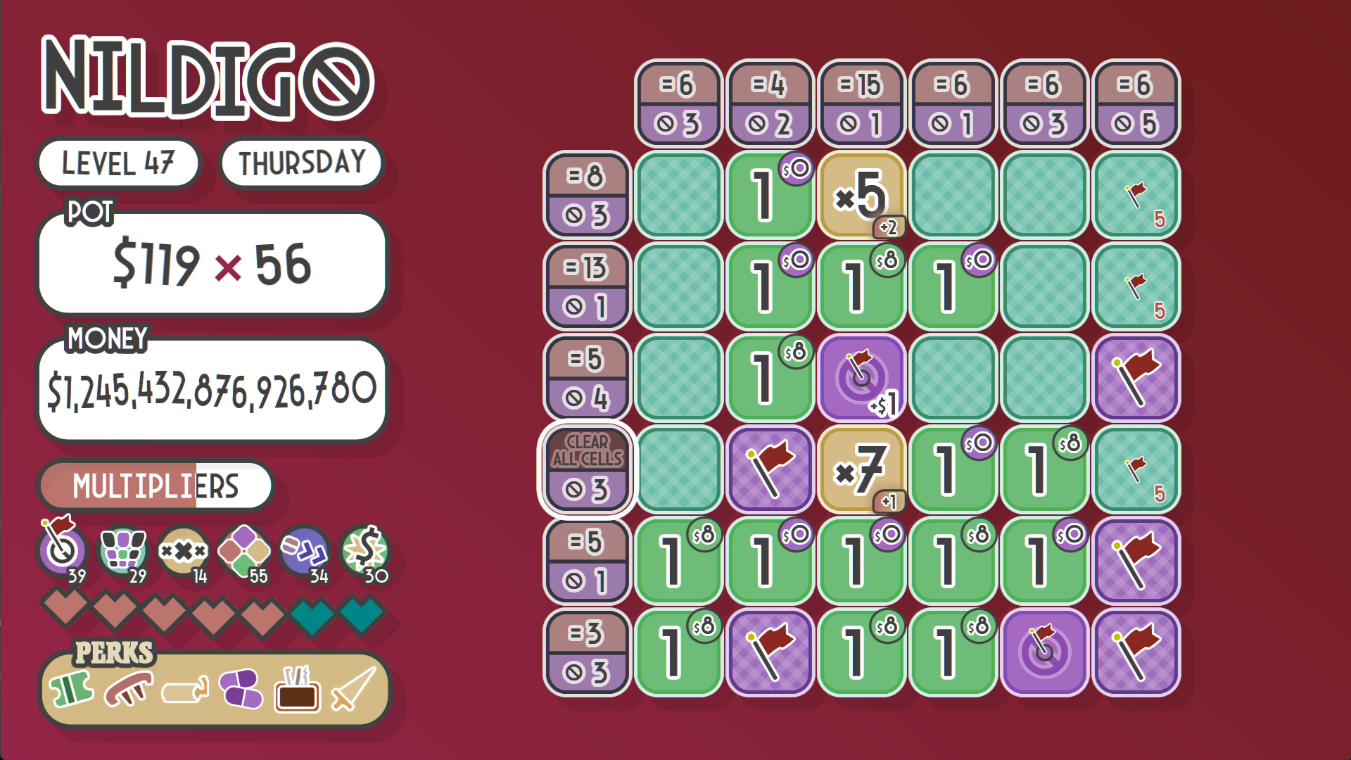
Sometimes, game ideas form fully in my head in a flash of inspiration. Sometimes, they gestate over years and years. Weirdly, Nildigo is both.
I had the idea for a game inspired by Voltorb Flip from Pokémon HeartGold and SoulSilver a month after it came out. My first-ever mockups of what became Nildigo are from 2010, the same year those games came out.
However, turning that into a roguelite was an idea born from my newfound love of games like Luck be a Landlord, and almost the entire method of introducing perk and power mechanics came to me in around an hour of “aha!”
What influenced the style, and let me to choose Arcane Nine - and this is no word of a lie - is I was enamoured by the idea of the 3s having a flat top. I knew I’d designed one for that font. I chose that font.
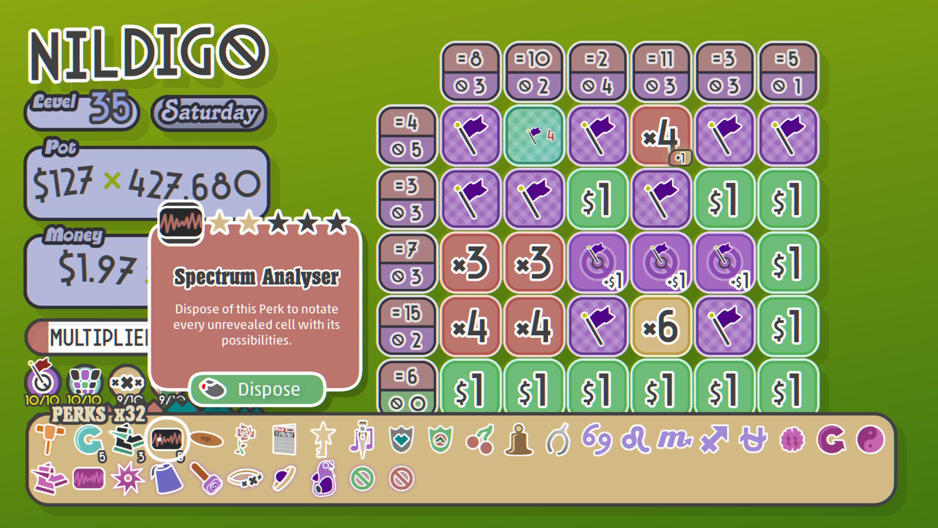
The entire of Nildigo’s visual identity was built around the art deco style of Arcane Nine, and with it, my inspirations with the game snowballed. The villain Nildigod, the tongue-in-cheek writing, most of the perks - all descendents of that decision.
Font choices matter, folks!
Chainwhacks
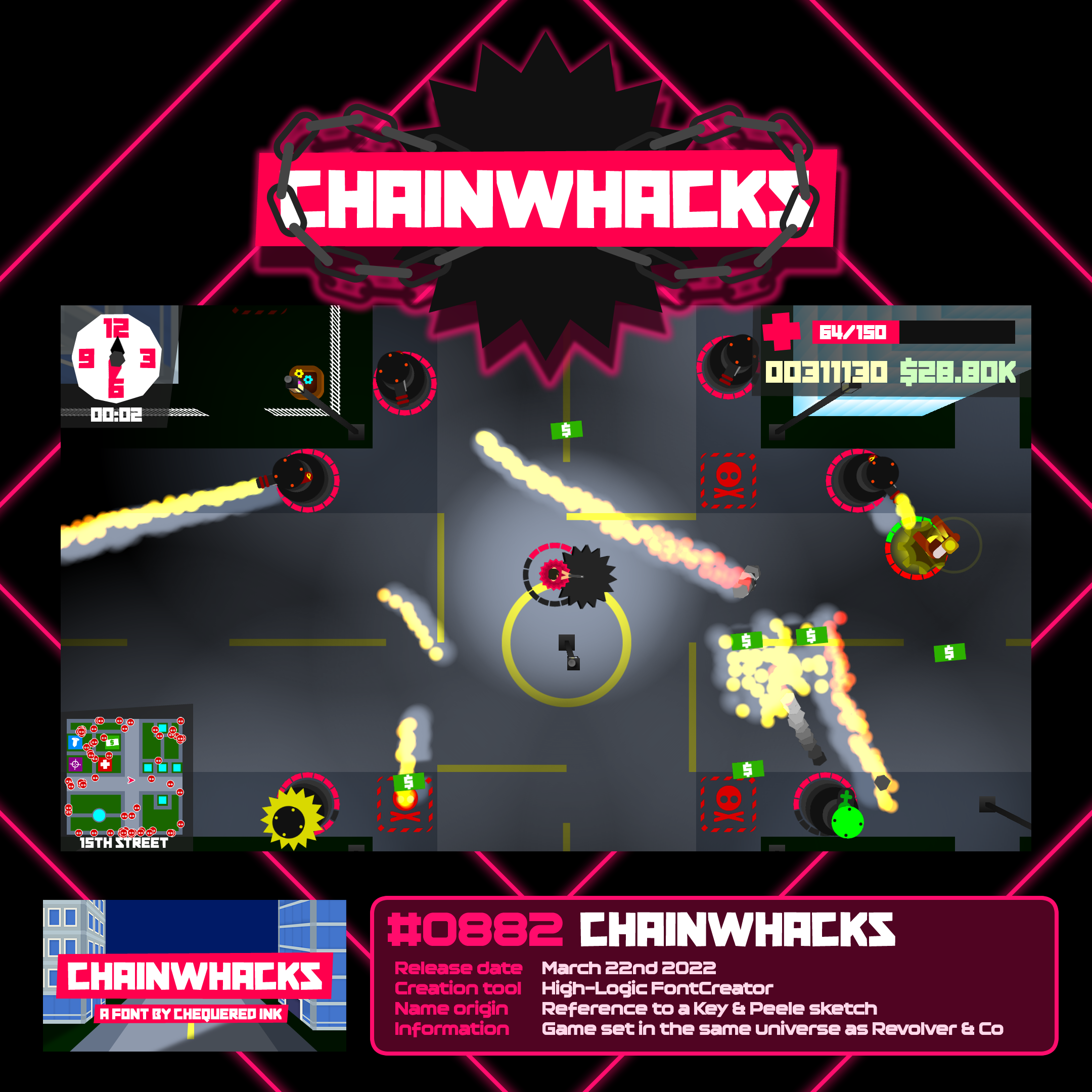
#0882 Chainwhacks
When GX.Games ran a large-scale game jam in 2022, I took it as an opportunity to flex both my major skills - short-term game development and font creation - in one go. I made the font for the game, the game around the font, and named both the same thing.
Chainwhacks expands a universe I started in 2007 with a game called “Puzzle Valley” and then dipped into with further lore in Revolver and Co. The main character from Chainwhacks, Lana, later appeared in a 1.1 update to Revolver and Co, which tied the stories together even closer. (Long story short: all three are set on an island, before, during and after a human vs robot war.)
The font is modestly basic, but I think it’s one of my more interesting fonts, tying together my experience of comic fonts and angular fonts into a single unified style that works well.
And incase the name rings a bell: yes, the game and font are both named after one particular Key & Peele sketch.
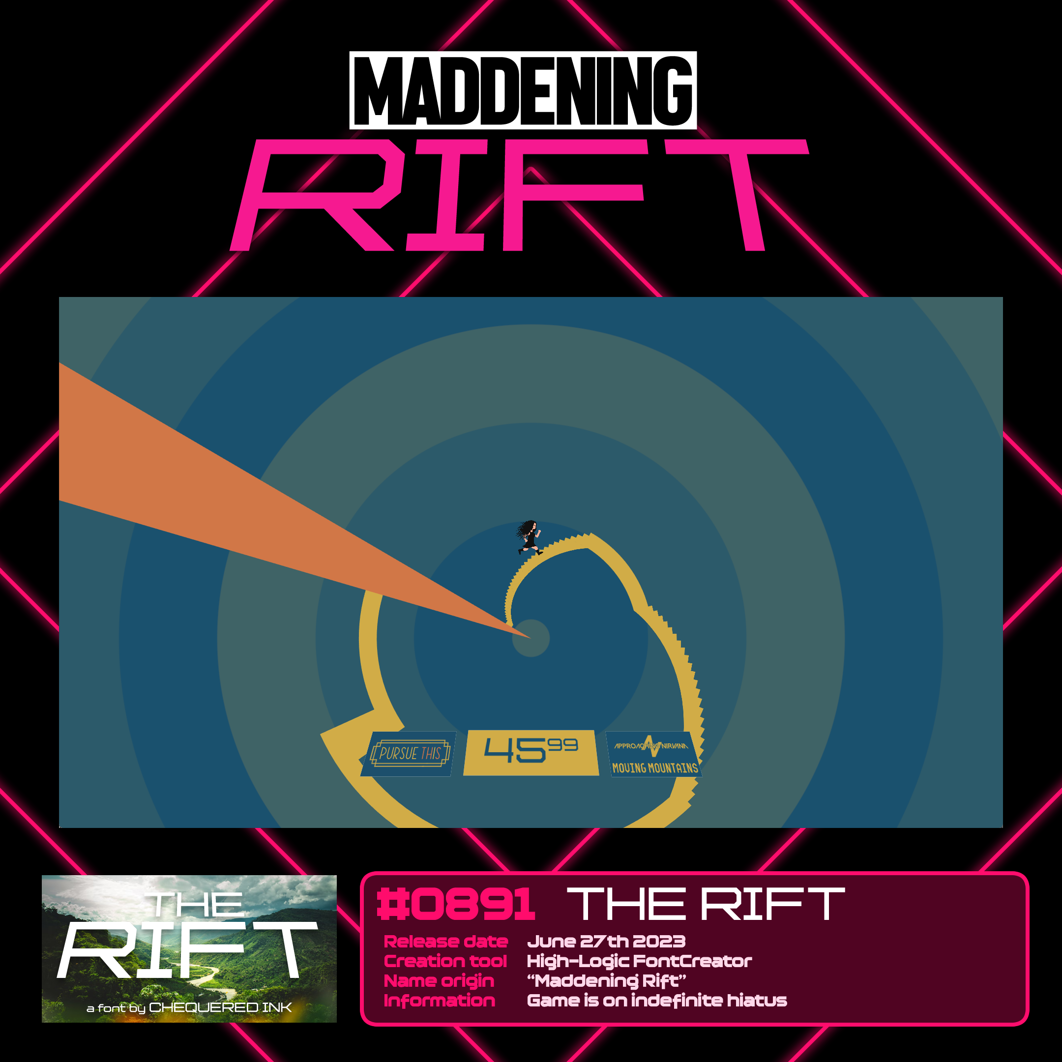
Maddening Rift
#0891 The Rift
The Rift and The Rift Shop were both made for Maddening Rift, the planned finale of my Maddening series that ended up never materialising – I over-scoped and lost interest in making it.
I was fond of the character I wrote for Maddening Rift, Holly Zane (descendent of the characters from the earlier Maddening games), so I used aspects of her design in a different game, Monoquous 2, instead.
I’m glad I ended up dropping Maddening Rift. A lot of what I did with it, I’m sad to have not seen through with, but I definitely plan on taking some of it and applying to better games.
It is bittersweet to feel like I am done with a game series that was truly formative to my career, but I’m glad to have that time to devote to games that excite me as much as my upcoming baby Nildigo does. More on that a couple of entries above.
Maddening Rift lives on, through The Rift and The Rift Shop, which I released for others to use, and Holly’s appearance in Monoquous 2, which did materialise in December 2024.
I still use my own work in my games to this day, often for smaller projects. My three latest free games to use my own fonts are the sensibly-titled “Sniper Waifu”, “Gunfire of the Manatees”, and “You Wouldn’t Steal an Idle Game About the DVD Logo”.
Business and busy-ness
My font output remained steady through 2025, even with my schedule getting more and more packed with other events…
A big birthday celebration in January with 8 of us from Harts Bluff, board game trips in February, zoo and shopping trips in March, our third IRL in April, showing off Nildigo in Bristol in May, Swansea Pride in May, finding out we’d need to move out at contract’s end in May, A LOT IN MAY ALONE, another big group get together for Emily’s birthday in June, moving house to Bedwas with Emily and Sam in July, suddenly getting into the Welsh Gender Service for the plans regarding my physical transition end goal in August (three days after attending Daniel and Nana’s wedding mid-month), a huge Cardiff shopping spree and ANOTHER board game meetup in September, Harts Bluff’s FOURTH IRL in October, a long, third-of-the-year visit to my closest Clocktower-origin friend (she wouldn’t appreciate being named so let’s call her “Market Research”), and my first ever Christmas away from home along with a couple of dates and other meetings in December…
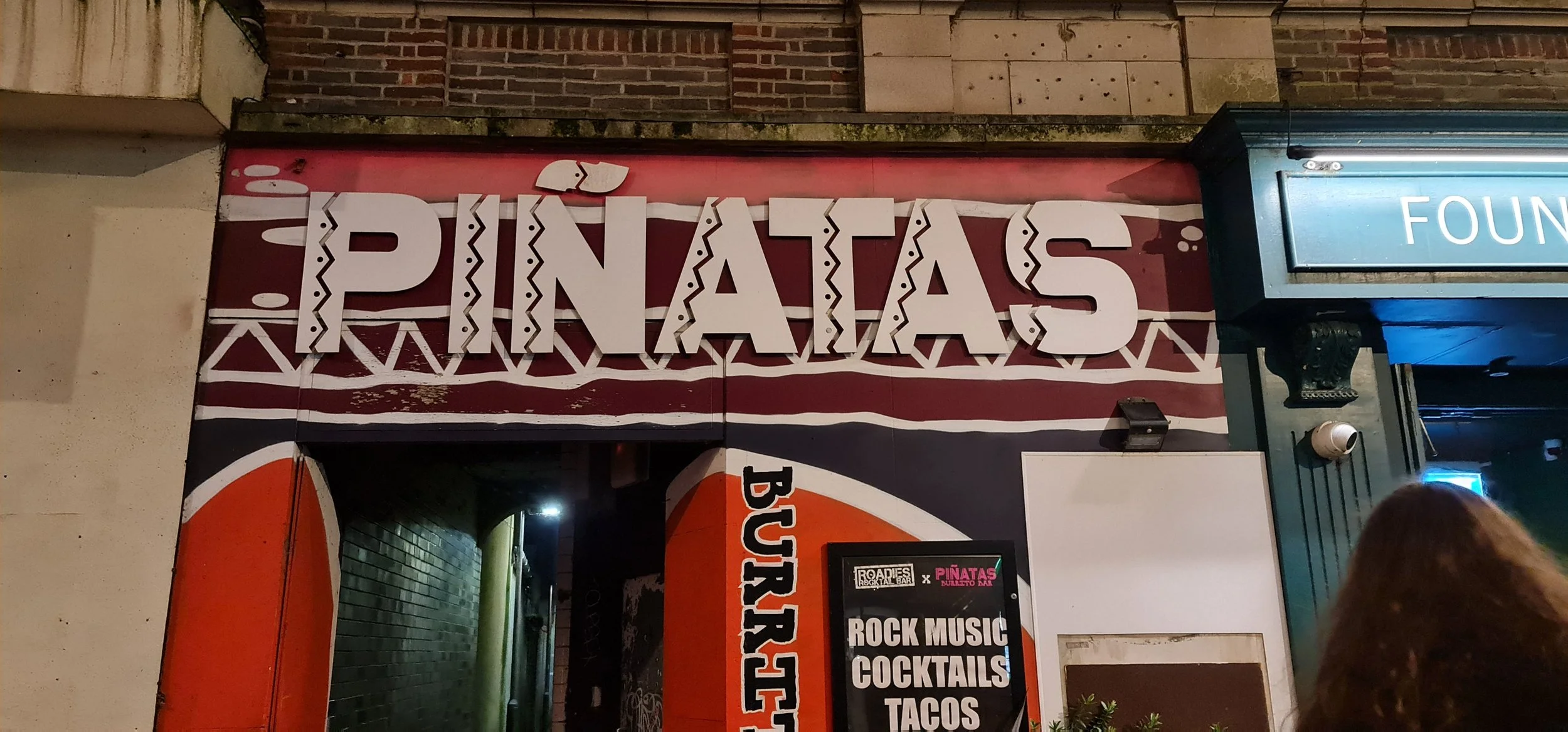
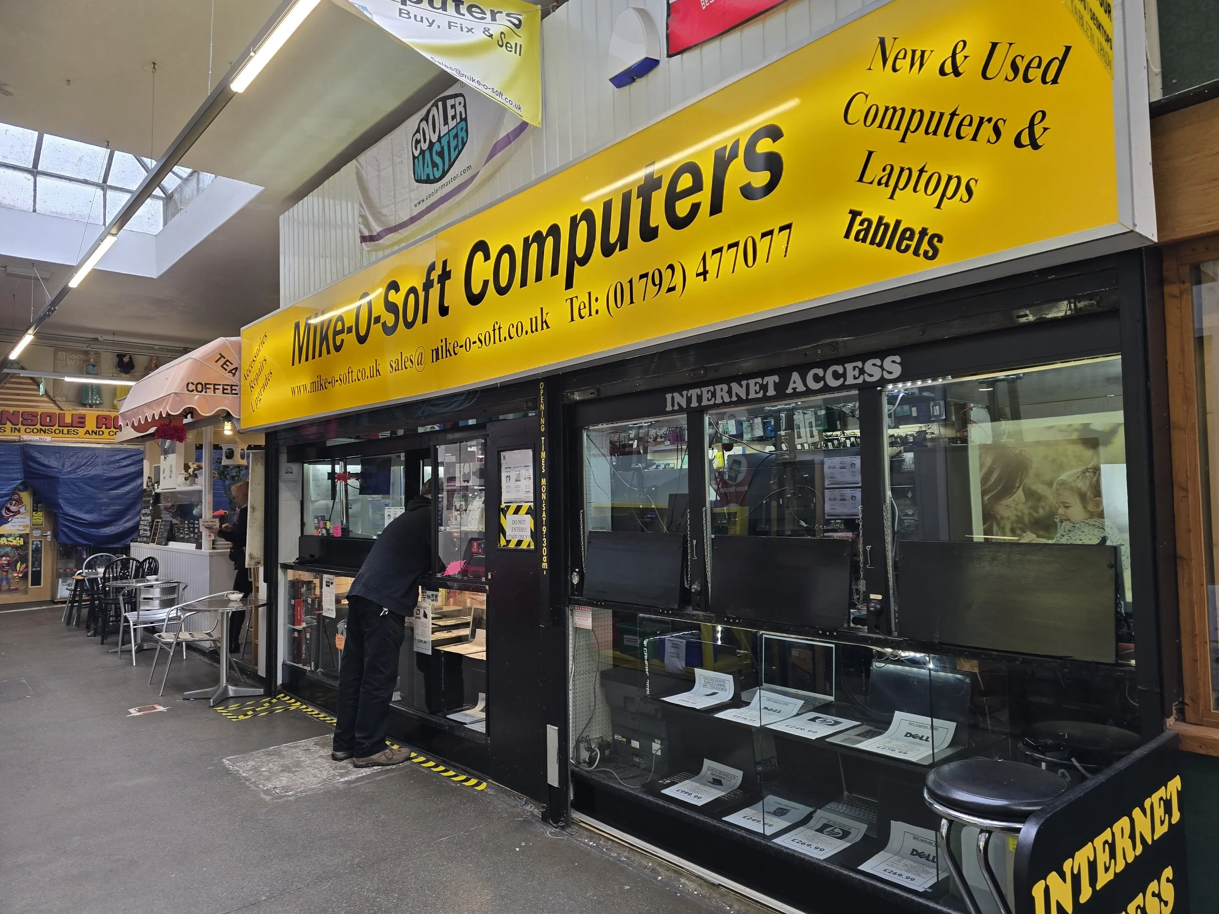
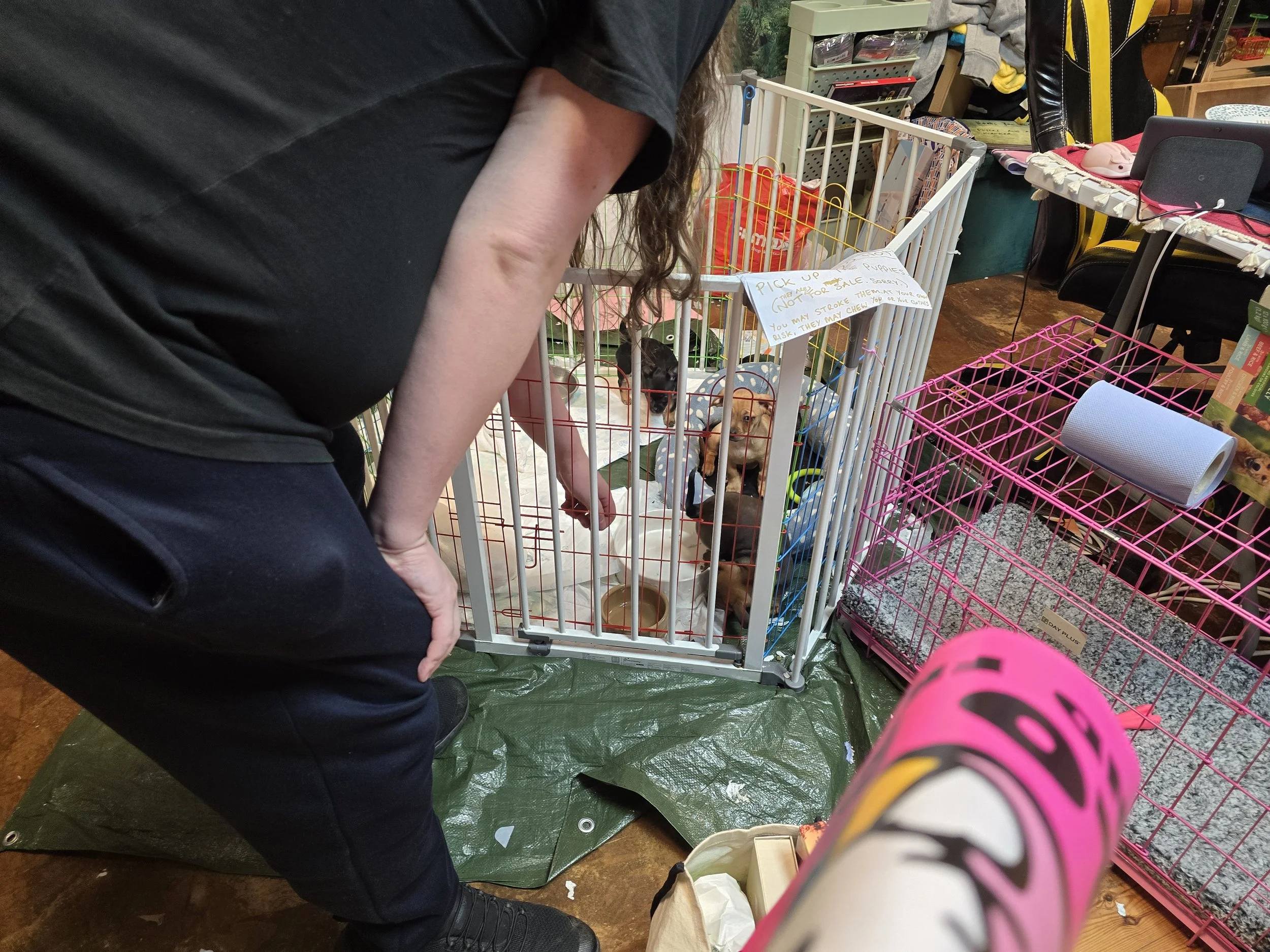
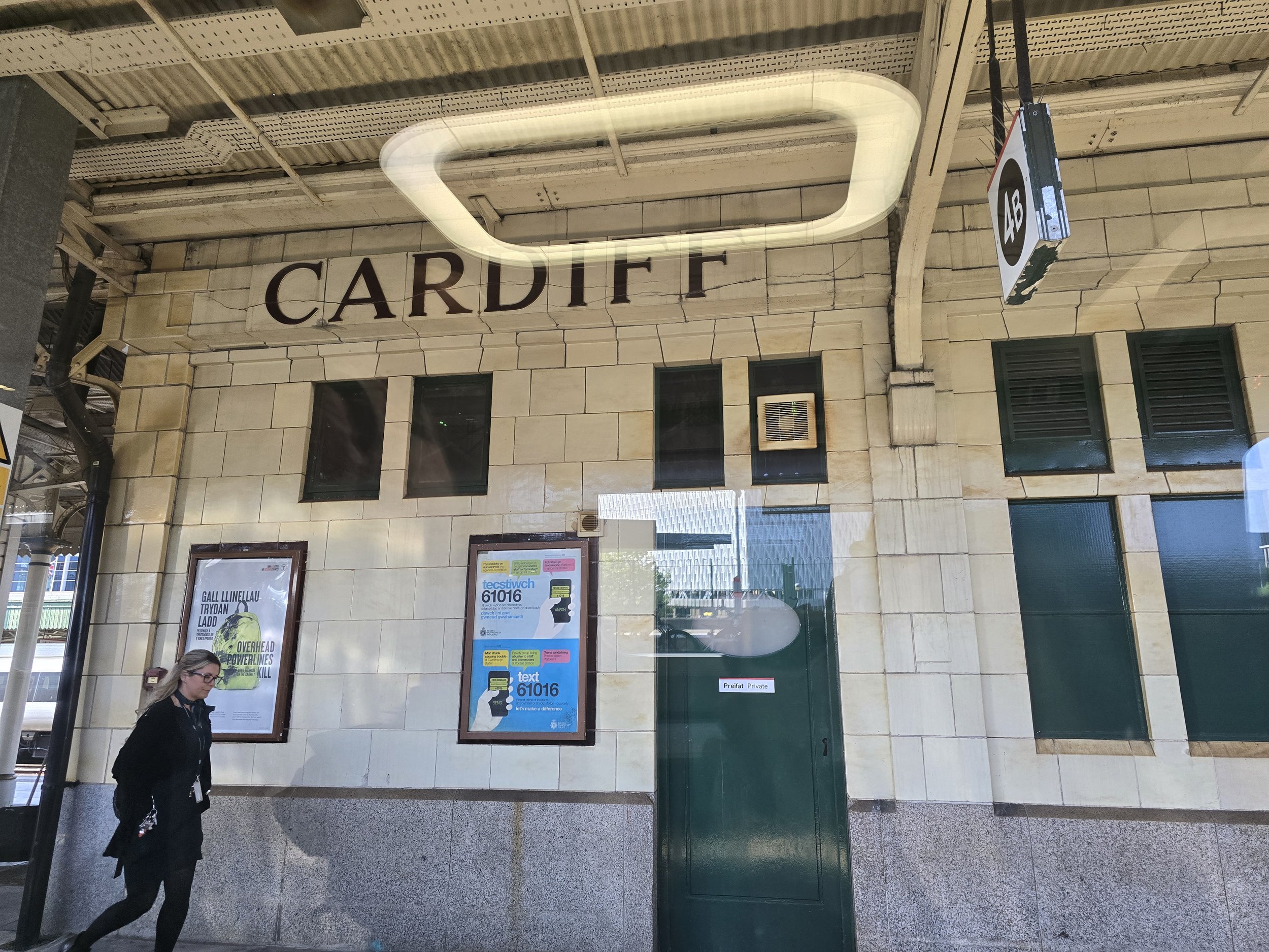
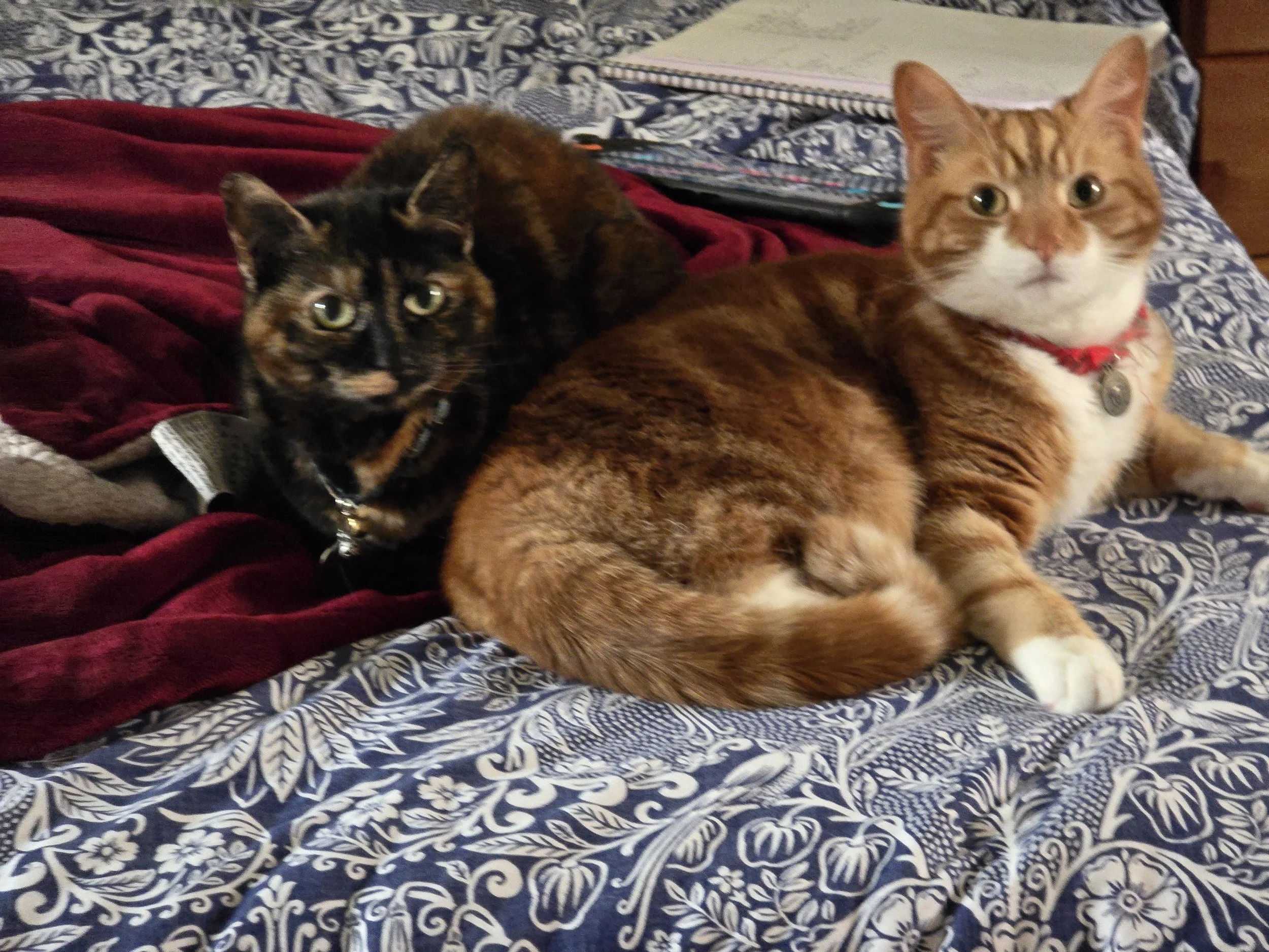
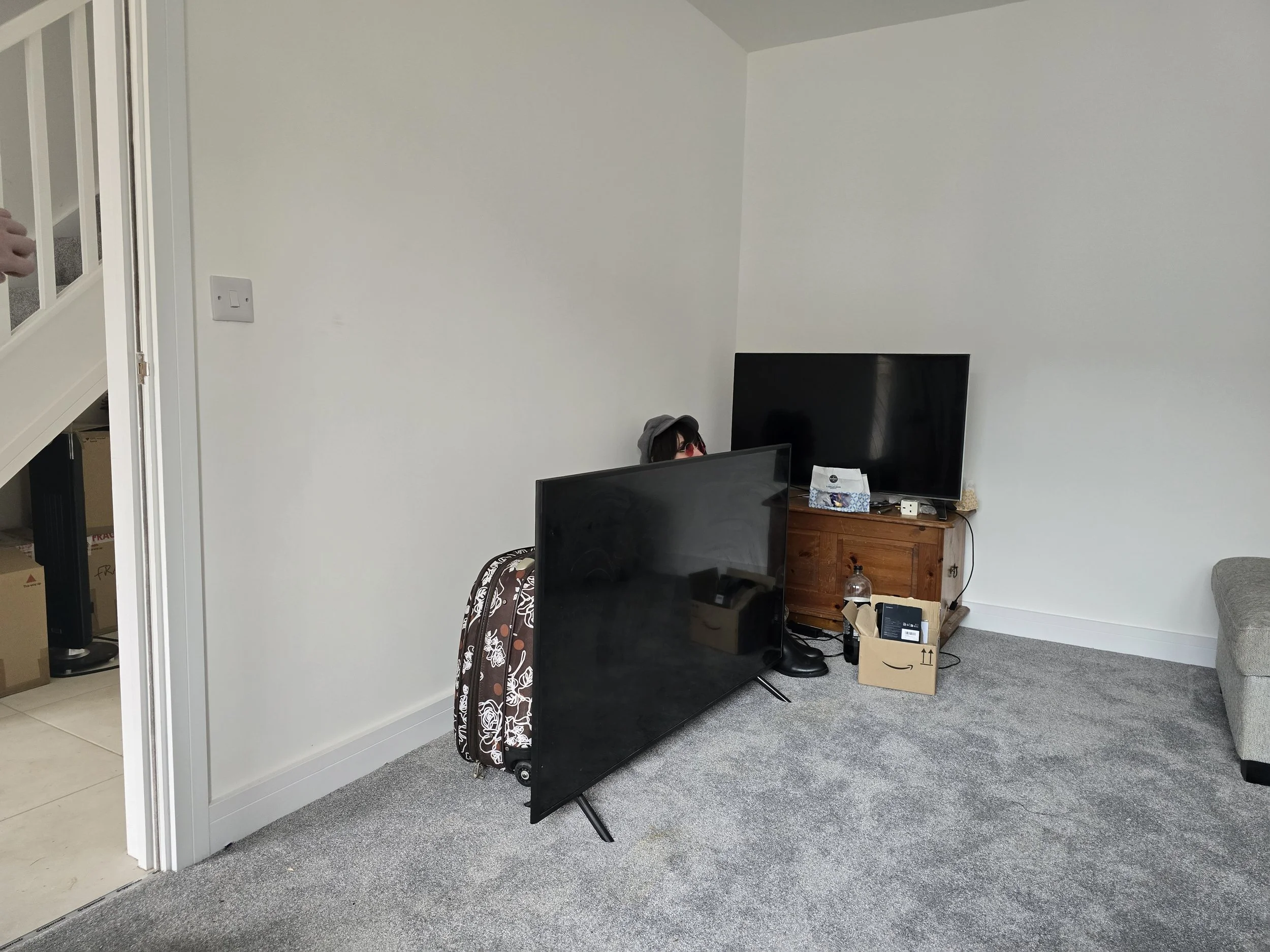
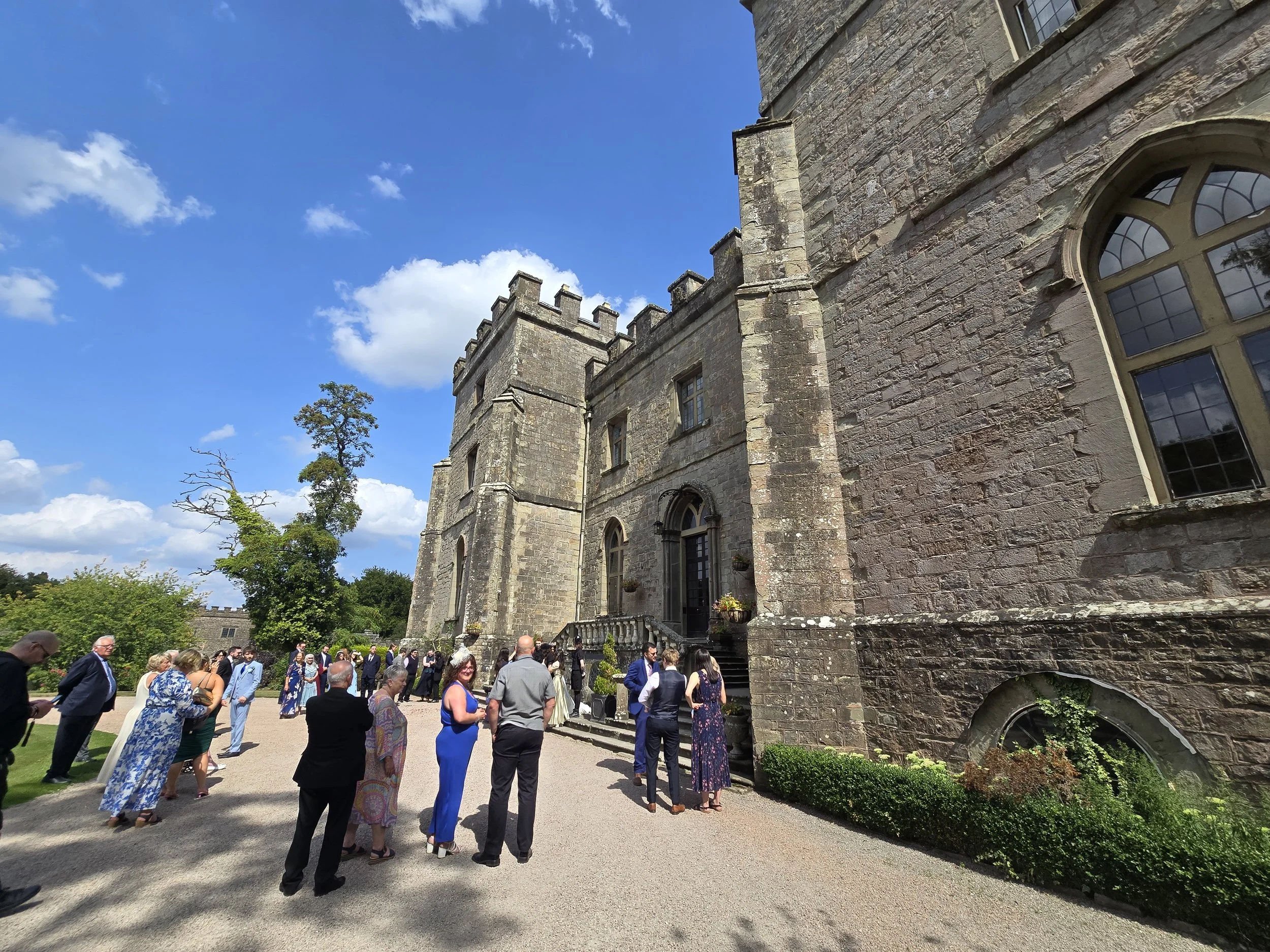
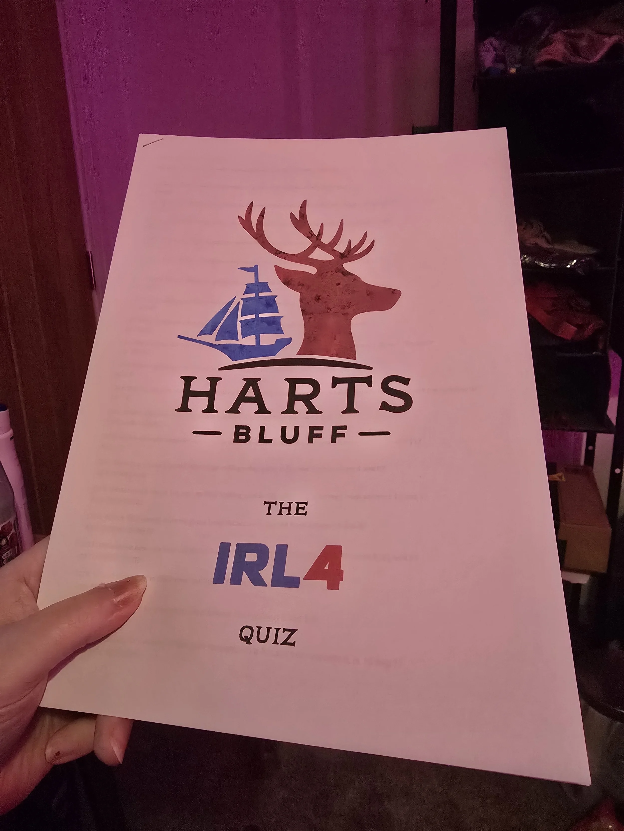
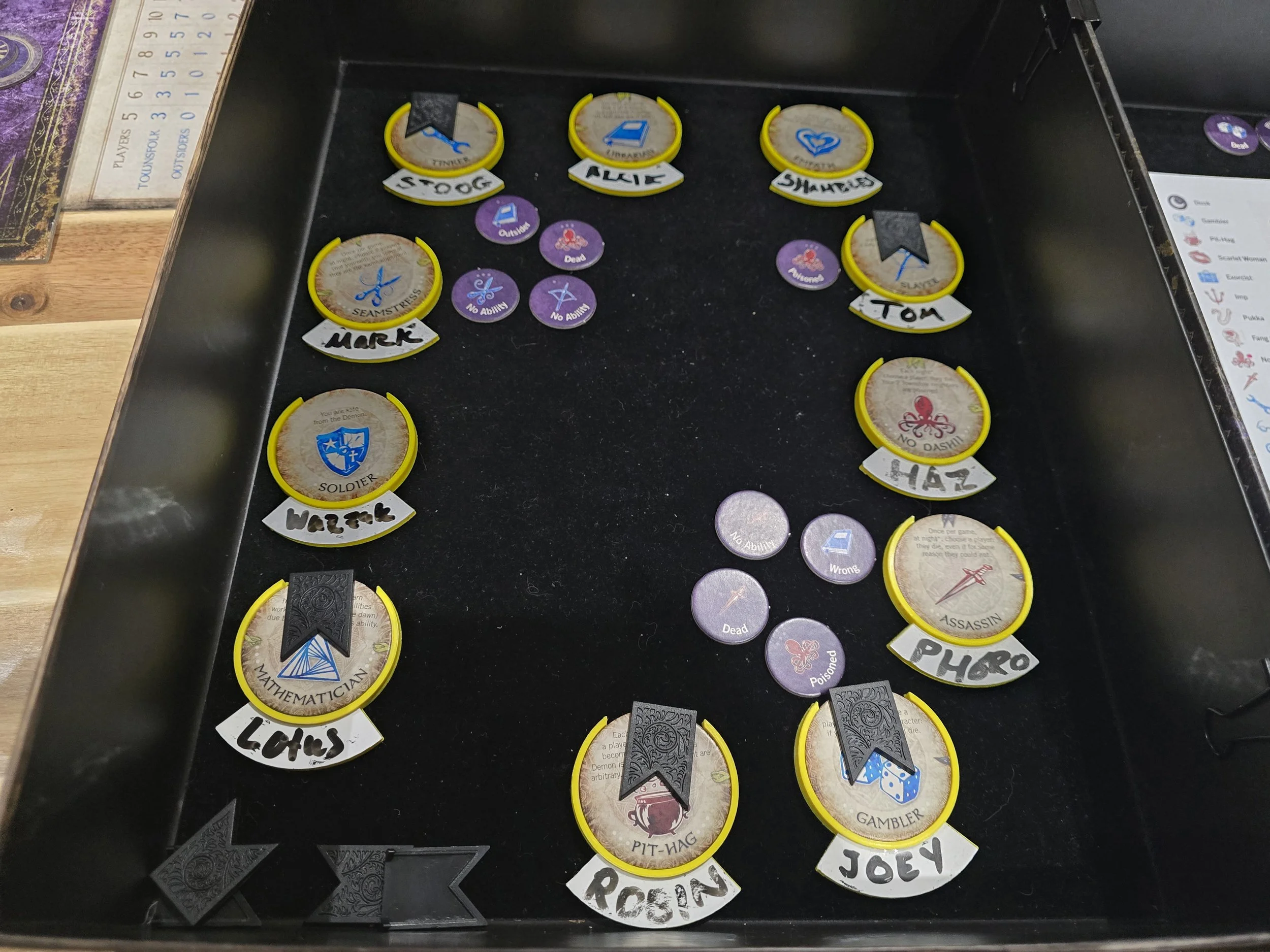
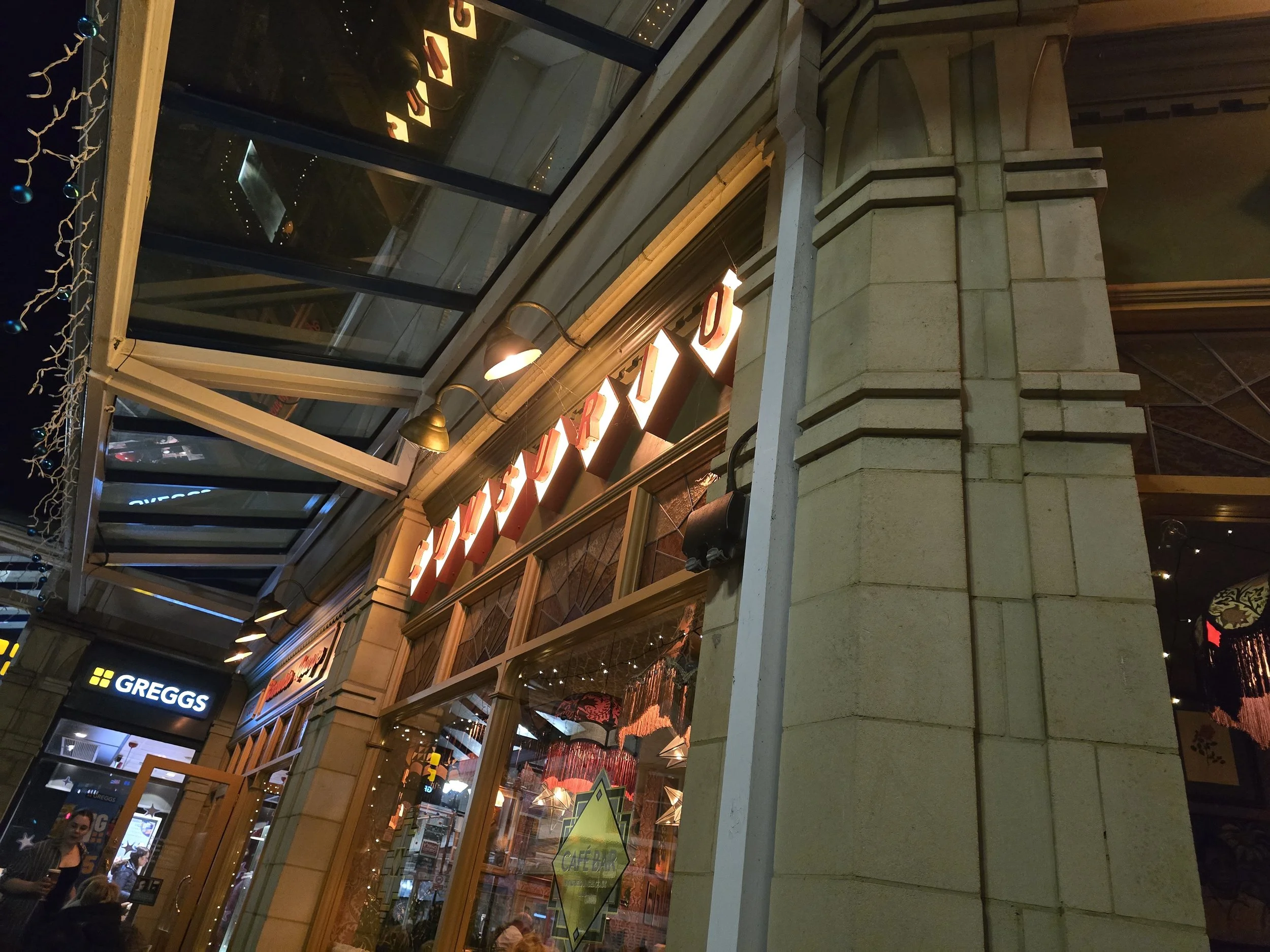
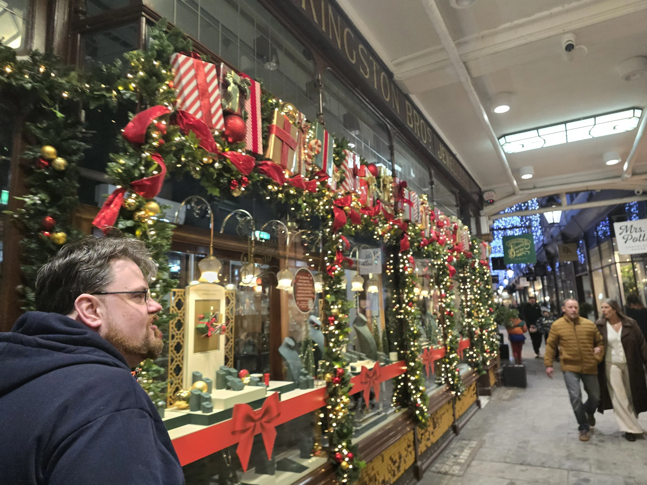
A picture a month from 2025, massively glossing over multiple other events.
Yeah, 2025 was exhausting. But NOTHING compared to 2026. I decided for 2026 to make a New Year’s Bingo card, with a 5x5 grid of personal goals. I’m quite far into it already. And the moment I publish this, I finish a line and pass my primary goal for the Bingo board. Huzzah!
One of my goals was to reach 1,000 fonts made – I started the year on 978 officially made. A lot of the resulting fonts have mirrored what’s happened in 2026:
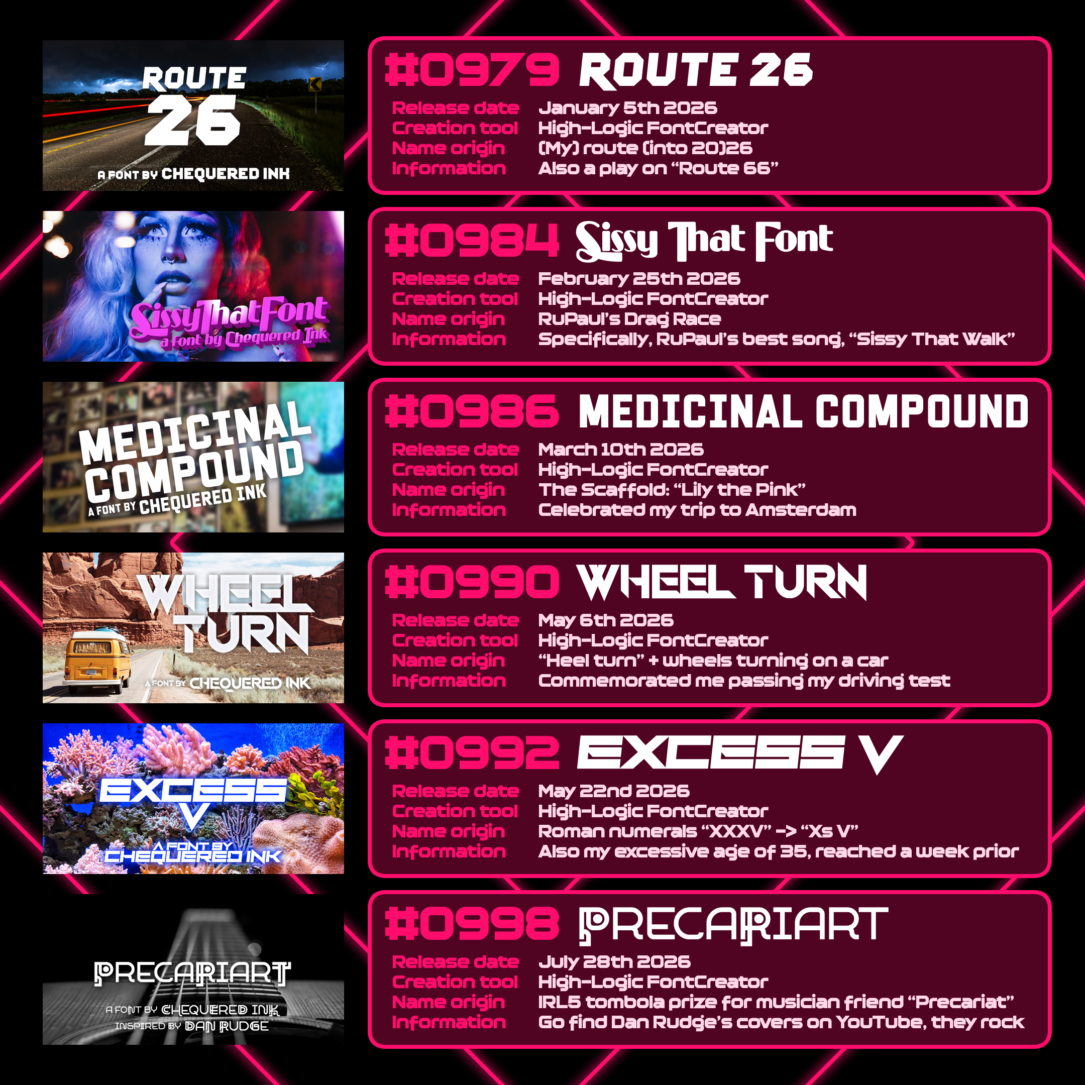
2026 Fonts & Milestones
Route 26 was a little nod to my plans for the year ahead. Primarily – continue losing weight with the surgery deadline in mind. So far so ahead.
Sissy That Font references Sissy That Walk, my favourite RuPaul song. I got into RuPaul’s Drag Race thanks to prompting by Emily. Market Research also got into it alongside me.
Following my visit to Amsterdam with Emily and Sam in March - my first time leaving the country since 2003, my first time ever flying, and much, much more besides - do I need to explain the name “Medicinal Compound”?
Deciding in, like, November, that I wanted to learn to drive. Having the spare funds to book intensive lessons, and to buy the cutest car I could find. (His name is Sandy the Pikachu, after my incredible ex-boss who sadly passed in the weeks prior to the car’s acquisition). And only THEN… learning to drive. I passed first time. Four minors. Yay! To steer, you make the wheel turn. When you move, the wheels turn. Hence, the eternally-pleasing multipun “Wheel Turn”.
“Excess V” is pun on “Xs V”, or “XXXV”, my age. I turned 35 this year.
Harts Bluff’s fifth IRL occurred in July. Part of that event was a traditional British fete where we held a tombola, and one of the prizes was to name and style one of my fonts. Dan “Precariat” Rudge won, and chose a font he could use for his music going forward – Precariart was the result.
Heaviest hitters (the half-a-mil club)
Over the years, several fonts have become standouts for their download counts and numbers of uses I’ve seen randomly, online and in-person. For an idea of the kinds of styles that have given me the most success, here they are.
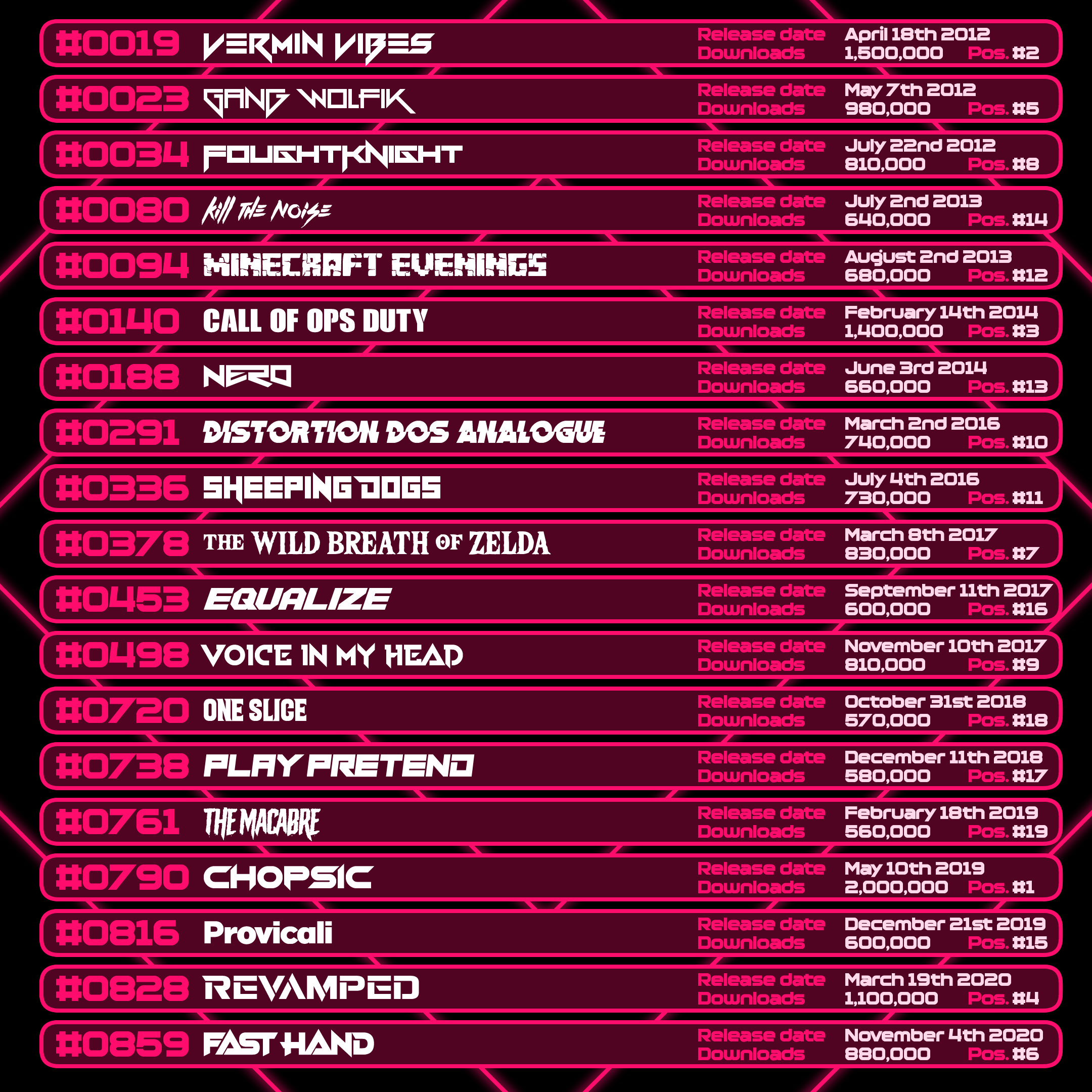
Vermin Vibes, Gang Wolfik and FoughtKnight were the trio that really solidified my prevailing style – techno, angular, and inspired by the EDM I listened to so often. Once I learnt FontCreator, my biggest hits were suddenly more often those directly inspired by others.
Kill the Noise, Minecraft Evenings, Call of Ops Duty and Nero were very blatantly-named tributes to musicians and games.
From there, a lot of my bigger fonts were back to basics again, with Distortion Dos Analogue, Sheeping Dogs, The Wild Breath of Zelda, Equalize, and Voice in My Head. Two of those were made in FontStruct, at a time when my Font Creator use was increasing, and one – Equalize - was started years before I ended up finishing and releasing it on a whim. Disavowing perfectionism has been nothing but a good thing for me.
There is a 222-font gap between Voice in My Head and the next font that’s reached half a million downloads, bridging the 2-year period where I was at my most depressed. Does this say anything about mindset versus output? Not a clue. Anyway…
Of my fonts from the last 5 years, none have reached 500,000 just yet, but several are on track. Most of the fonts above are still regularly receiving hundreds of downloads each day.
The beginning of the end
With 999 fonts done, including the 999th for the early stages of this giant retrospective…
It’s time to make the 1,000th.
[VII] Making Font #1,000 “The Inevitable End”
High-Logic FontCreator – or any big, versatile font creation suite out there – will have its own subset of tools with which to make whatever you want, however. One of my favourite techniques is to create brush stroke fonts my way: public domain or licensed images of generic strokes of paint, digitally modified into alphabets, numbers and punctuation.
I wanted to throw back to that style for font 1,000. But… uh…
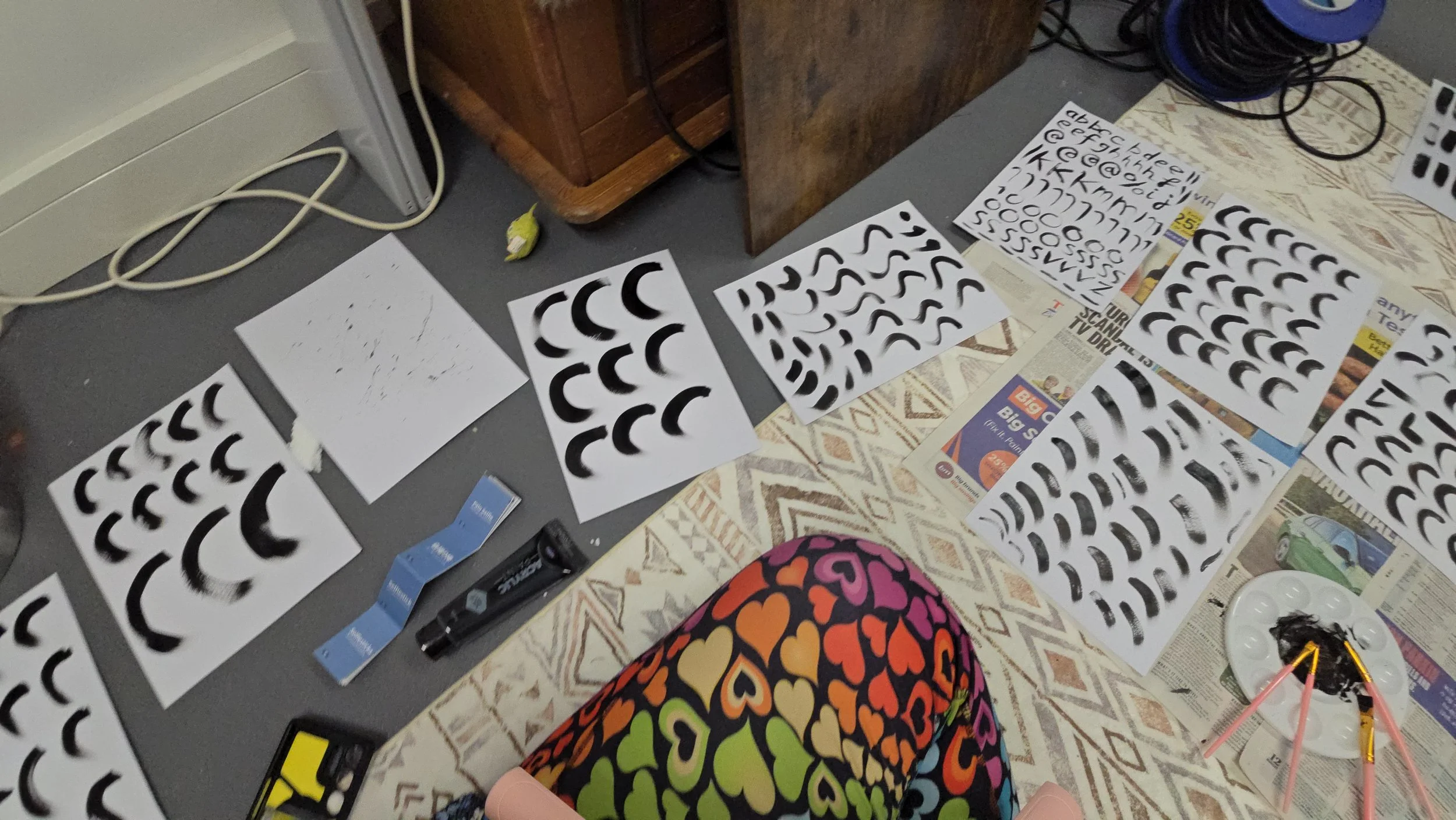
Unfamiliar territory
You can do this digitally just fine. But I have always wanted to try going analogue, while keeping the process I know for most of this. Font 1,000 felt like time to pull the trigger.
If you want to emulate this process, hot swap any part of it with something you’re more comfortable doing. Digitise the strokes, or license them from stock sites. Or even paint every letter manually. Or use a pen! Or use anything! Black on white is ideal, but photo-editing lets you get away with basically anything if you’re willing to put the time in.
I bought a newspaper, black acrylic paint, a stack of card, paintbrushes of various sizes and shapes and a little palette, and spent a couple of hours sitting cross-legged on the garage floor, filling sheet after sheet of card with brush strokes. I gave myself as much to work with as physically possible.
Most of the strokes were straight lines and curves of various sizes. I did a few extra experiments too, like a sheet of just paint I flicked from a brush to create extra paint splatters, and a page of lower-case (that ended up unused).
My goal was to create a good selection of usable strokes with tapered/fading ends, in order to create a deliberately scrappy-looking brush font by the end of the process.
After a couple of days leaving the results out to dry, I ran each page through my scanner until I had a folder full of .pngs.
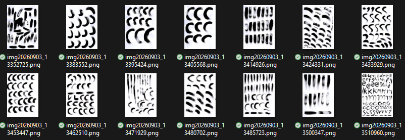
It doesn’t look like a lot. But it’s a lot.
After this, for future time-saving, I did several things to the results. I applied an alpha filter to turn the blank areas of the page transparent (this is a reason black-on-white is ideal), with a slight gamma levelling to make sure the transparent areas were 100% transparent. I then separated every single stroke into its own layer in several compiled images - one for straights, one for curves, one for splats etc - for ease of use later on.
Quite a few of the resulting strokes are nearly usable, but not ideal. The joy of being as experienced as I am is – I’ve done this part so many times, I’ve effectively futureproofed the entire process. I know how I can easily tweak the result, either in Fireworks or FontCreator, to make an end result I’m happy with. I’m very comfortable with the workflow.
Deliberately choosing styles where imperfection is expected makes it even easier.
Once everything’s separated, I give myself a new blank canvas and start drafting letters – seeing what works, and what will work for the entire font. Letters are pieced together from several strokes each; it’s easiest at this point to do the non-curved, more basic letters first. E, F, I, L and the like.
Once I find a style of lettering I like, I start completing the alphabet – in very similar ways to how I did it in FontStruct too. Starting with letters that are trickier, like S, and more fundamental. I can then use those letters’ forms to help create other letters, and make sure the curvier letters fit in. (All the while, in my case, crossing my fingers that I’ve done enough usable curve strokes to cover the font.)
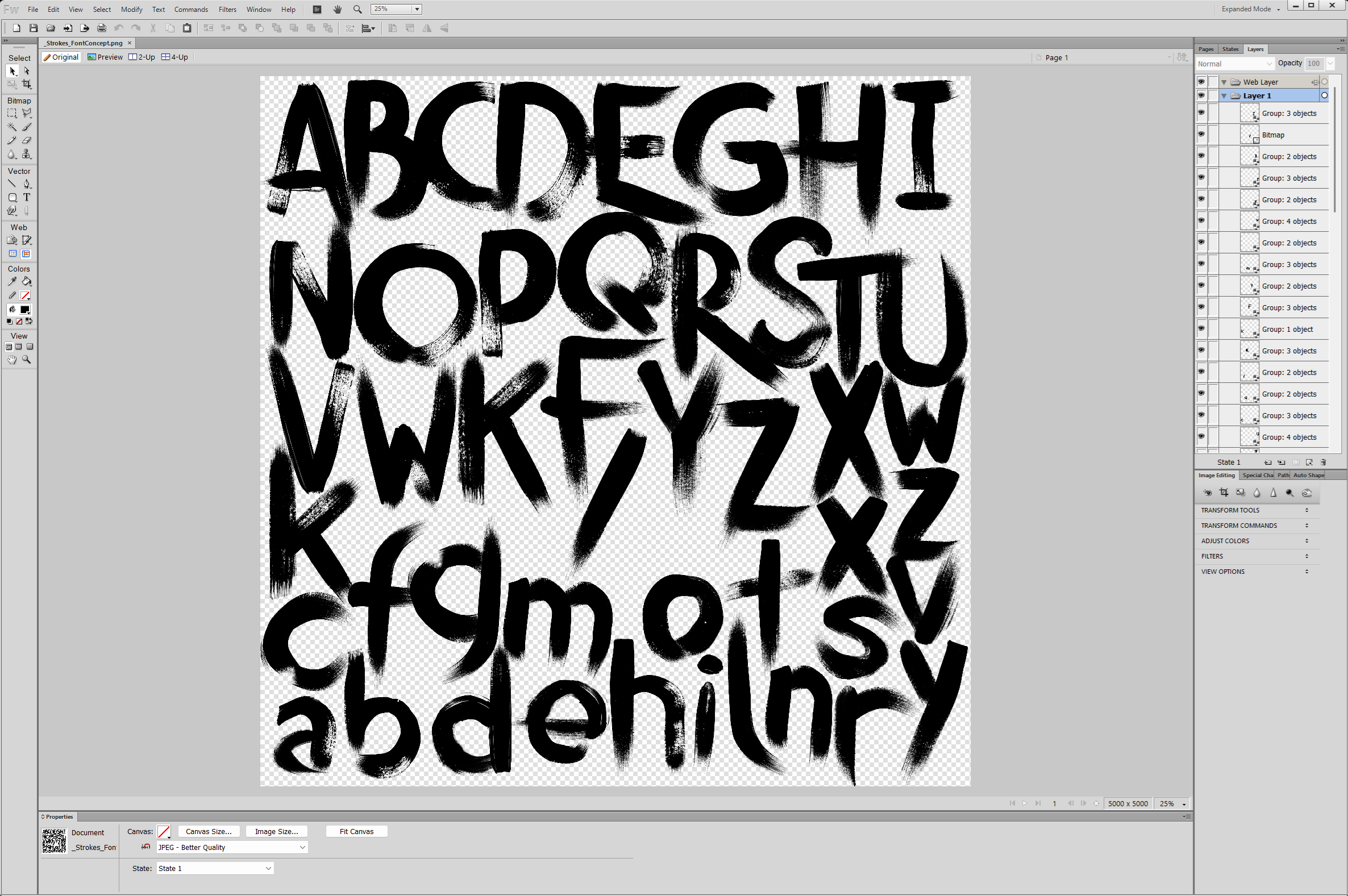
All of this can be done in any design program. There’re plenty of free options, and plenty of paid but non-obsolete options too. I’m stuck in my old ways.
Some photo-editing is done while I am still in Fireworks. Generally, with the method I am using, it is better to edit what I can here, since any imperfections will be masked when the characters are converted to vectors in FontCreator. Those that aren’t, I can deal with later.
At this point I started loading what I have into FontCreator. For my workflow and programs of choice, the import process is as easy as it gets – copy from Fireworks, paste into FontCreator. It immediately converts the pasted image into vectors, with black areas as “filled” and white or transparent as “unfilled”.
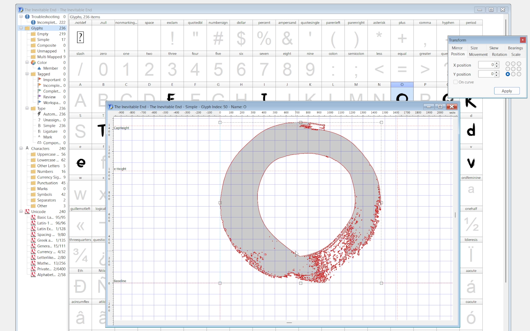
As each letter is imported, I sized it to roughly meet CapHeight at the top and Baseline at the bottom, then adjusted the width line for optical consistency
In some cases, I am already tweaking characters after importing them. The most common adjustment I will make at this stage is slightly moving counters to keep stroke widths consistent – this is easier to do with vectors than the raster artwork.
Where it makes sense, I shortcut some characters by modifying what I already have. For example, in the lowercase, I merge the top of the “I” with the bottom of the “L” flipped, to make the “J”. I move around the paint artifacts and flip around the tittle* so any words that pair I with J don’t show obvious duplication.
* “tittle”: the dot on the lower-case “i” and “j”
From there, it’s all the same techniques repeated until the alphabet is done. Art into vector characters into resizing into tweaks, keeping an eye on the font in the Preview window to make sure it’s coming along okay, and adjust or remake any letters that don’t work.
The rest of the font is exactly the same process for all the numbers, punctuation, and extended language support. I always try to add, at a minimum, Latin-1 Supplement to my fonts, and have done for the last 4 years or so.
Some of the punctuation I’ve prepared for. I painted a couple of apostrophes to use, which go straight in. Front slash is just half of the capital X, which can then be mirrored for backslash, and added to for the percent sign.
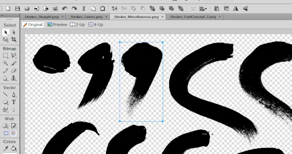
Period and apostrophes were easy to paint in full, and were two of the only characters that went in directly from the scanned strokes
In spite of this being a completely different style of font and method of creation to The Structed Beginning, a lot of the same shortcuts and optimisation carry over, like creating some of the numbers from existing letters.
There are plenty of cheeky tricks. The British pound symbol can usually be made easily with an upside-down capital J and a dash or equals, for example.
Once everything but characters with diacritics* are covered (for one last optimisation towards the finalisation of the font), I run it through FontCreator’s automatic kerning tool. This speeds up the kerning process; I can then manually adjust any suspect pairings.
* “diacritics”: pronunciation modifiers on letters, such as the accent on “é”
The way I kern fonts is to automate the initial pairings, and then remove any pairings that AutoKern returned with a positive size. Probably not the best way to do it, but it works. My apologies to any other font professionals out there.
Some pairings will require adjustment afterwards, but this is as easy as running through the list of remaining pairings, making sure they look okay, and then adding any missing pairings that would benefit the font. This is a gentle procedure with a font like The Inevitable End as it already is designed to look erratic. Kerning has to be WAY off to actually look wrong.
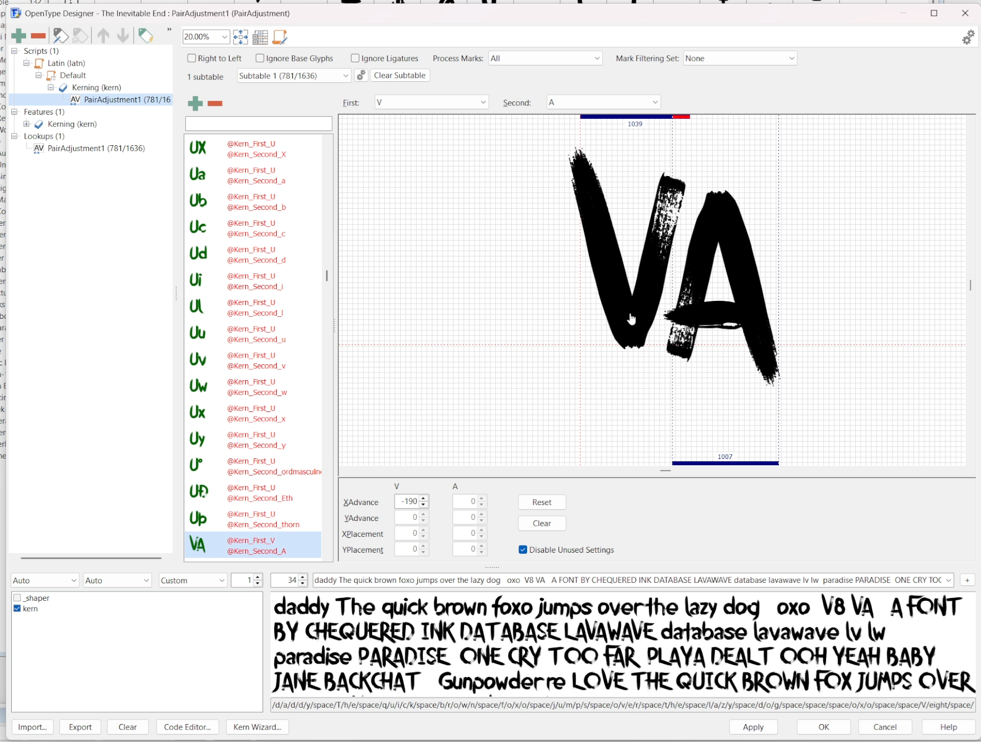
Common kerning pairs that need special care are “AT”, “AV”, “AW”, “AY”, “LT”, “LY”, and the reverse of all of them except swap “L” for “J”
The reason I kern before I add characters with diacritics is for speed. Those characters are usually picked up separately by AutoKern when they kern identically to their non-diacritic equivalent characters. It’s faster to manually group them in the code that AutoKern created.
Once kerning is done, the final big step is to add those characters with diacritics. FontCreator makes this easy with the “Complete Composites” tool, which pairs the letters and diacritics I have already created. With minimal manual adjustment (the A Ring did not play nice, perils of making a high-resolution complex brush font), I have them all ready to go.
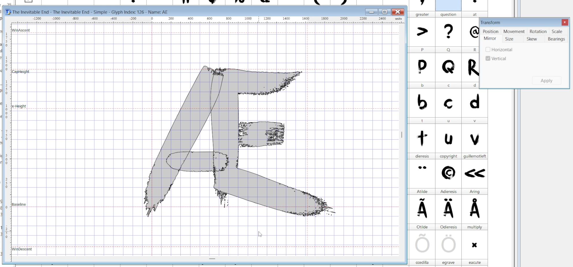
Æ is the only character in this area to be constructed manually - slash, hyphen + “E”, with subtle reshaping, make for a cleaner Æ than “A” + “E”
One last character to add – I replace the “notdef”* character with the Chequered Ink logo for branding. I have it as a .png that imports cleanly with the same tools into the font. This finishes the font itself.
* “notdef”: the character the font will default to if a user types something unsupported by it
From here, I tweak the export settings for legacy kerning (otherwise it won’t work on DaFont properly), install it, and make the thumbnail art, usually using stock photography from Unsplash and whatever art I want to include in it myself. This also gives me an opportunity to test the final font and catch any issues I missed.
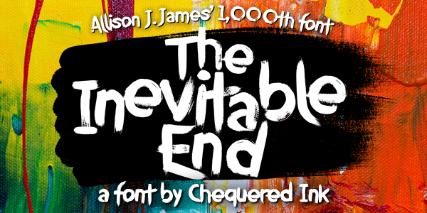
Font #1000: The Inevitable End
Acknowledging that, one day, there will be an end.
And until that day, even when I’m on font #1000, there’s always a way to push myself, and experiment, and try new stuff, even just a little bit, while remaining in my comfort zone for the bulk of the work.
The Inevitable End is not a perfect font. But I am not a perfectionist. As a retrospective representation of everything that makes me me… it is perfect.
[VIII] Epilogue
That is the story of how I made 1,000 fonts. They’re all out there. They’re all free to use in non-profit stuff, downloadable on my website, DaFont and FontSpace. Go nuts. Or buy them all in one pack for commercial use via Chequered Ink. Or use Google Fonts, or Adobe Fonts, or MyFonts, or FontSquirrel, or Comic Sans, or make your own. You do you.
Is “The Inevitable End” the end of my font career? …No. I’ve got bills to pay. I named font #1,000 “The Inevitable End” for two reasons: knowing full well that one day, not today, there will be an end. And a Röyksopp album.
However, is this the start of a bit of a break? …Probably. At least for fonts. I’ve got Nildigo to give the attention it deserves after nearly two years of development, and then whatever game I make next to fall in love with fresh.
But I still enjoy making fonts. It’s probably not going to be a LONG break.
After all, I’m sitting on a number of unfinished fonts. I tend to chip away on many at once. Expect to see Anghywir, Caballera, Cherishment, Concustard, Conquestion, Defiants, Dirty Gary, Fearwax, Fractal Font, Guidance, Gunpowder Blacksmith, Neon Rites, Paint by Umber, Paintkillers, Polar Eclipses, Savage Cabbage, Solamen, Turtleimmortal, Twostep, and Whipsplash, among at least a thousand others, at some time in the future.
My most important piece of advice for anyone looking to replicate what I’ve done? Start with one. It doesn’t matter if it’s bad. Doesn’t matter if it performs poorly. Don’t expect it to be good, or do well with it, or have any lofty hopes for creation one. Enjoy making whatever you make, font or otherwise, and you’ll enjoy the second one more.
And above all, don’t listen to just one person’s journey and copy it note for note. you won’t enjoy yourself. I enjoyed myself by finding the way I love to create.
You’ll find yours.
- Allison J. James
Want to see all 1,000 of my fonts with individual footnotes, release information etc? I’ve also got a timeline.
