Images in this post are used for critique.
As anyone with eyeballs will no doubt be aware, companies these days seem to love changing their logos - reinventing their brand or just making it look sleeker. Or outright worse. Anyone that's seen my Formspring page will know my main "one" has been Pepsi, whose new logo is... ugh. Just ugh. And while nowadays I've stopped noticing it, I still think it's terrible.
But as someone who quite likes graphic design (read - not art) and in particular typography, every time a familiar brand does this, I get thoughts about it. So I thought I'd share them.
new-google-logo
Google (top - old logo, bottom - new logo) would probably receive a hell of a lot of grief if they ever properly altered their logo. It's just so familiar, even though it's just a plain font with some seemingly randomly chosen colours. Luckily, their recent update was just a polishing of it, brightening the colours, downscaling the bevel and removing the drop shadow. Very nicely done.

ps3logo
PlayStation 3 (left old, right new)'s new logo, stand-alone, is better in my opinion. Simpler, more identifiable (as it's just an evolution on the PS2 and PSP logos), and doesn't immediately make you think of any Smashing Pumpkins LPs or Tobey Maguire superhero movies. However, it was an evolution brought about by the new matte-black, slimline PlayStation 3. Although I've warmed to it now I own one and have managed to gawp at one in the flesh, I still think the shiny original looked nicer. And the worst change brought about by the new logo, to me, is the box art for PS3 games, which has changed from a sleek, faux-shiny side-bar to a topbar with a black-grey gradient. Bleh.

starbucks
Starbucks just went simpler for their overhaul, shedding the green "Starbucks Coffee" and turning the black innards green. Can't say I like this change yet. The "central" circle of the new logo is completely offset and makes it look a tad odd (though this is also the case for the old logo, it's less apparent as it's not as in-your-face and it's out of the "main two circles"). Not the worst thing in the world though. Just waiting for them to shed the other outer circle now and just have a woman's face and some long hair as their logo!
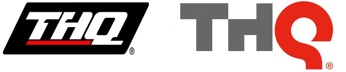
thq
THQ went simple and bevel-free. Both logos are a bit fugly, to be frank, but I'd grown warm to the overly slanty older one. If the new logo's H hadn't had its shoulder amputated I think I'd like it a lot more. At the moment, it looks like the T is a table, the H is a chair sitting by it, and the Q is Yivo from Futurama: The Beast with a Billion Backs, waiting to ram its face into the neck of whoever dares to sit on the H.

gap
Gap hired a very strange person to redesign their logo. There is no way of elaborating on that.Wait, there is. HAHAHAHAHAHAHAHAHA WHAT THE HELL IS THAT?!

argos
Argos did the subtle modernisation thing, and it works rather beautifully. Infact, this is one of the few logo redesigns I preferred over its predecessor from the moment it was unveiled. Cleaner and less pointy while retaining its simplicity and colour scheme. To be honest, though, I'd personally go one step further and kill the cheesy underline-slash-fake-smile that's sitting on a ton of other logos these days (see Kraft's abomination of a new logo and Amazon, which I guess can be let off as it serves the other clever purpose of pointing from A to Z, the letters of the alphabet the website can cater for)

itunes
iTunes went bleck. I can see the thought process - CDs, while not dead and probably for the foreseeable future won't be, aren't particularly popular these days. Particularly for those that use iTunes often - the people Apple would want to be steering towards their own online music store. So fair enough, that can go. But the musical note, in a generic blue circle, with a generic white outer shell? With generic gradient and gloss effects? It's not awful, it's just bland. To make matters worse, it looks like the logo's blue was taken from iTunes' interface, which is now almost colourless.

quicktime
Quicktime / Quicktime X's overhaul fares better. I never got why a little segment was cut out of the Q in the old logo, and if Windows gets Quicktime X I'll never have to know. It's still a tad generic - shiny Q, with a shiny centre ball, and as a sister program to iTunes their logos bear next to no resemblance (not that they ever did), but all in all it looks superior.

wmp
Windows Media Player may as well get a mention while I'm at it. While iTunes ditched its CD references, WMP added them with their logo revamp (I believe a change that came with Vista-exclusive WMP 11), turning a very Simon-ish logo into a set of three CD cases and a big orange Play-button-wielding disc. My big problem with this is that it pretty much killed its identifiability. Windows things have the Windows colours on. That's just a bunch of clear bits of plastic that could quite happily be slapped onto WinAmp, the disgusting RealPlayer, you name it.
There are plenty of others worth noting, though I won't link to them (if you search on the internet for "logo redesigns", "logo revamps" or anything along those lines you'll find professional designers who have dissected the living daylights out of them).
KFC altered their colours more than anything, turning the red-beige-blue into more of a red-beige-brown. They look nigh on identical so it just seems to me like a waste of marketing money.
I've seen a new MasterCard logo circulating the Internet - if that thing takes over their current logo I think I'll have a bit of a cry.
Burger King and Walkers (US: Lays Potato Chips) have done revamps but nothing major over the years, which always look okay in exception for that hideous monstrosity Walkers had for a short while.
And of course, Pepsi. What the hell were you thinking, Pepsi?
Since I don't blog much, just thought I'd make a little addendum. Today, I spent £58 on sweets - enough to last a damn lifetime! I got me:
1,200 Rainbow Dust tubes
40 Rip & Tip Sherbet, little bags filled with sherbet of either raspberry or orange
A bag of those Pink Pig things that are nice until you've had about four; sickly thereafter
500 flying saucers (the foamy UFO-shaped things filled with sherbet. I like sherbet.)
50 foamy bananas and 50 foamy shrimp, essentially a pick 'n' mix delicacy
A kilogram of those E-number-packed letters that are kinda crunchy and sweet
150 double lollies
If I was able to experience a sugar rush (I never have and doubt I ever will), this would be it!
Anyway, that's all from me. This took an hour to write that could have been on LittleBigPlanet 2 (which owns heartily, by the way). No more time to lose!